We rebranded with purpose. Read the story

Paragon Productions

Building the Paragon Production brand

How we created the visual story for the storytellers

VIEW PROJECT

project type

  • Branding
  • Web Design
  • Content
  • Development

team

Building the Paragon Production brand

One word in discovery unlocked everything

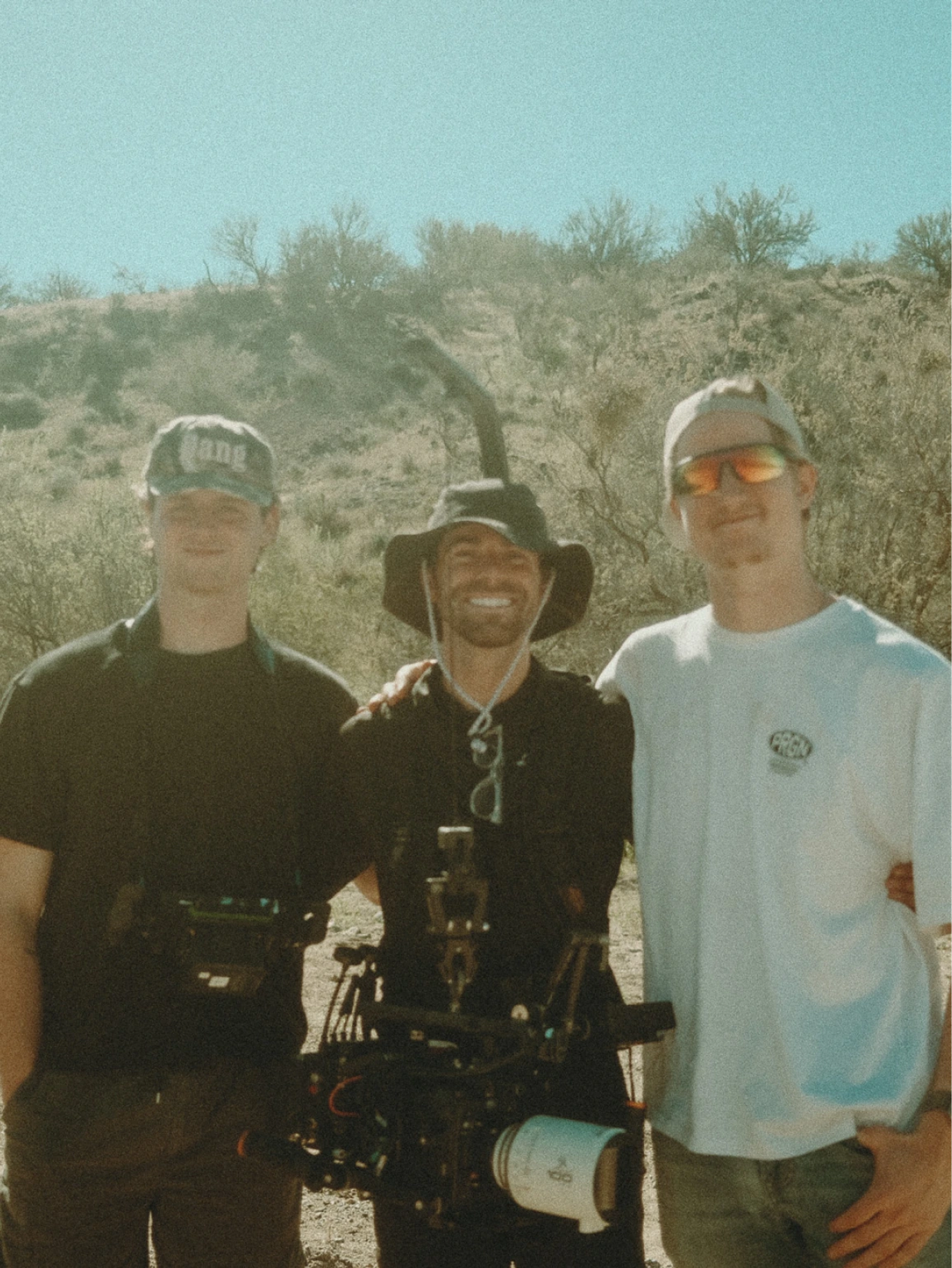
Jack reached out wanting a website refresh. Pretty normal ask.

But then we got on the call and I'm like... uhhhh, wait.

This guy makes films for a living. Commercials, short films, the kind of work where you show up and make someone else's story look incredibbblleee. And his own brand had almost nothing to say for itself. Kind of a bummer, honestly.

That felt like a problem we couldn't walk away from. So we did what any responsible creative team would do... we talked him into telling HIS own story.

Jack (and the team) are just... genuinely good dudes. Warm. Midwest through and through. The kind of people who are easy to talk to from minute one.

We got into his background pretty fast and that's when it came out: the name Paragon had been with him since his Halo days. An old gamertag that followed him into a real business. We laughed about LAN parties, streaming matches, hunting down montage videos on YouTube.

Probably did this for longer than we should have, but we all eventually got back to work.

Three things kept coming up. His Midwest roots, not as geography but as a vibe. His obsession with motorsport, Formula 1, IndyCar, all of it. And the name Paragon itself, which literally means perfection.

Here's the thing though... "building a brand around perfection" is kind of a nightmare brief. Too clean. Too untouchable. Too borrinnggg. So we kept pushing. Kept digging.

What does perfection actually mean to Jack? What does it look like when it's moving?

And then it clicked.

It wasn't perfection. It was the pursuit of it.

That one word unlocked everything.
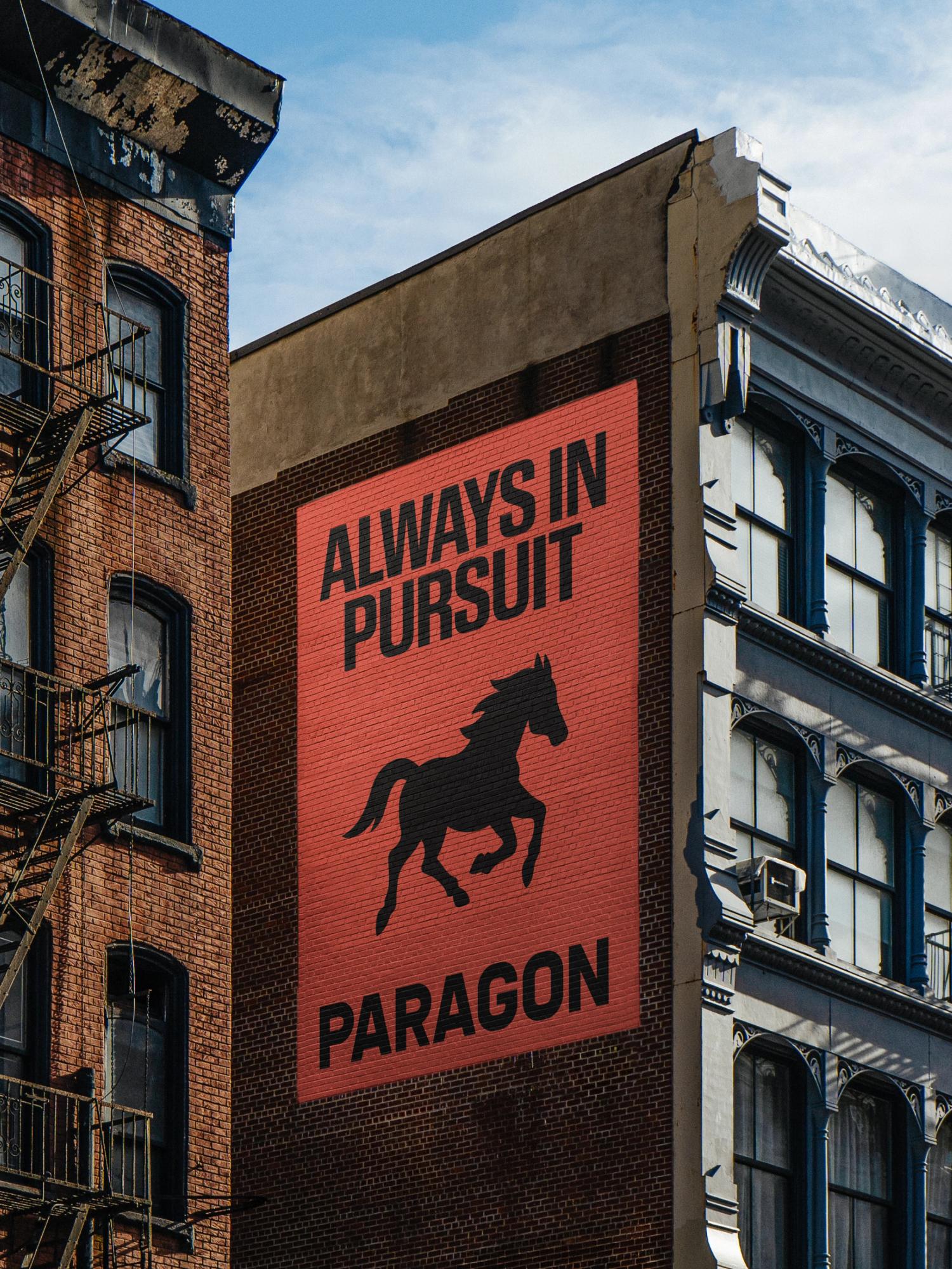
The mark

Jack came to us with Ferrari and F1 references (Hamilton, Leclerc, all that cinematic racing polish), but he's from Indianapolis, home of the Indy 500, and he wanted Paragon to carry that Midwestern soul just as much as the global craft.

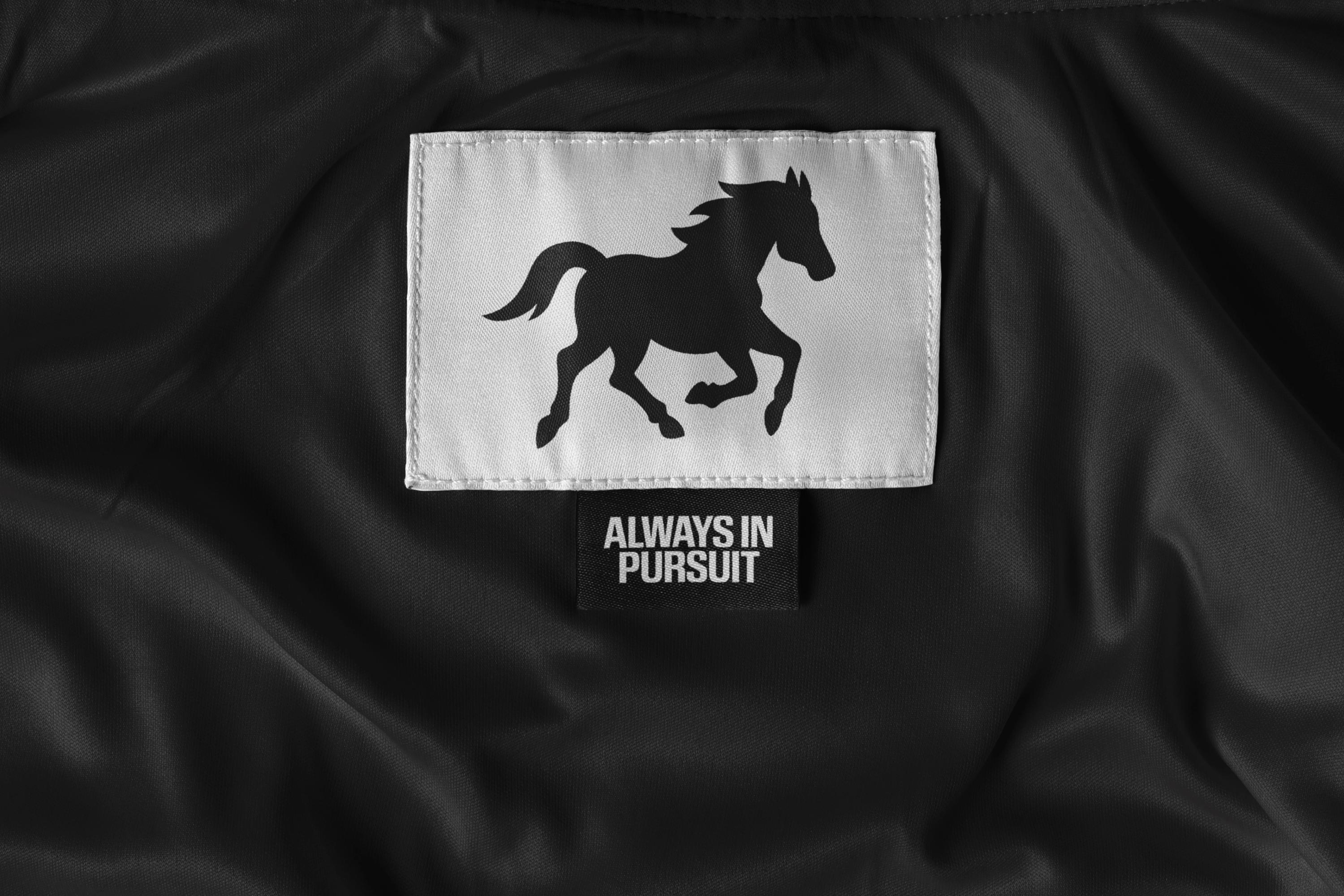
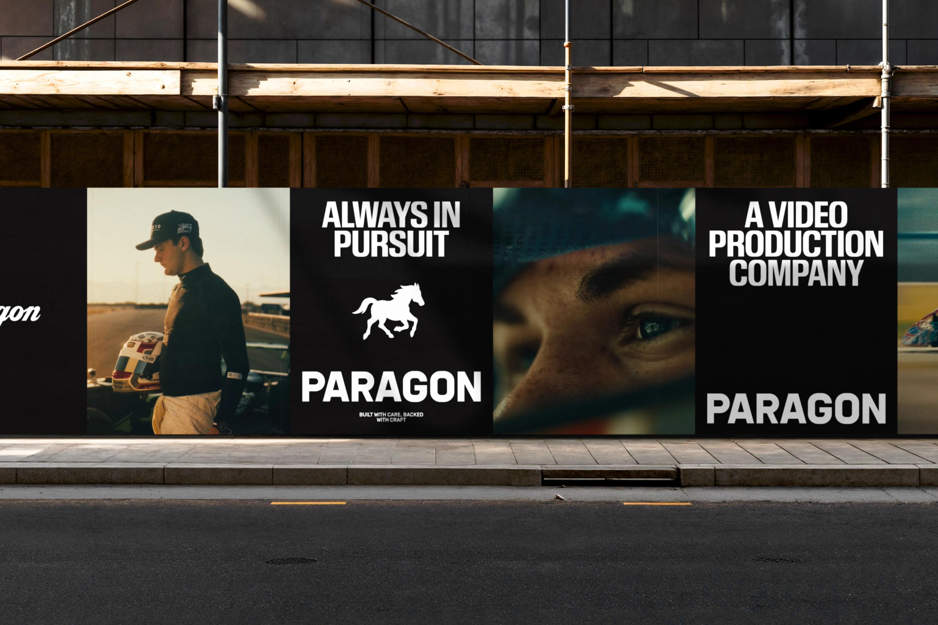
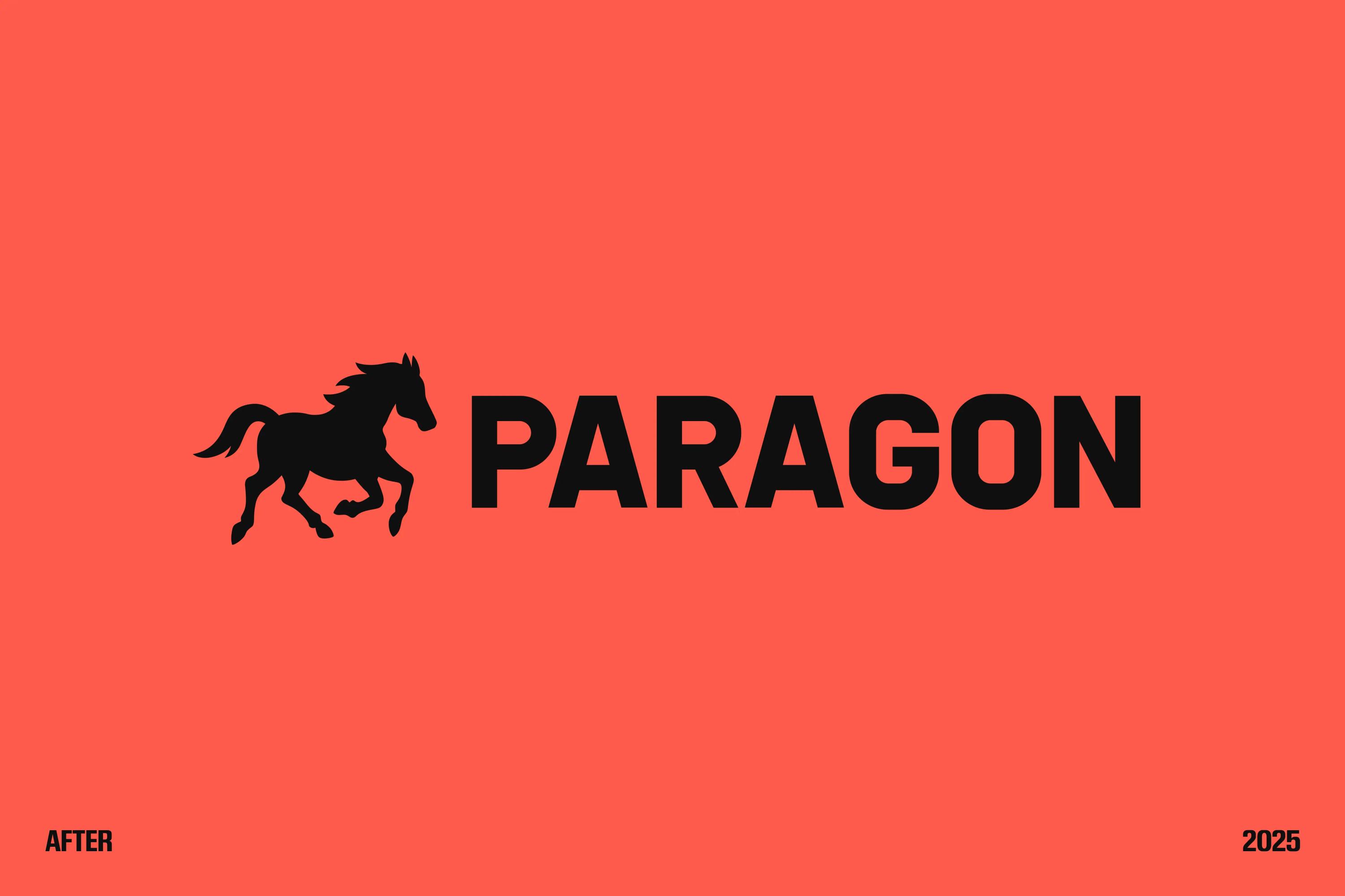
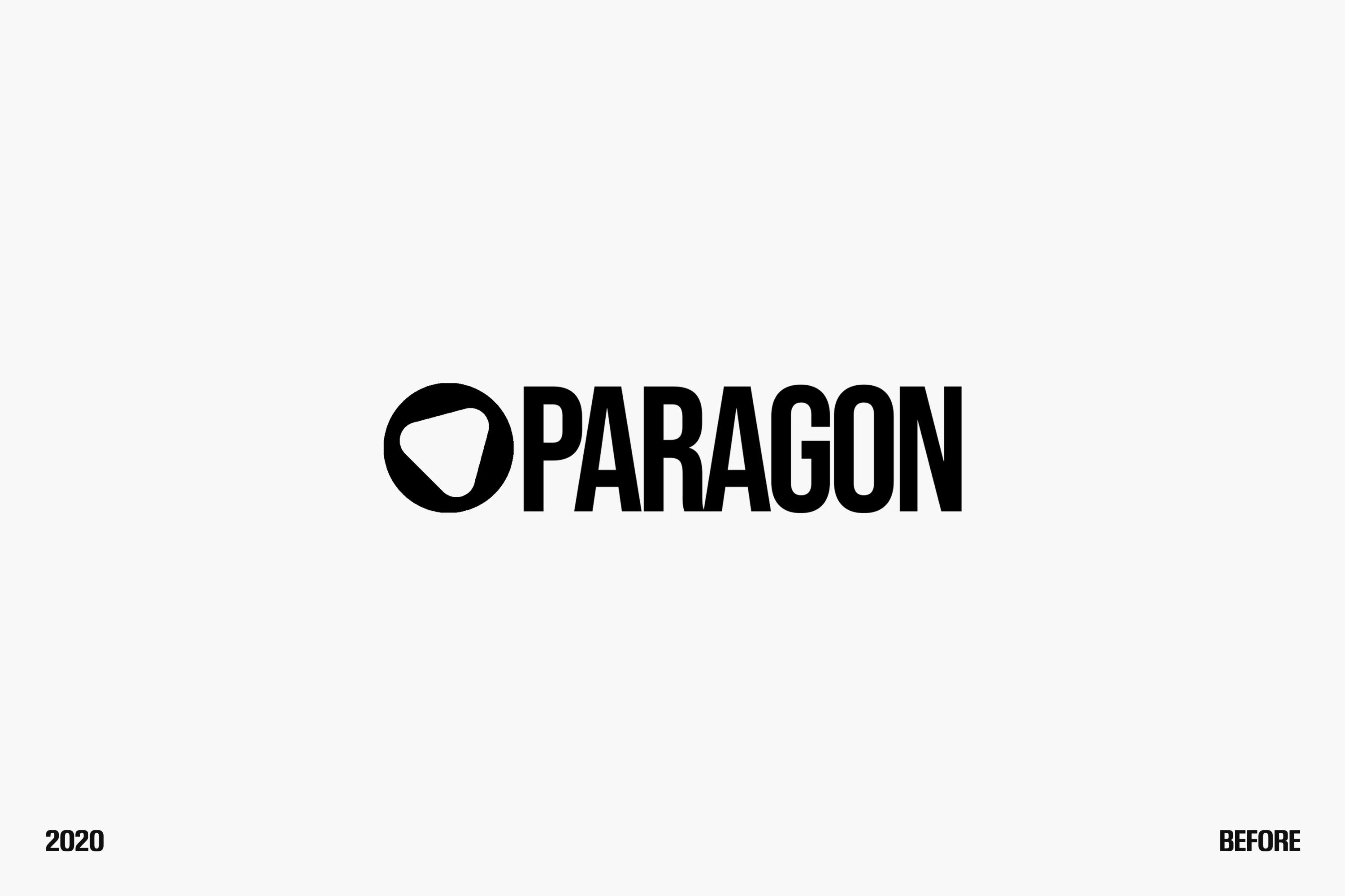
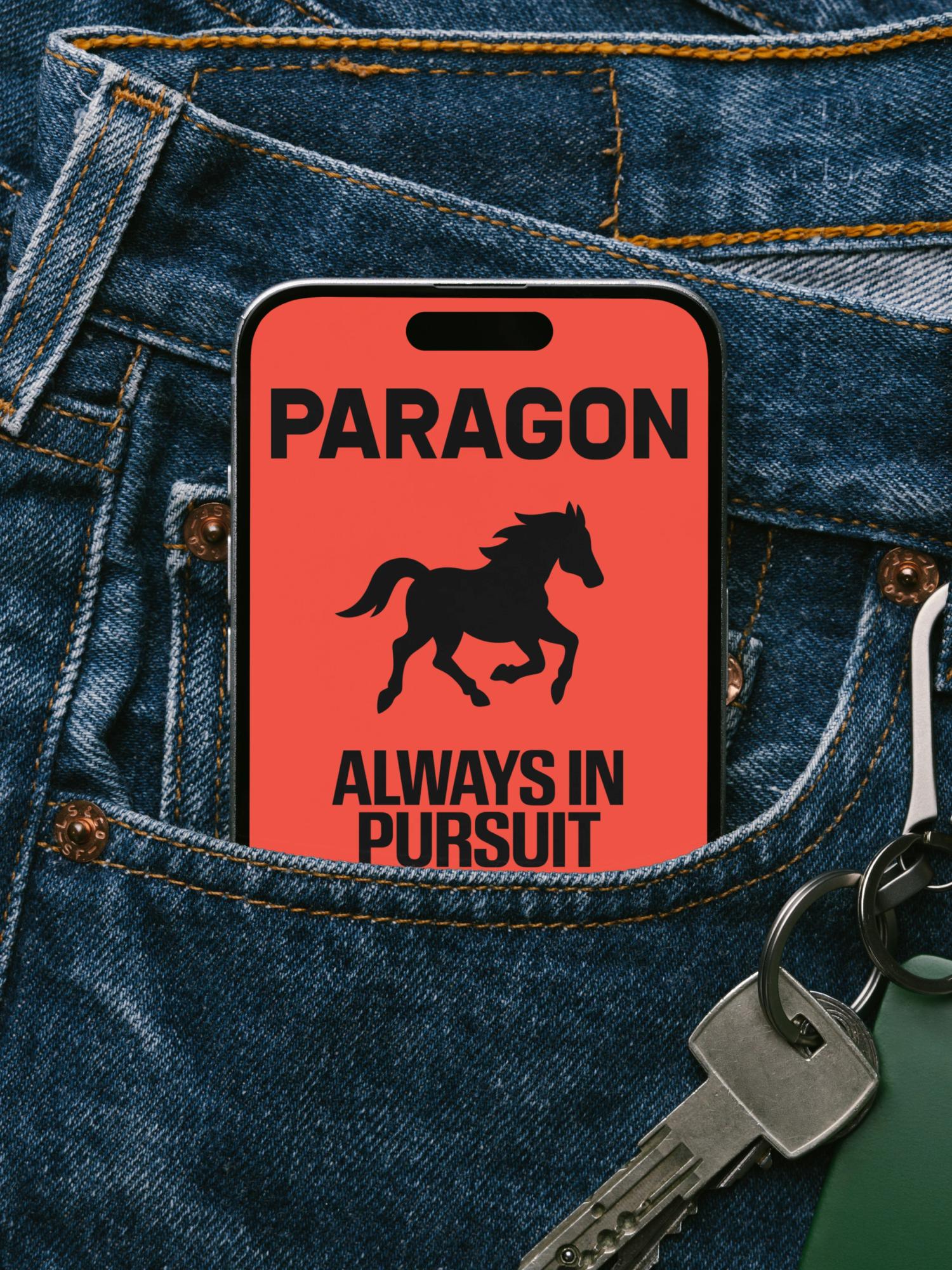
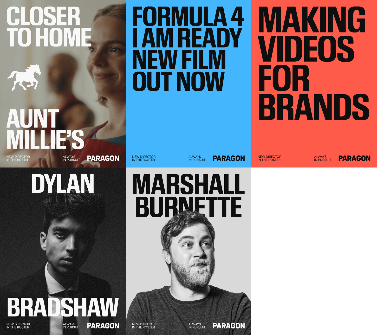
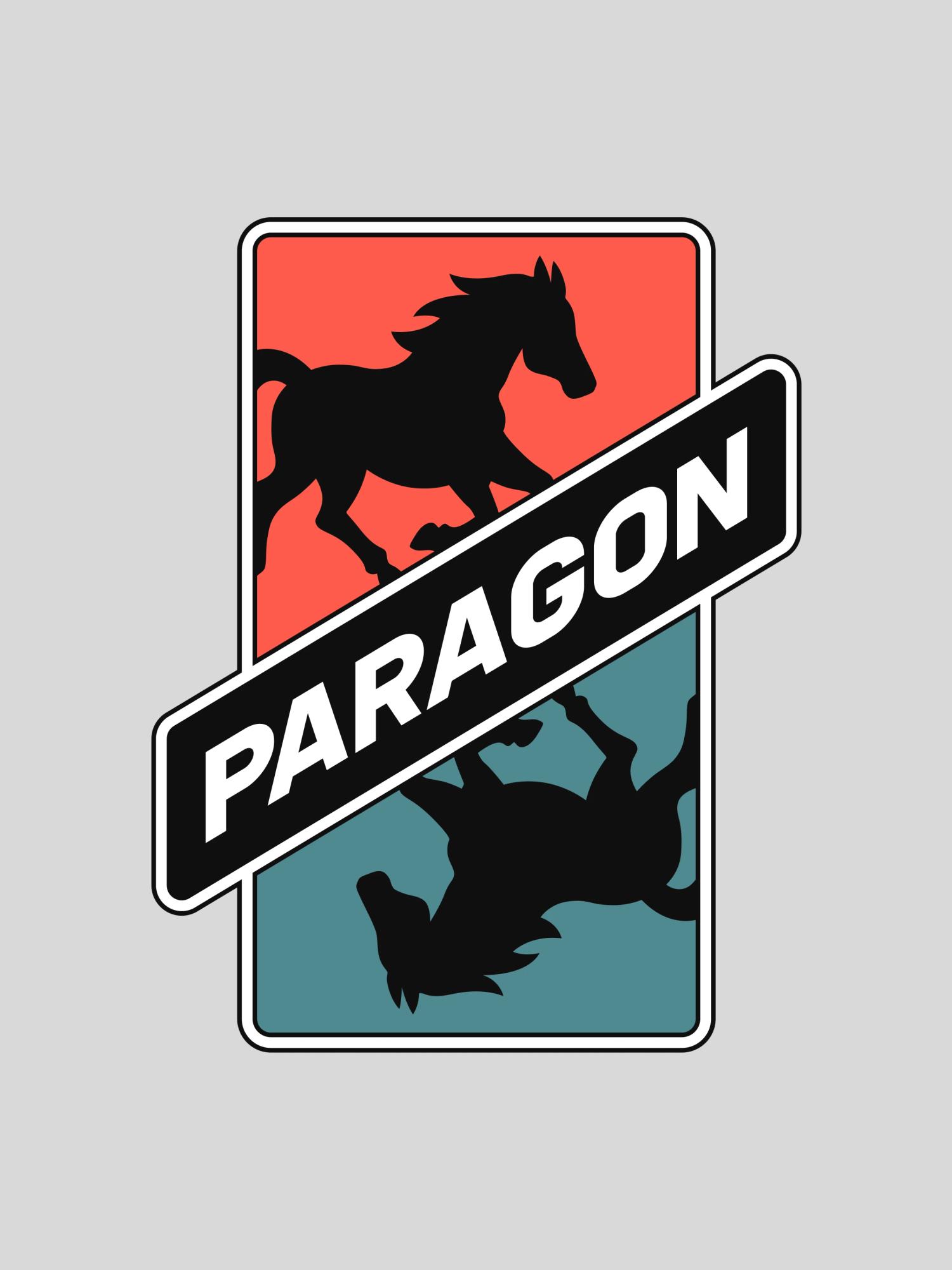
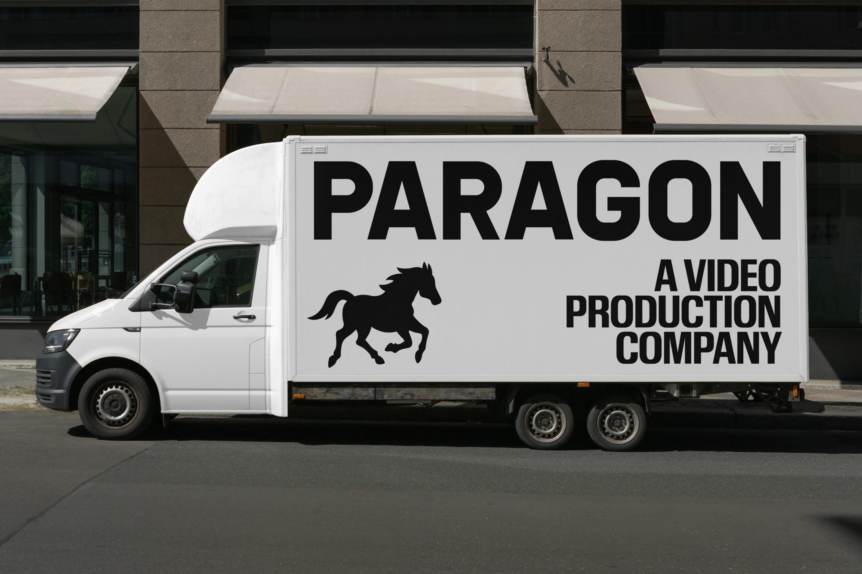
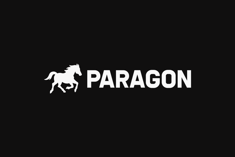
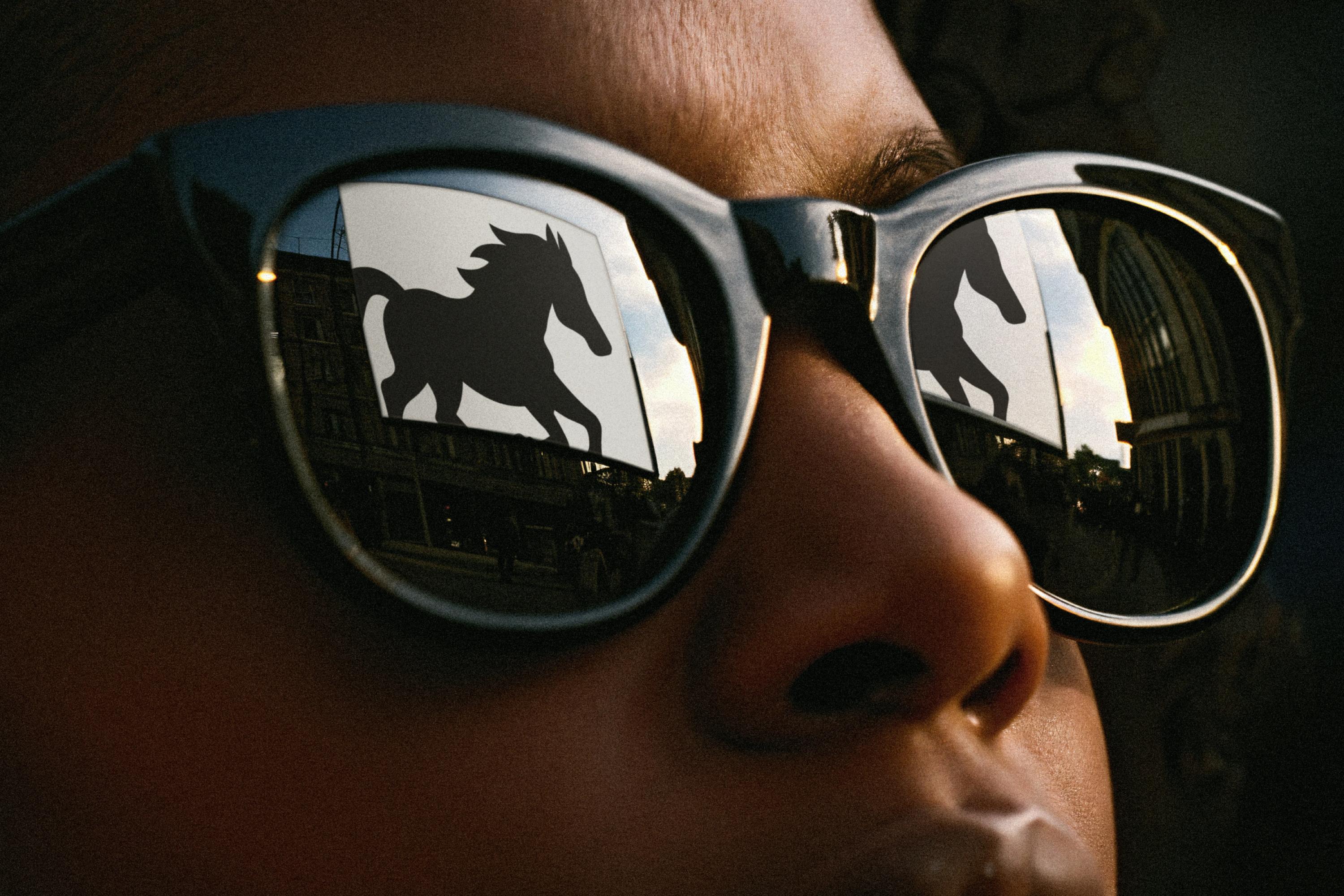
Flags and tires felt too on-the-nose, so we kept digging and landed on the horse: already at home in automotive branding (Ferrari, Mustang), and a dead-on fit for Jack's own words, "precise, fast, reliable, but built with heart," and Paragon's slogan, "Always in Pursuit."

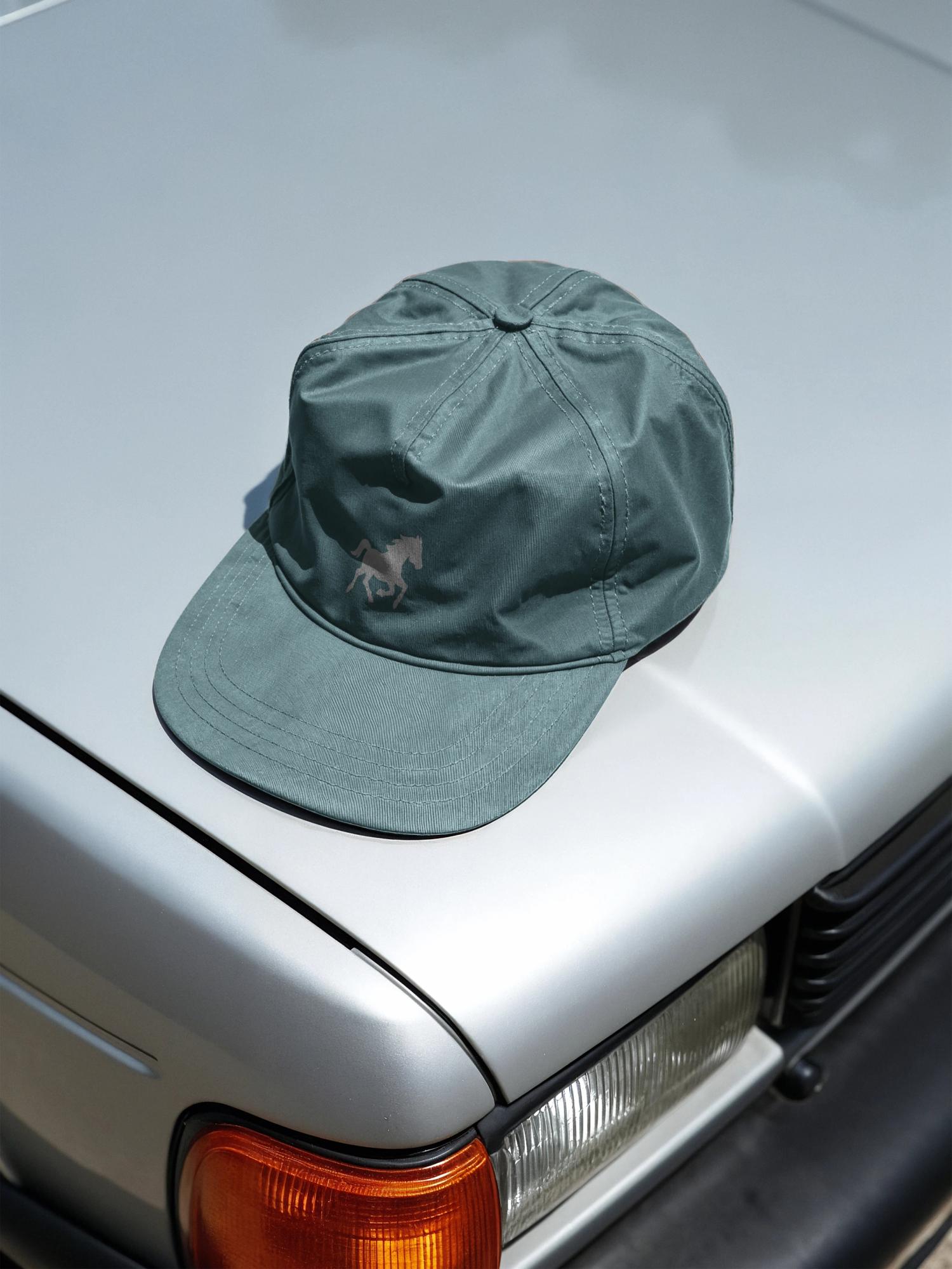
We pictured a horse galloping through the open Midwest at full tilt, fast but human, built on grit instead of luxury. After rounds of sketches, we pared it down to a compact, slightly aggressive silhouette caught mid-motion, then dropped an early star accent once we realized the horse told the whole story on its own.

The wordmarks

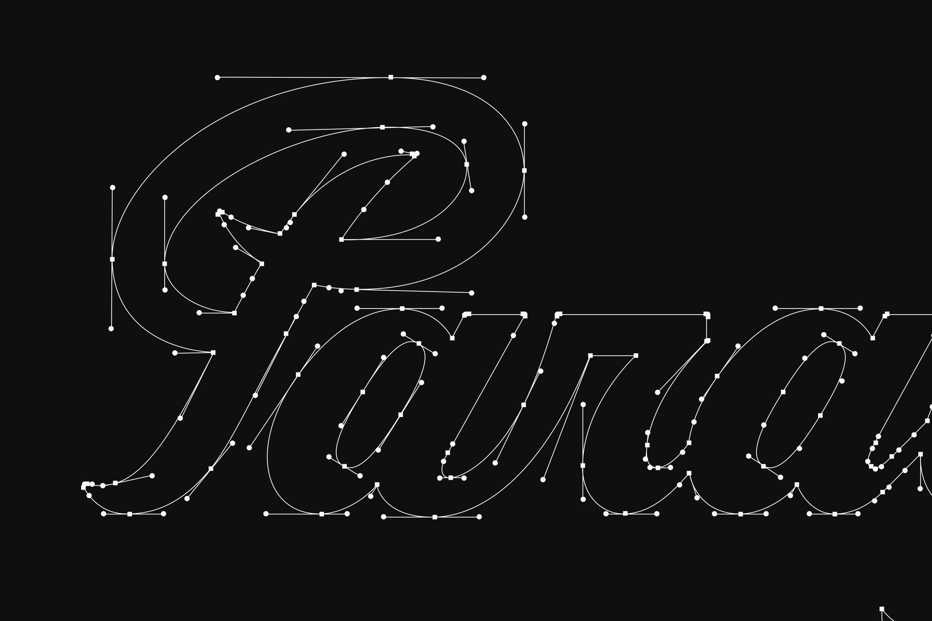
As true lettering nerds, every time we start a new project we find ourselves wondering how we're gonna work a custom wordmark into the recipe. Branding is a form of art, and honestly, why keep it simple when you can make it hard on yourself?

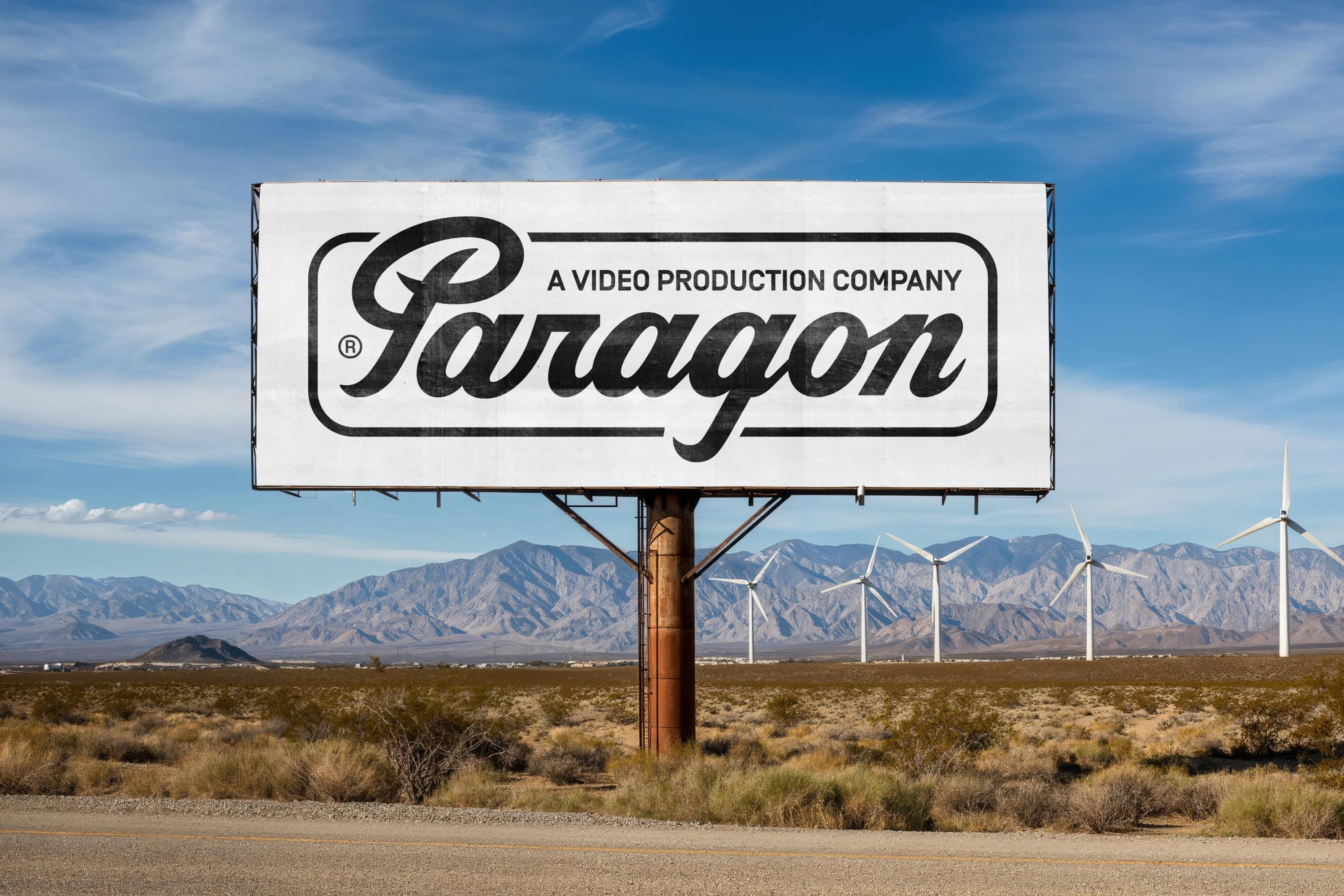
So instead of reaching for an off-the-shelf font, we drew Paragon a fully custom wordmark: modern, clean, elegant, compact, with a quietly masculine edge.

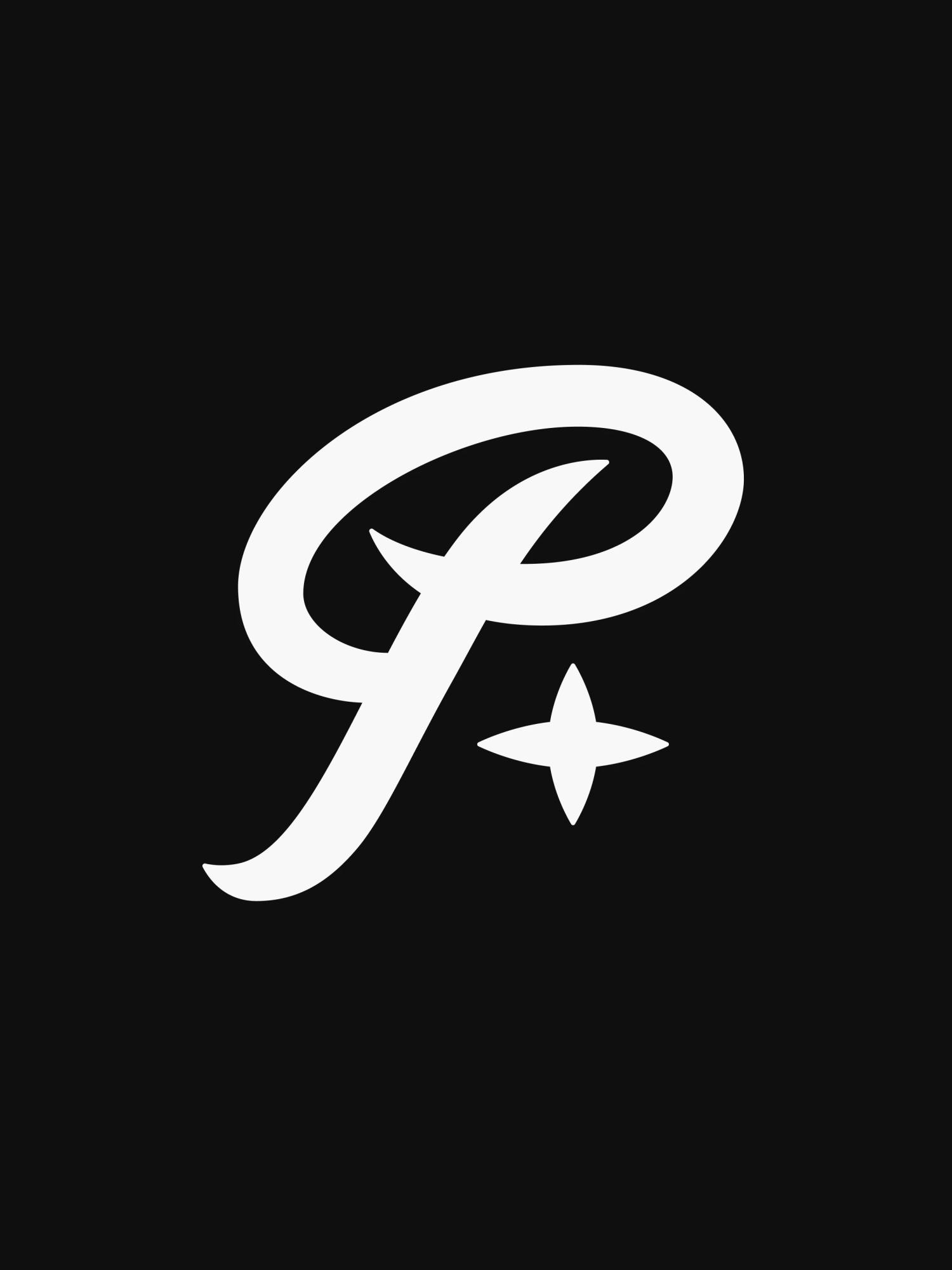
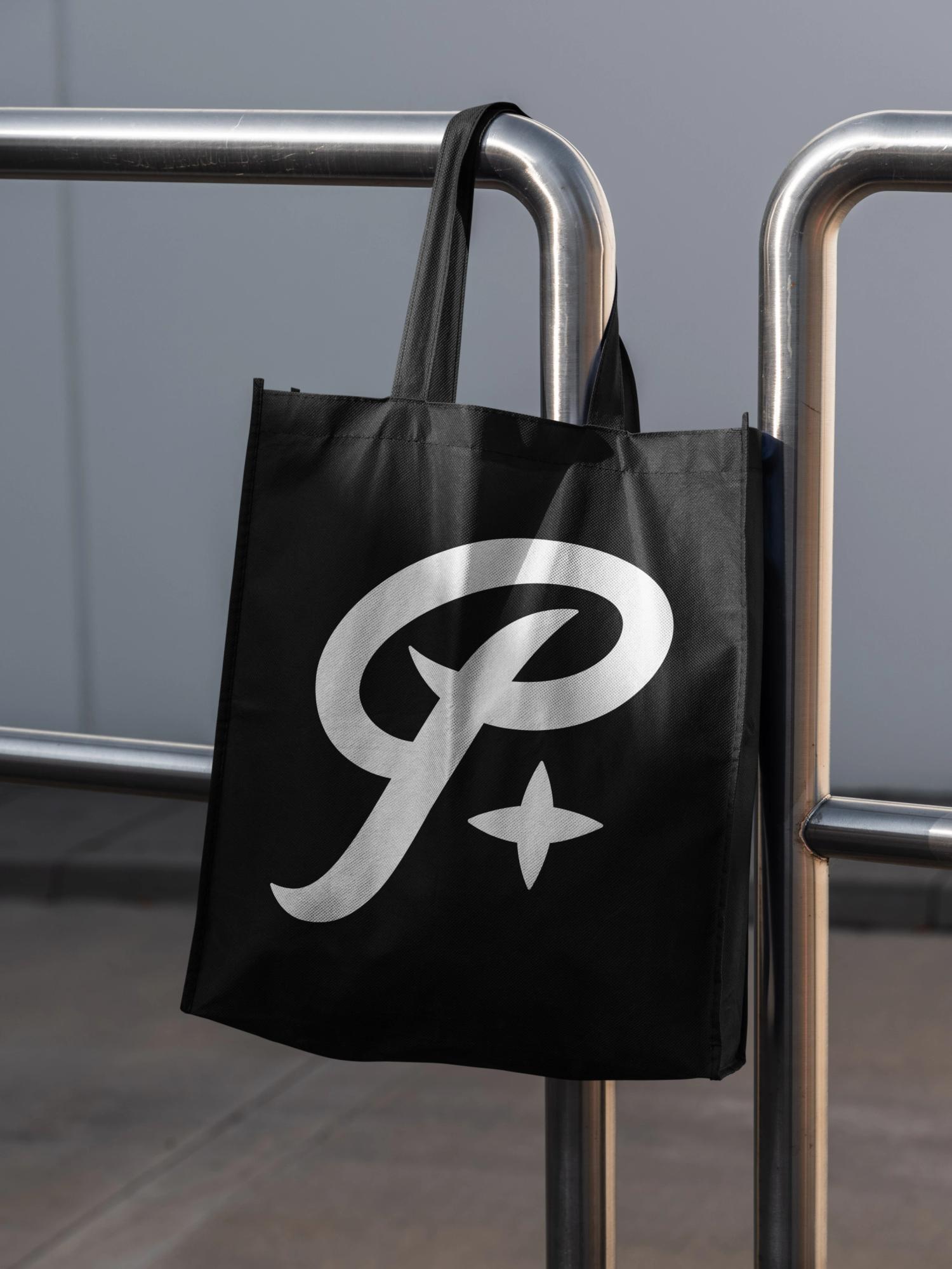
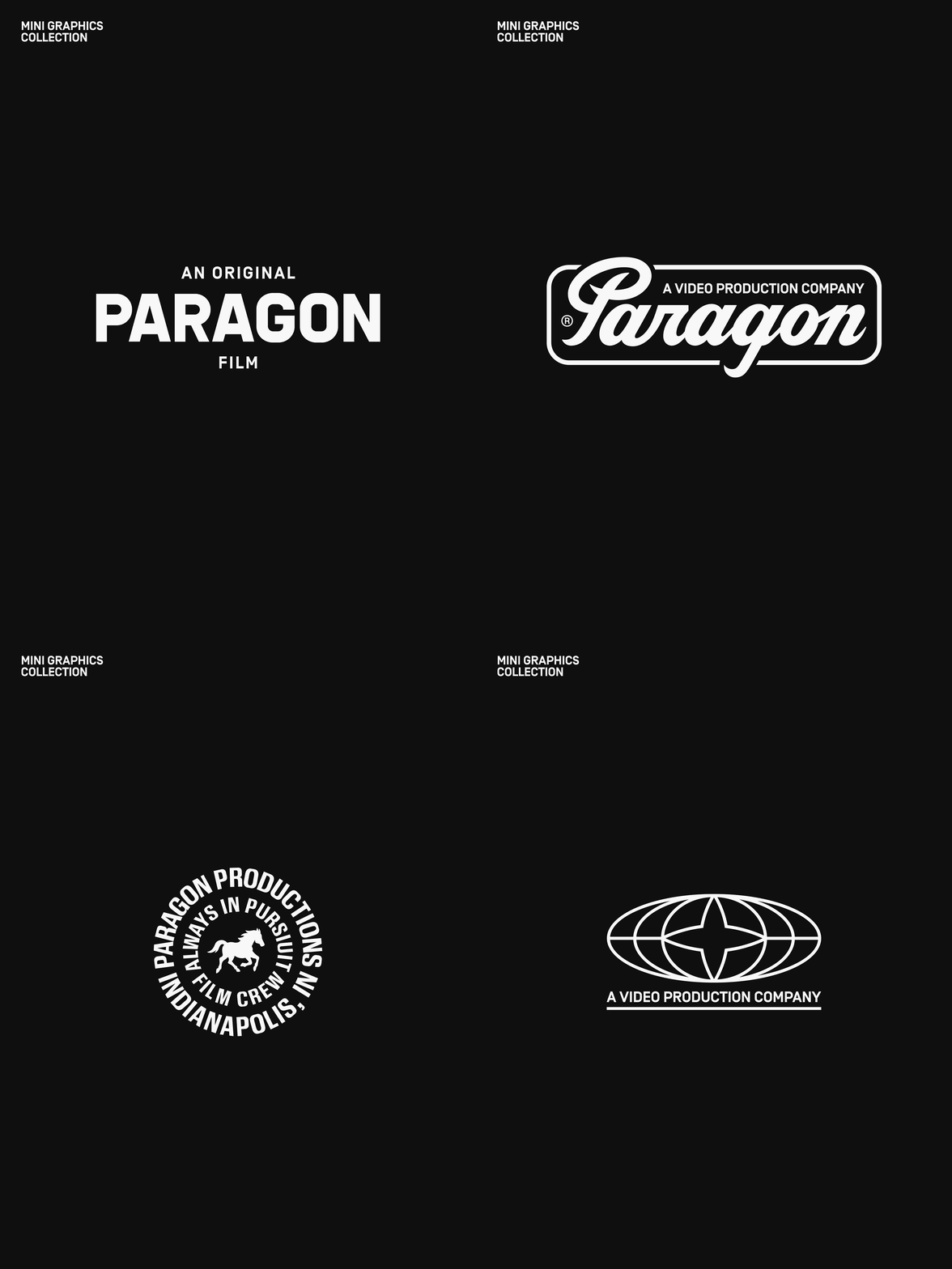
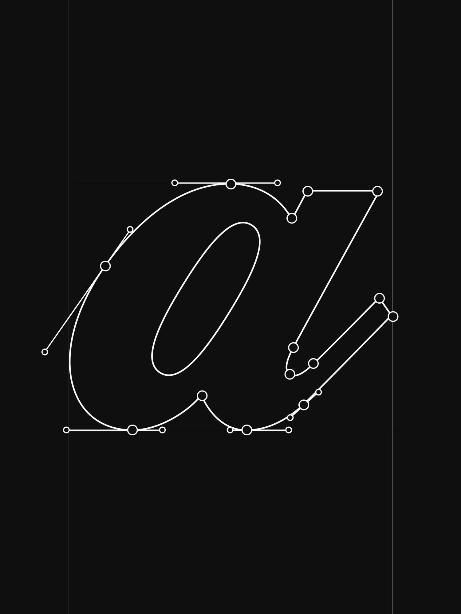
Then we couldn't resist a secondary mark either. I mean, one is cool... but Paragon definitely deserved to have two! Vintage cursive automotive logos like Lamborghini had us itching to design our own, something to bring real premium heritage to the brand while nodding to that automotive world.

Our first pass leaned too baseball-jersey, not enough luxury, so we refined it toward something more elevated, and pulled the P from the wordmark to build a monogram.

The fonts

What would a brand be without fonts? Probably not a brand. Often seen as an underrated asset, they're the true soul of an identity. At least according to us.

Our type system runs on three fonts, each pulling its weight.

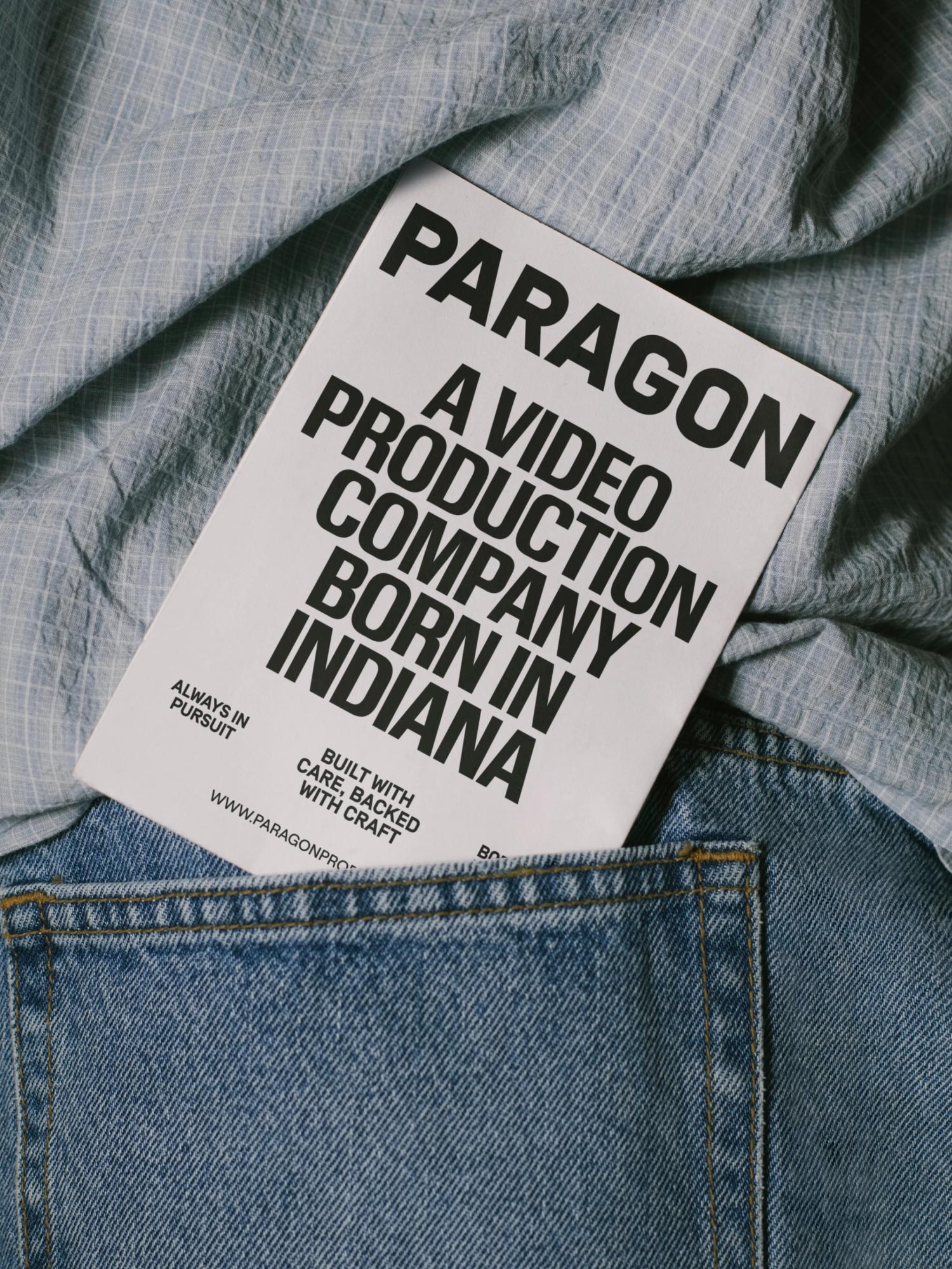
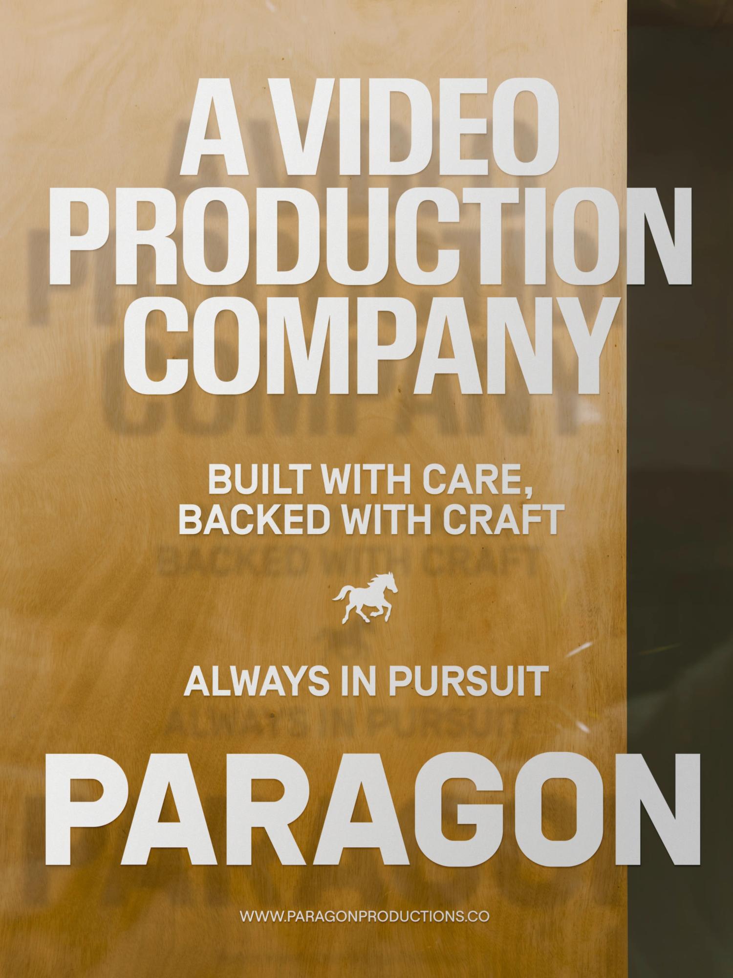
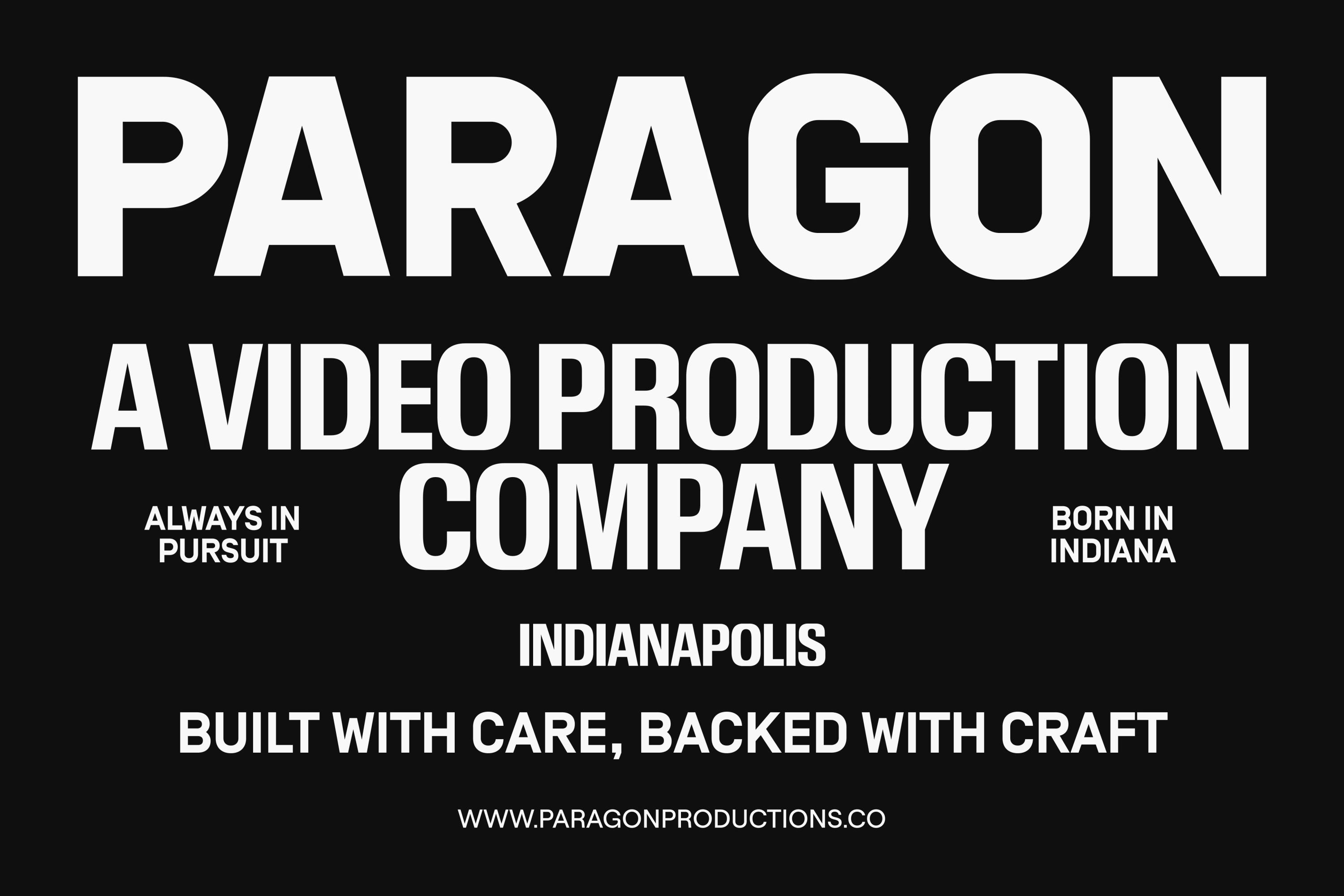
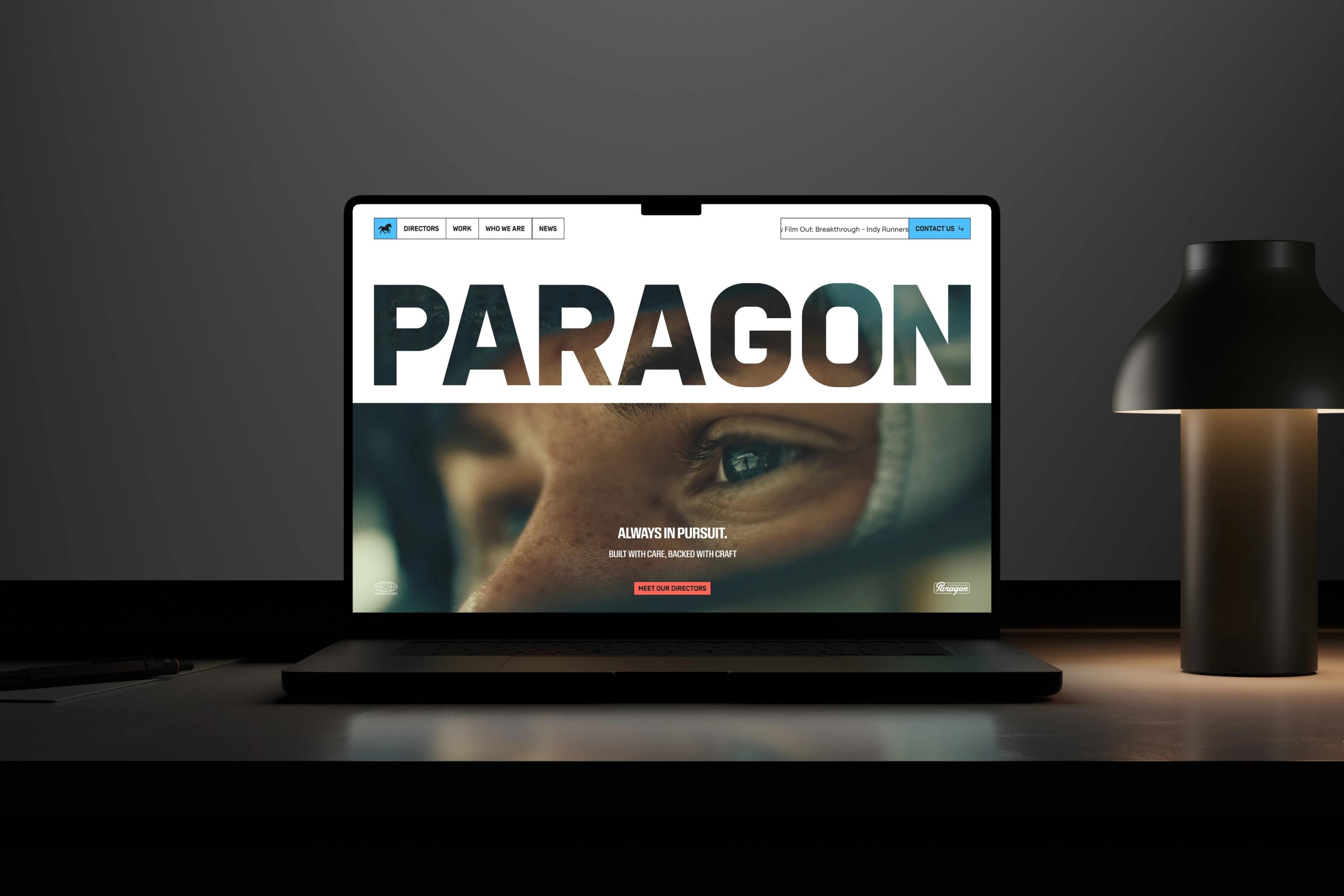
For titles, we went with Review Condensed Bold, the squarish, commanding face Berton Hasebe drew for T: The New York Times Style Magazine. We needed something bold and big enough to hold its own laid over imagery, whether that's a photo or a moving frame, so the headline still lands with real impact. To us it also nailed that 80s automotive vibe, the kind of lettering you'd find on a vintage car speedometer.

The accent font is Simplon Norm Bold, a Swiss take on the European road-sign letter with elongated, signage-rooted proportions. Used all-caps, it carries that technical, vintage, automotive personality while behaving almost like a monospace, which makes it perfect for small annotations and eyebrows.

And for body copy, Roobert from Displaay, a clean, geometric mono-linear sans. It's endlessly versatile and premium, with an engineered feel, but those slightly unusual "bent pipe" curves give it just enough fun and 80s warmth to keep it from feeling cold.

Across all three, the goal was cohesion: a type system that feels technical, slightly vintage, and tied to that automotive aesthetic.

The badges

What would a brand be without fonts? Probably not a brand. Often seen as an underrated asset, they're the true soul of an identity. At least according to us.

Our type system runs on three fonts, each pulling its weight.

For titles, we went with Review Condensed Bold, the squarish, commanding face Berton Hasebe drew for T: The New York Times Style Magazine. We needed something bold and big enough to hold its own laid over imagery, whether that's a photo or a moving frame, so the headline still lands with real impact. To us it also nailed that 80s automotive vibe, the kind of lettering you'd find on a vintage car speedometer.

The accent font is Simplon Norm Bold, a Swiss take on the European road-sign letter with elongated, signage-rooted proportions. Used all-caps, it carries that technical, vintage, automotive personality while behaving almost like a monospace, which makes it perfect for small annotations and eyebrows.

And for body copy, Roobert from Displaay, a clean, geometric mono-linear sans. It's endlessly versatile and premium, with an engineered feel, but those slightly unusual "bent pipe" curves give it just enough fun and 80s warmth to keep it from feeling cold.

Across all three, the goal was cohesion: a type system that feels technical, slightly vintage, and tied to that automotive aesthetic.

The merch

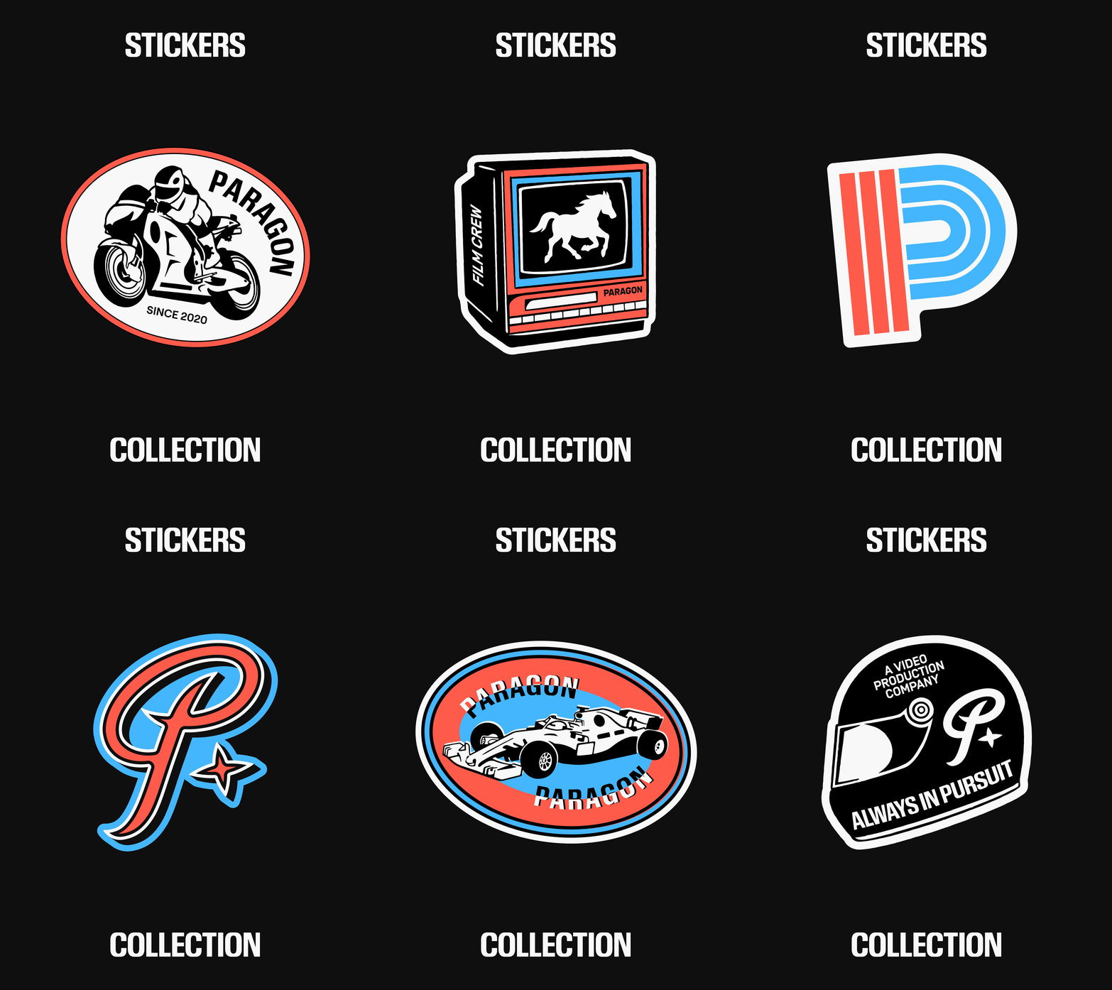
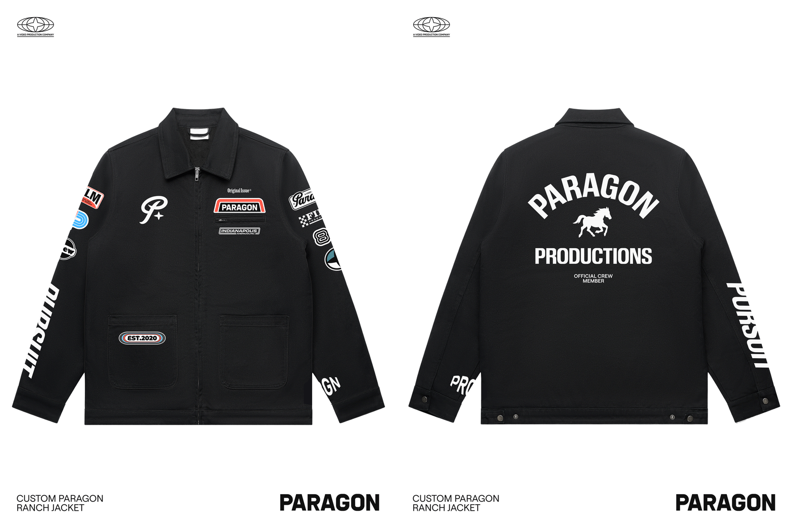
When Jack reached out and started detailing the scope, merch came up very early in the conversation. We couldn't be happier about that.

I think if Pierre could clone a second version of himself and assign him one single task to accomplish in life, it would be designing t-shirts all day.

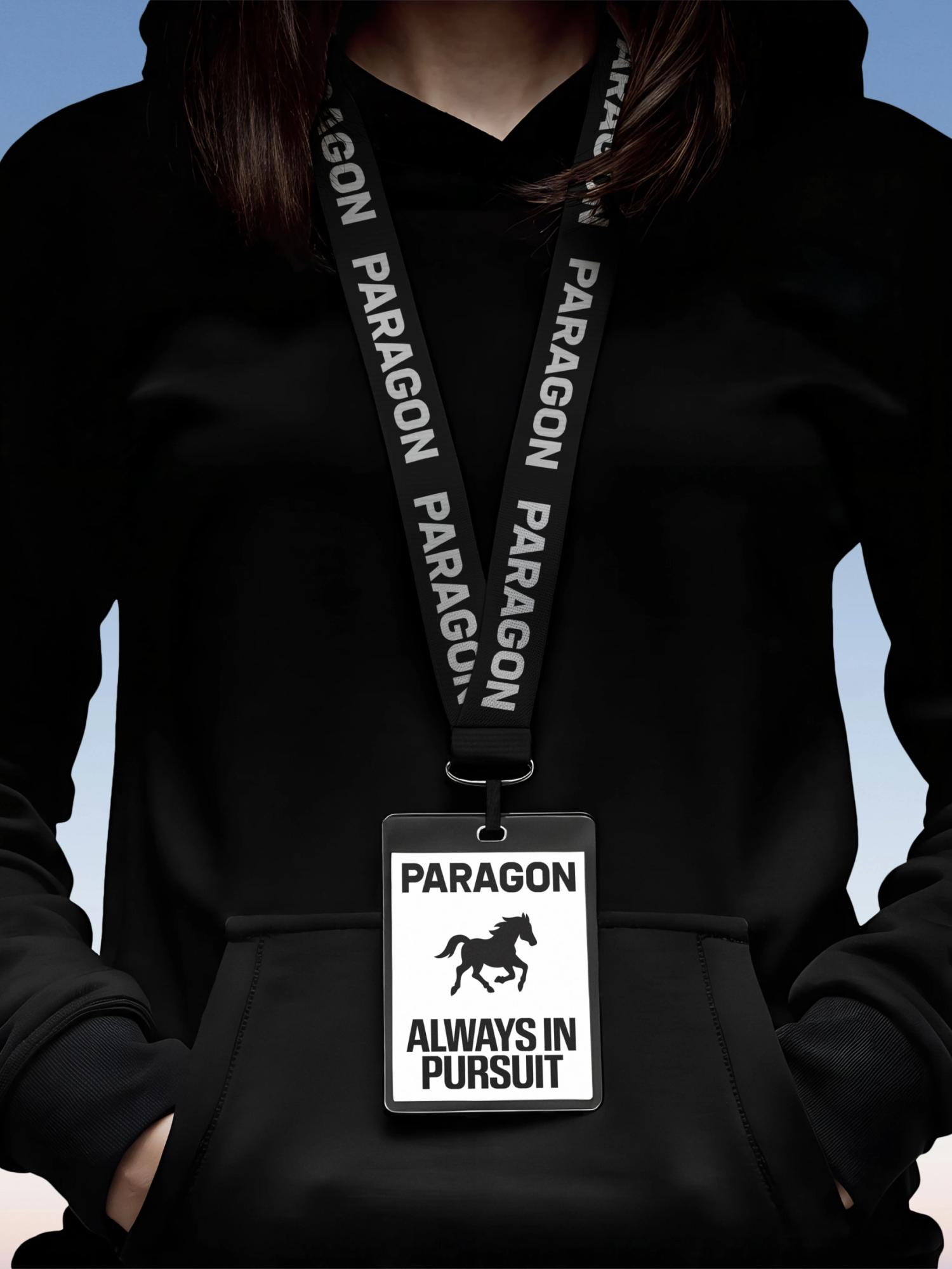
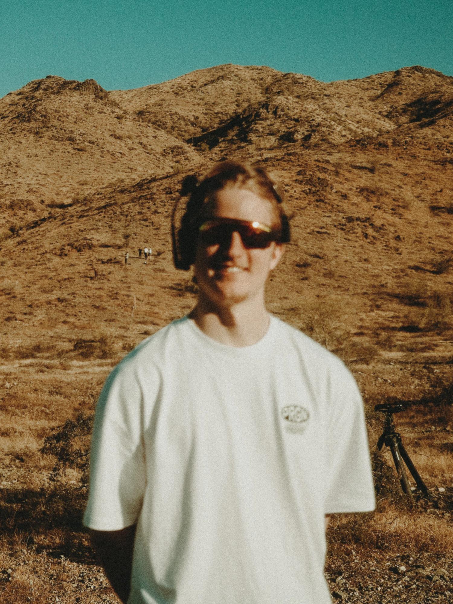
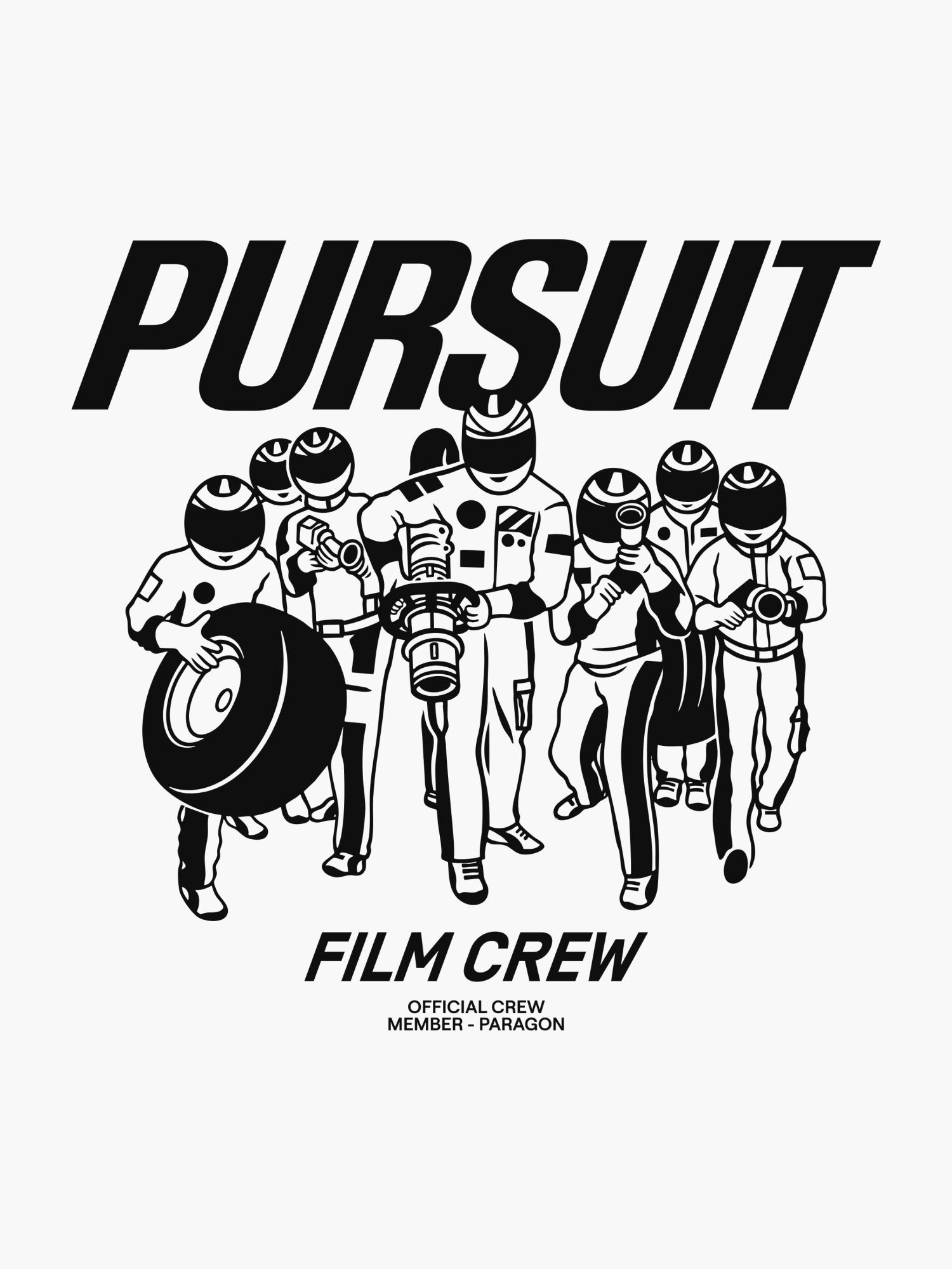
Merch is obviously cool, but for Paragon it also served a real strategic objective. Being on set during a shoot means the whole Paragon team is meeting the client and working alongside them, and having everyone in branded merch brings a genuine feeling of professionalism and cohesion. A bit like an F1 crew. You see the connection?

Jack also wanted to create pieces the team would actually love. A simple goal: design a t-shirt that becomes their favorite in everyday life. So we made hoodies and even a black denim jacket too, all built to look just as at home at a race track, on a horse ranch, or in a studio.

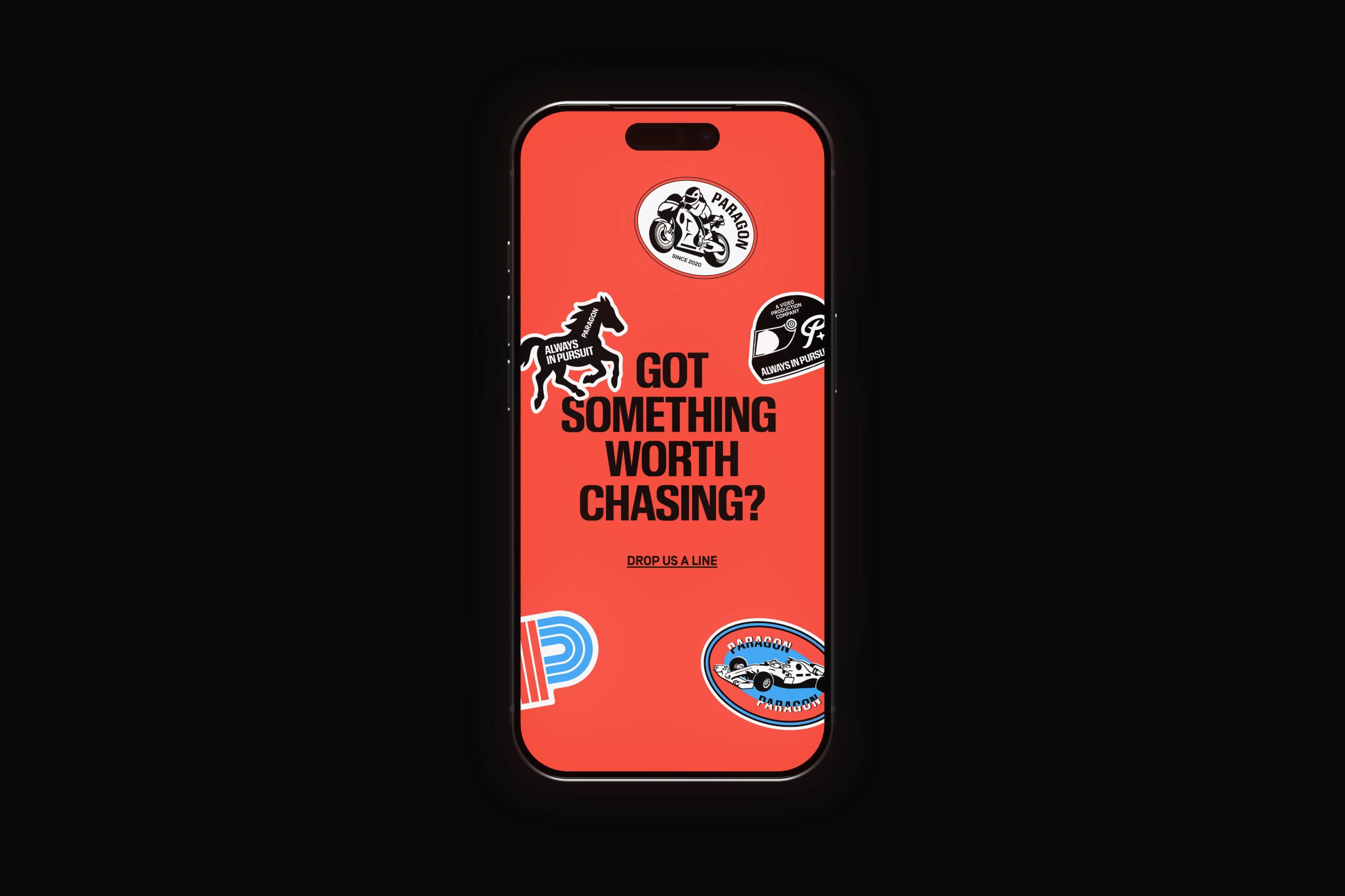
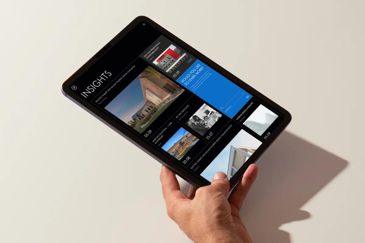
The website

When Jack reached out and started detailing the scope, merch came up very early in the conversation. We couldn't be happier about that.

I think if Pierre could clone a second version of himself and assign him one single task to accomplish in life, it would be designing t-shirts all day.

Merch is obviously cool, but for Paragon it also served a real strategic objective. Being on set during a shoot means the whole Paragon team is meeting the client and working alongside them, and having everyone in branded merch brings a genuine feeling of professionalism and cohesion. A bit like an F1 crew. You see the connection?

Jack also wanted to create pieces the team would actually love. A simple goal: design a t-shirt that becomes their favorite in everyday life. So we made hoodies and even a black denim jacket too, all built to look just as at home at a race track, on a horse ranch, or in a studio.

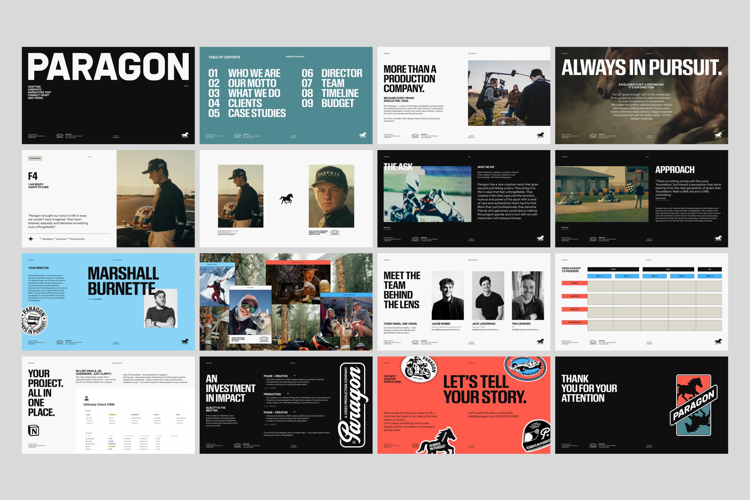
Marketing deck

Time to reveal one of our best kept secrets... Are you ready?

I mean, it might seem obvious to some people and not so obvious to others, but decks are one of an entrepreneur's best weapons for success.

Any experienced founder will tell you a great deck can matter just as much as a great website. Decks are underrated, but they're often the thing that wins the battle and lands the contract.

Paragon needed decks that could do exactly that, so we built a full template of customizable slides in Figma, giving Jack everything he needs to speak to any side of the business.

Closing

Overall, this project has been a blast for us.

First, we got to meet Jack, who we genuinely clicked with right away, sharing the same passion for creativity and for building beautiful brands.

Second, the scope covered everything we truly love doing: building a powerful brand and then getting to translate it everywhere, across communication assets, the website, and the extra stuff like merch, stickers, and decks.

And finally, the real blessing was getting to work on such a cool subject. A production company making genuinely amazing videos for seriously cool brands. Being able to attach our designs to work like that is the kind of thing we wake up for.

Thanks for tuning in, and we hope you enjoyed this one.

project type

  • Branding
  • Web Design
  • Content
  • Development

team

Jonathan Crowe

CEO

Jonathan Crowe

Bio:
Latest article: