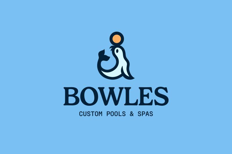
We rebranded with purpose. Read the story

Bowles Pools

Rebranding & Website for Bowles Pools

Giving a new look to a historical family business while keeping true to its roots.

VIEW PROJECT

project type

  • Branding
  • Web Design
  • Development

team

Rebranding & Website for Bowles Pools

Working on the rebranding of a business with legacy is always a challenge.


Young and wild designers would run straight to changing everything, reinventing the wheel and turning it into their own personal masterpiece. But that forgets the whole point: brand design is about serving the client's interests, not the designer's inflated artistic ego.


It's art and business strategy all mixed together. So when Bowles Pools asked us to modernize their brand, we knew the job was to upgrade what already existed, not start from scratch.
The art of brand facelift

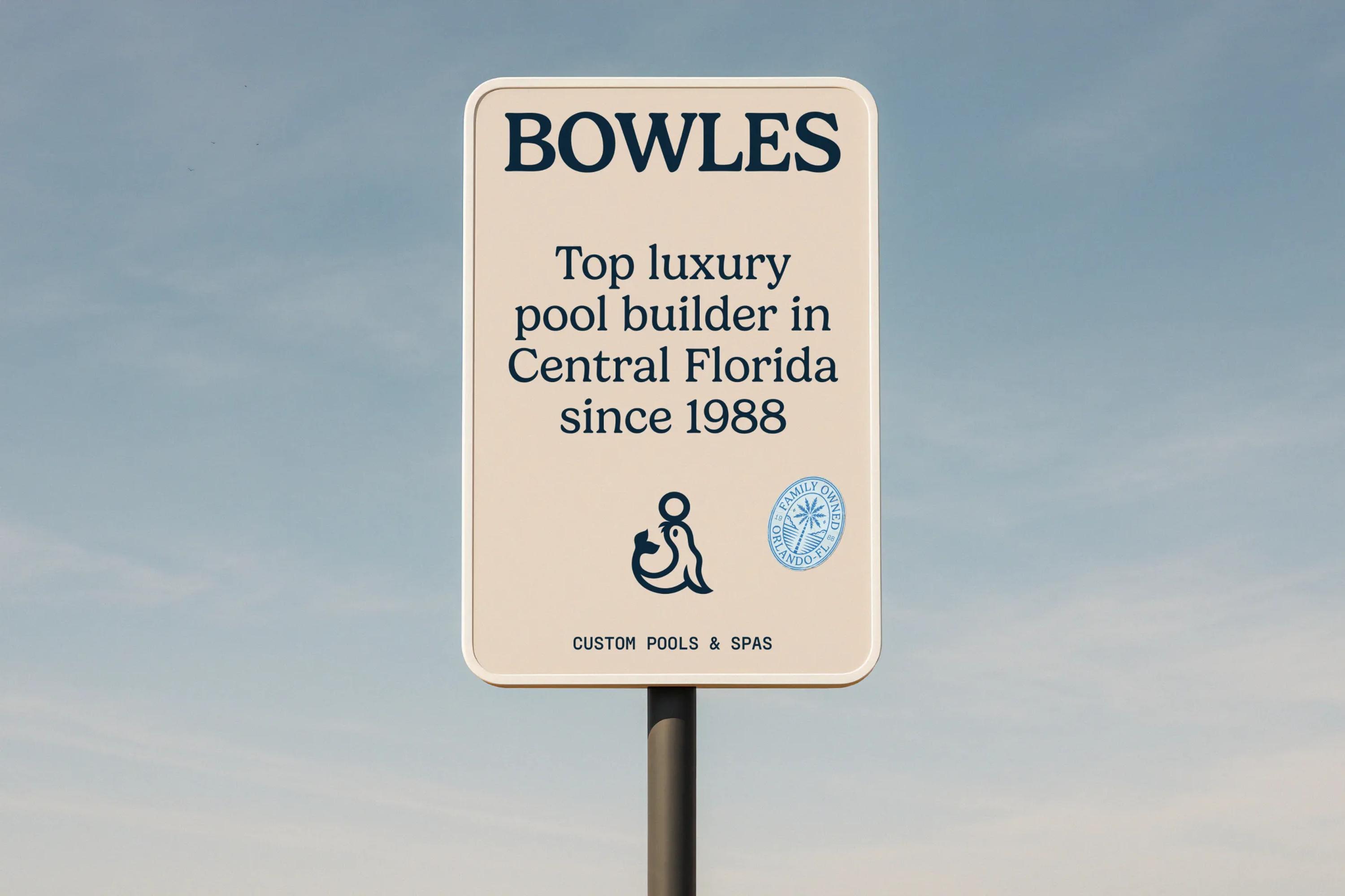
Bowles Pools has been a major player in Central Florida’s luxury pool industry since 1988. That means people in the area know the brand really well.

There’s a notion in branding called brand recognition: how familiar your brand is to your customers, and whether they actually recognize it when they see it. If one day you decide to change everything about your brand and keep nothing but the name, ditching all the elements that made you distinctive in the first place, chances are a big chunk of your audience won’t even recognize you anymore.

So you have to play smart. Look fresh and new, but stay recognizable to everyone who already knew you.

The logo

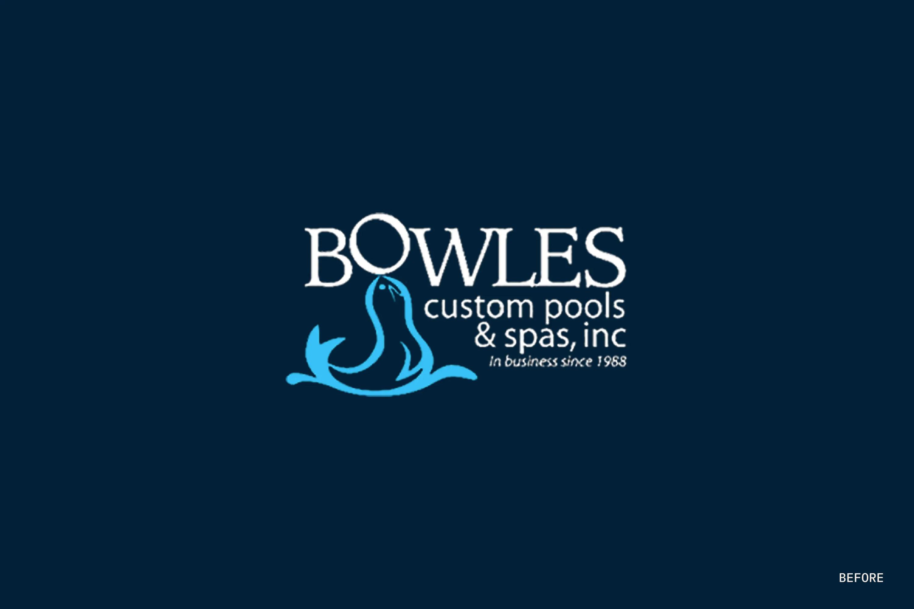
Our first impression of the former Bowles Pools logo was “OMG, what is this?!” I’m telling you, designers are real drama queens when you ask for their humble opinion. But that logo did have a few major issues.

The first: it was only available as an overly pixelated PNG. The second, and this one’s a biggie, was its total lack of flexibility. You basically had one block holding everything together at once: wordmark, symbol, tagline number one, tagline number two.

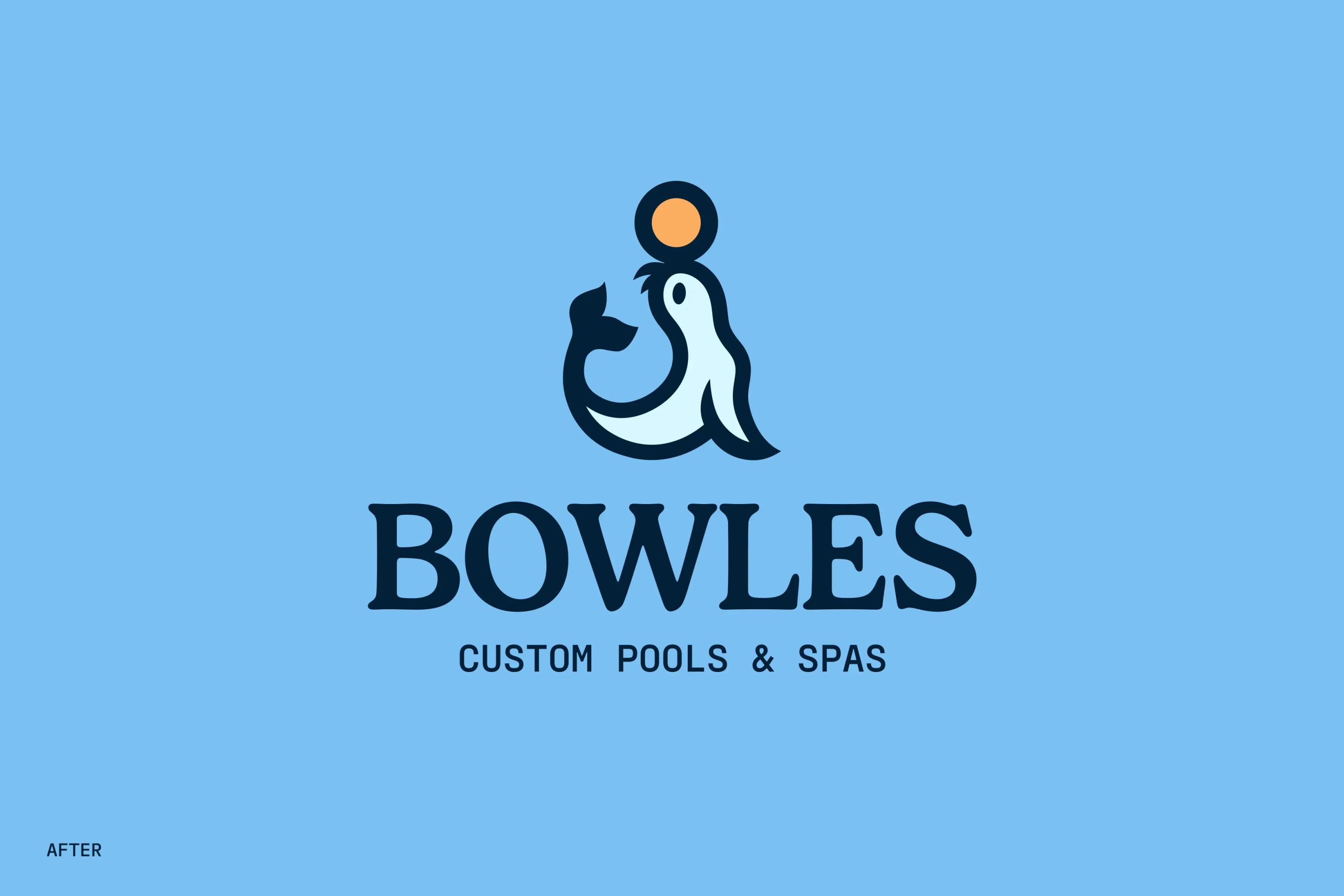
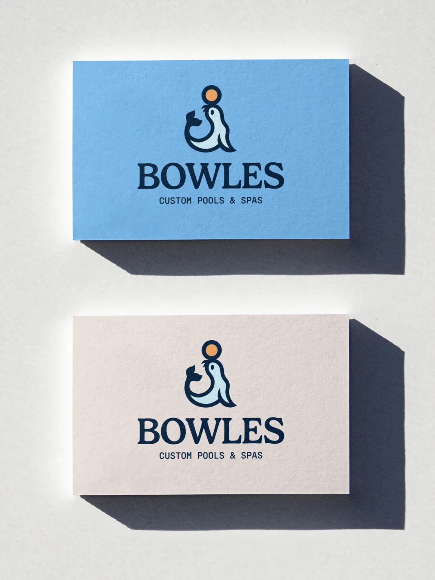
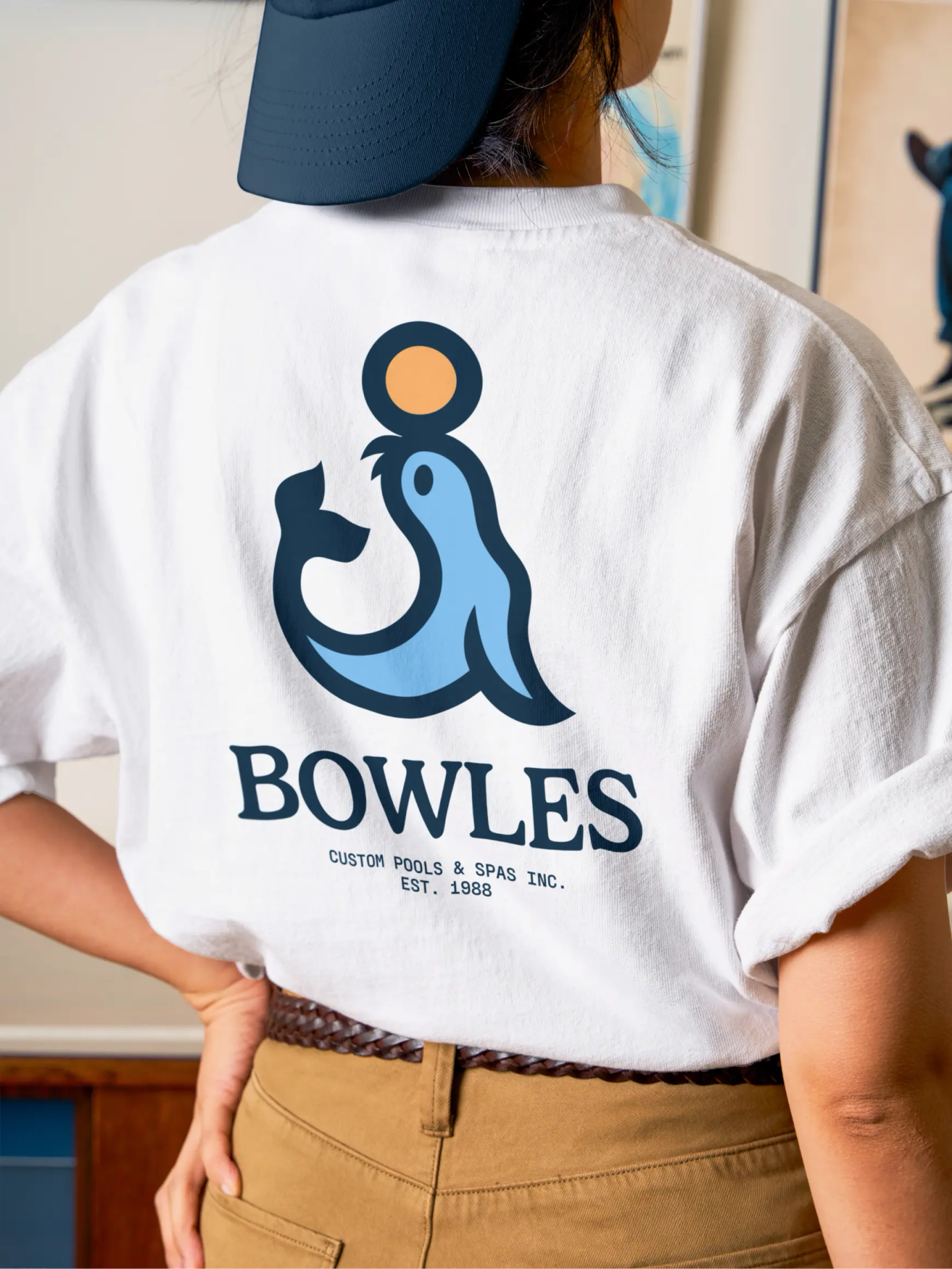
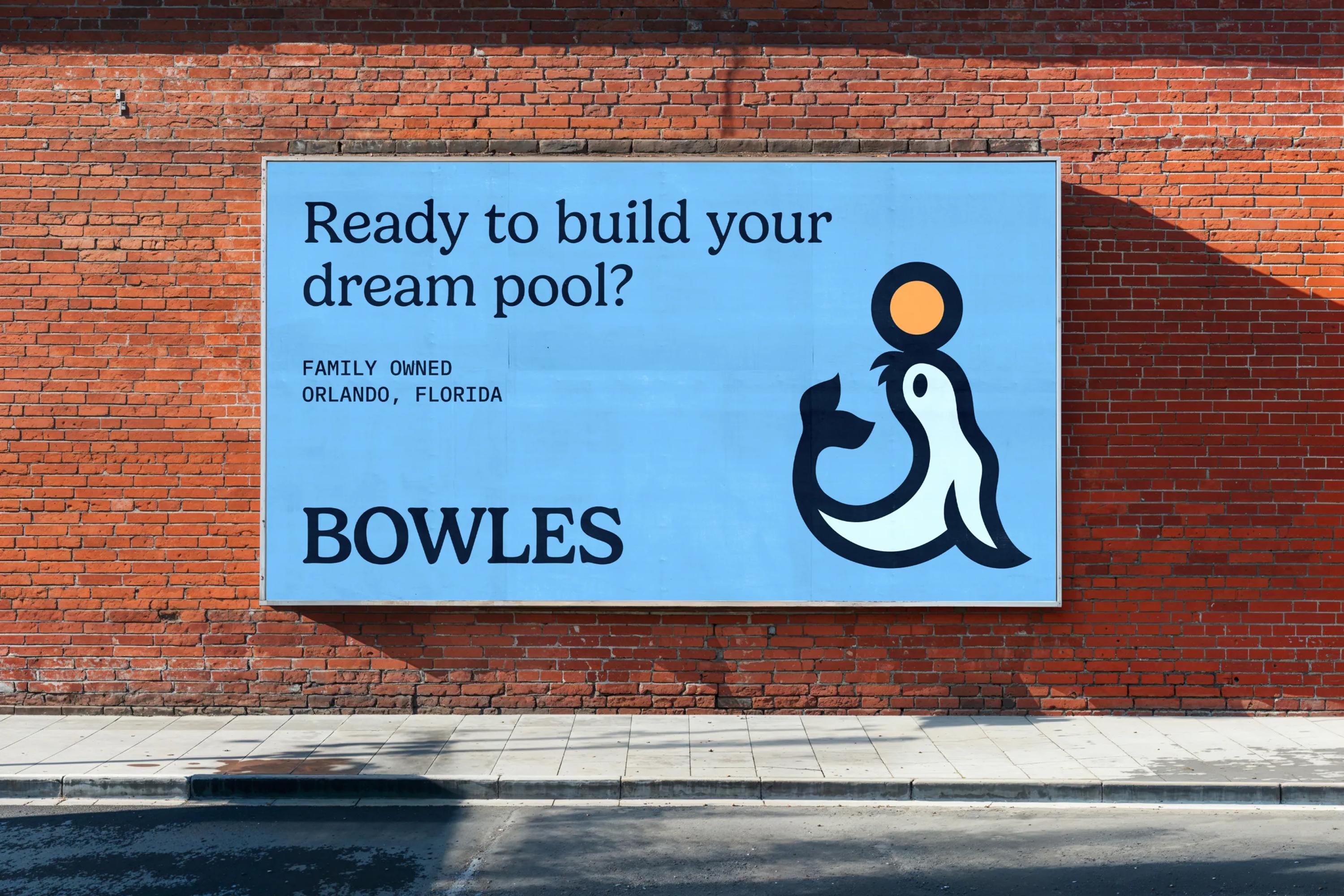
Okay, finito listing the problems, let’s run through the qualities. Numero uno: that sea lion with the ball. Highly identifiable, easy to remember, the kind of image that sticks in your head. Numero dos: the wordmark font. Genuinely cool, and a perfect match for the casual luxury of a Florida pool builder. Numero tres: the colors.They give off the vibe of a brand you’d trust to build the pool you’ve always dreamed of.

The fonts

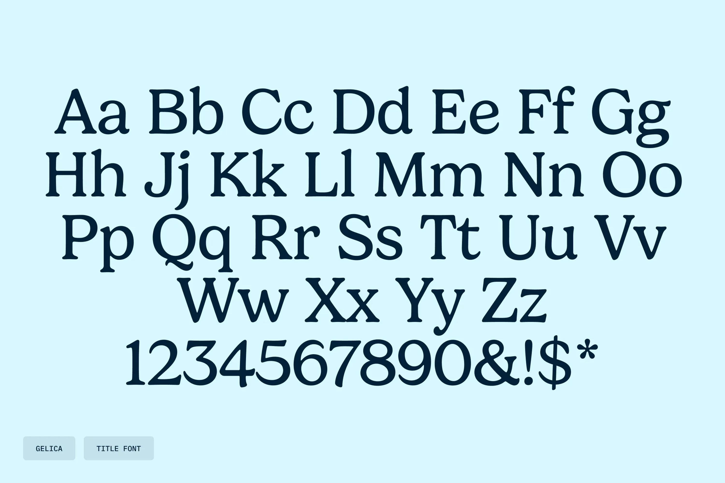
For the fonts, the goal was to keep real cohesion with the ones from the old branding. We genuinely loved the typeface in the original logo, so we went hunting for one that carried the same characteristics.

Introducing Gelica Regular, designed by Dave Rowland. A beautiful face, really close to the original. It was the ideal fit.

We then added an extra something with a mono font (IBM Plex Mono Regular) that brings a handmade, small-business feel to the new Bowles Pools branding.

The color palette

To build the new color palette, we started by extracting and slightly tweaking the original core colors: the navy blue, the bright sky blue, and the white.


We then brought in a warm yellow-orange tone to add contrast and make the ball pop. That color also warms up the whole brand, which would have felt a little cold with all those blues. After all, a swimming pool is always more appealing when it's hot out.


To round things off, we added a lighter shade of blue and a sandy stone color, like the ones you find around a pool deck.

Extra graphic assets

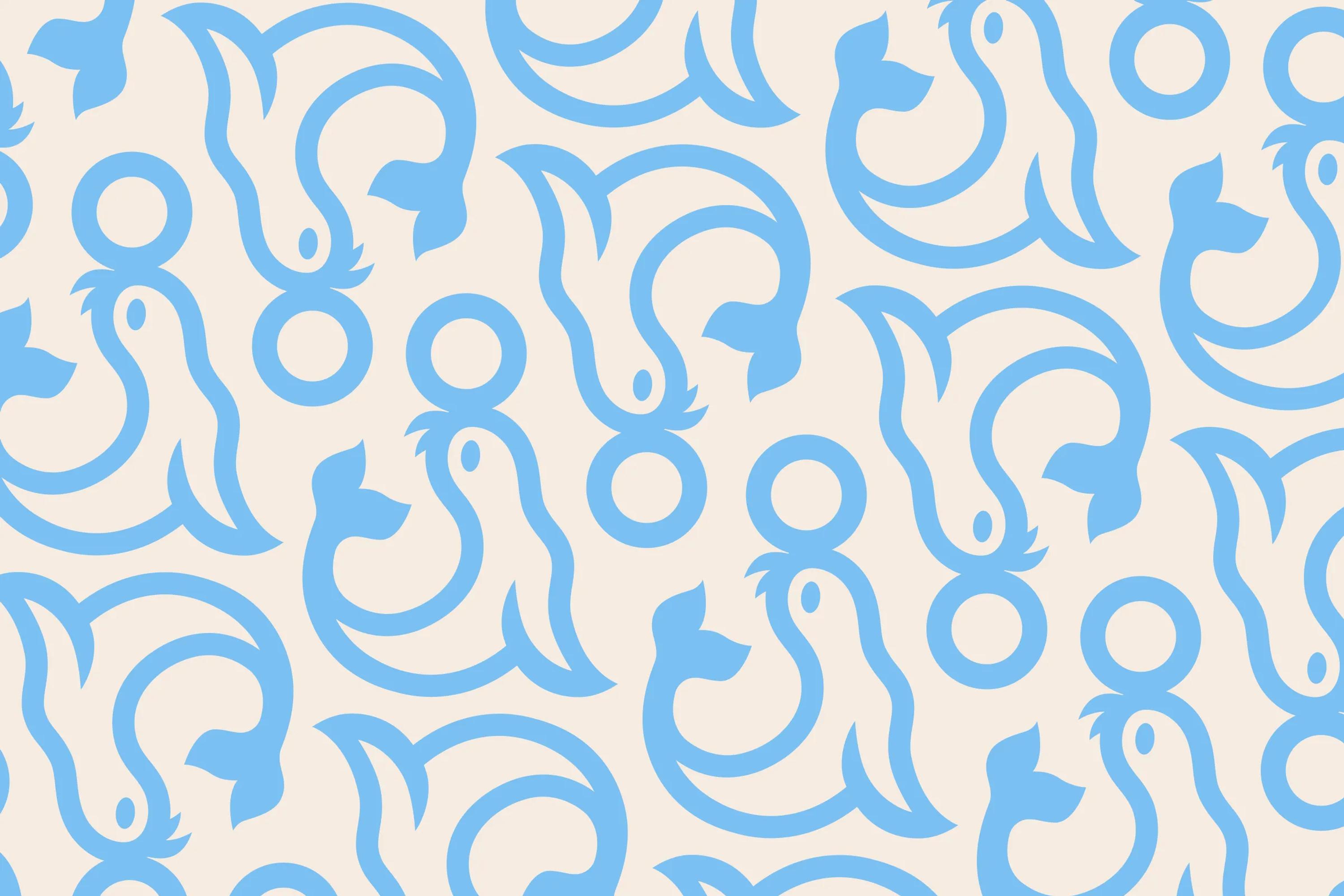
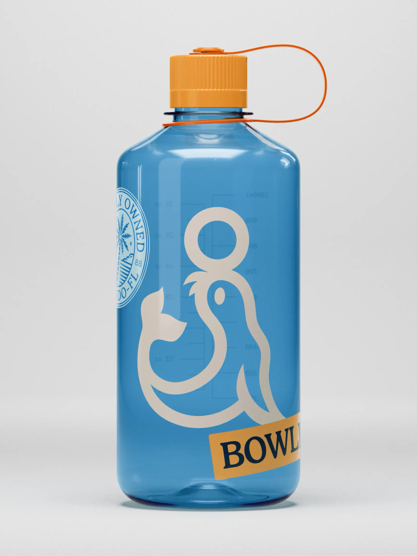
To make the brand identity richer, we decided to add a seamless pattern built from the logo symbol. Surprisingly, the slightly unbalanced shape of the sea lion turned out to be perfect for tiling into a seamless repeat. Life’s full of little surprises.

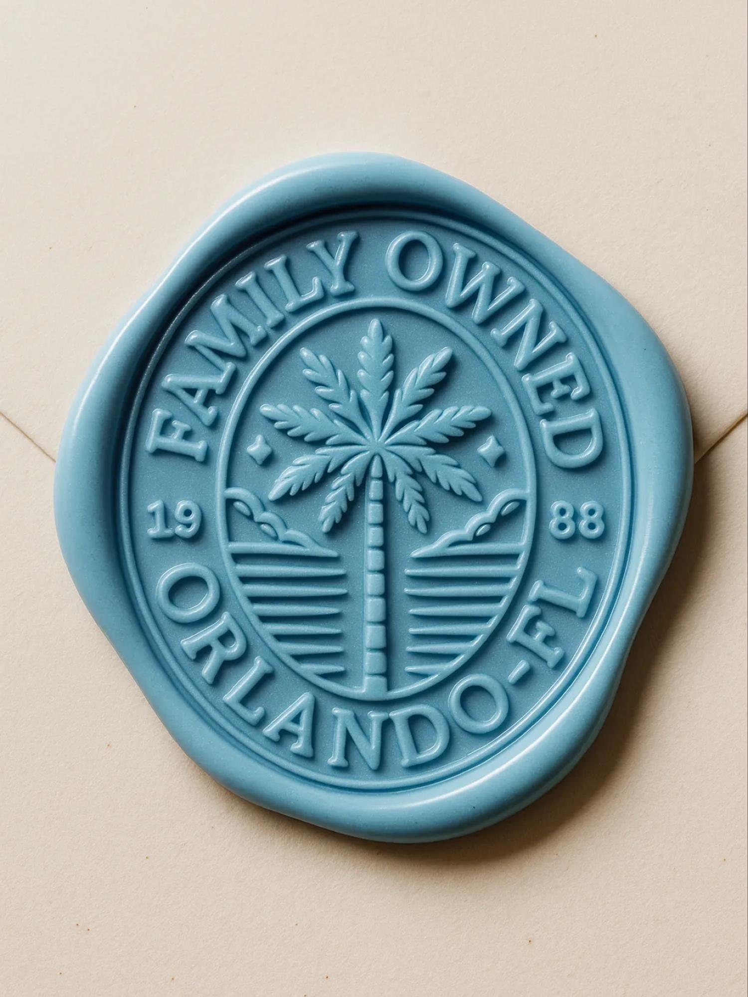
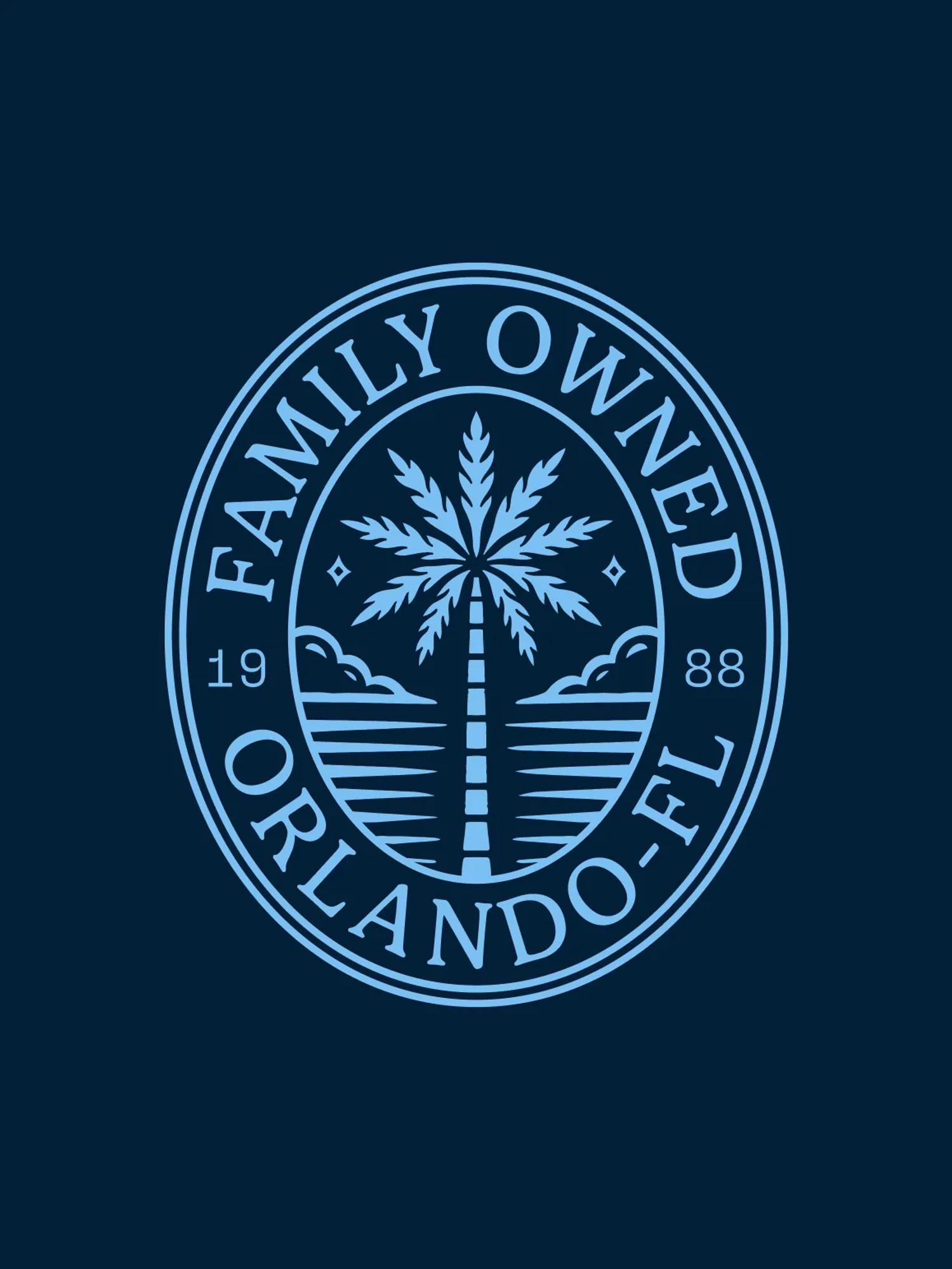
Finally, we designed a badge. Because building a brand without a badge is like going to a restaurant and skipping dessert. It’s doable, but it’s sad, and you might regret it for the rest of your life.

Jokes aside, a badge was perfect for a legacy family business with a luxury bent. So we treated it like a family crest, something that looks like it’s been around since the state of Florida itself: a palm tree, a few horizontal lines for the sea, two clouds, and two sparks.

Balanced and luxurious, but still really cool. Exactly the kind of thing you want printed on a t-shirt.

The website

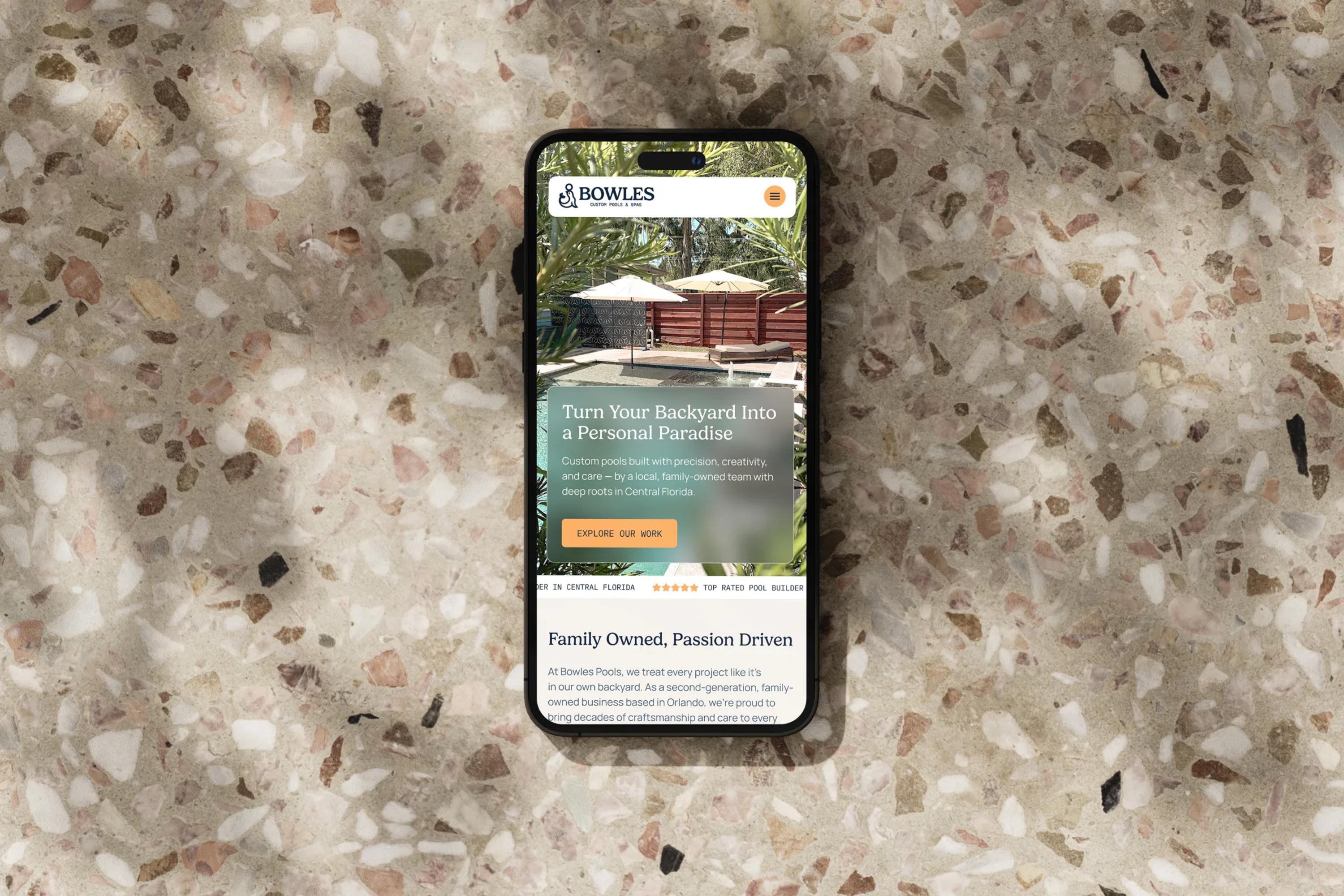
We then took the new branding and started designing the new Bowles Pools website. We're artists at heart, but marketers before anything else. When building the Bowles Pools site, it was essential to respect the ingredients that make a local small business like theirs successful.

The products are the hero. Reassurance, ratings, and testimonials need to be highly visible. The phone number has to be there at first glance. You know the drill.

As huge advocates of experimental weirdness and wild web explorations, we obviously love designing overly complex sites full of motion and interaction, but this one had to be simple and efficient. A weapon built for sales and conversion.

Closing

Rebranding a legacy business definitely isn't about erasing the past to make room for new stuff. It's about identifying what makes the brand recognizable to its longtime audience, which elements are worth keeping, and which ones should go.

Frankly, it's such a great design exercise. That's what's so interesting about our job. Design isn't just playing with your pencils and creating pretty color combinations, it's about being a partner who helps your client's business thrive over time.

Huge thanks to the Bowles Pools team for trusting us on this one. Hope you enjoyed the case study!

project type

  • Branding
  • Web Design
  • Development

team

Jonathan Crowe

CEO

Jonathan Crowe

Bio:
Latest article: