We rebranded with purpose. Read the story

Metlok

Branding & Website for Metlok

How we turned metal shingles into a brand you'd actually brag about.

VIEW PROJECT

project type

  • Branding
  • Web Design
  • Development
  • Marketing

team

Branding & Website for Metlok

The whole story begins with an email from Jared and his sister Jade, asking if we'd be interested in helping them develop their latest revolutionary business.

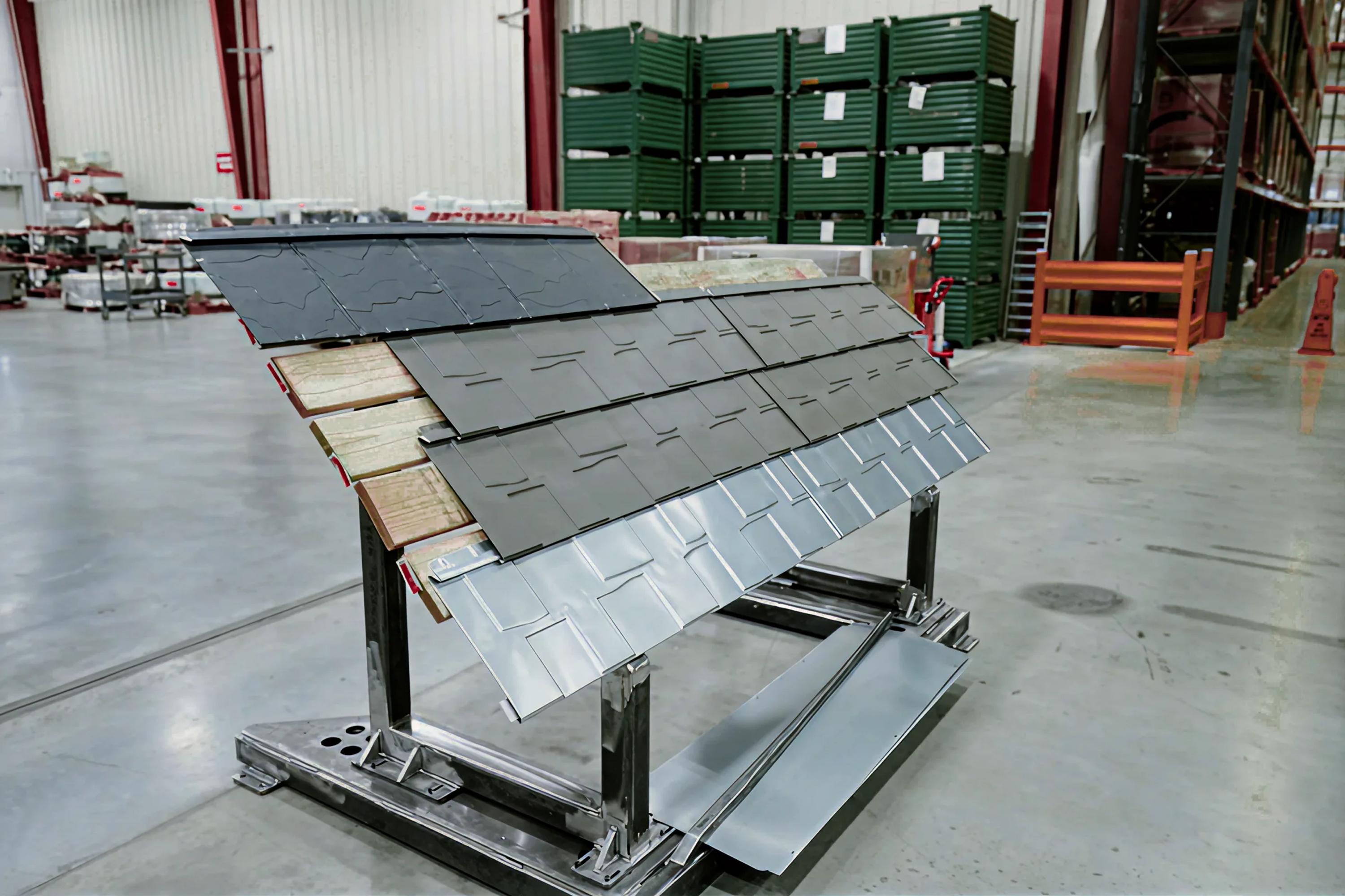
The brand? Metlok, a brand new product shaking up the roofing world: metal shingles that interlock with each other to create unbreakable roofs that last a lifetime.

I know some designers wouldn't get too excited about working for a company that sells metal shingles. They might think it's boring. WRONG, they're the boring ones! Any branding project can be fun and interesting if the founder trusts the design process and the vision.
And the opposite is just as true: even the sexiest industry can produce the most boring brands.

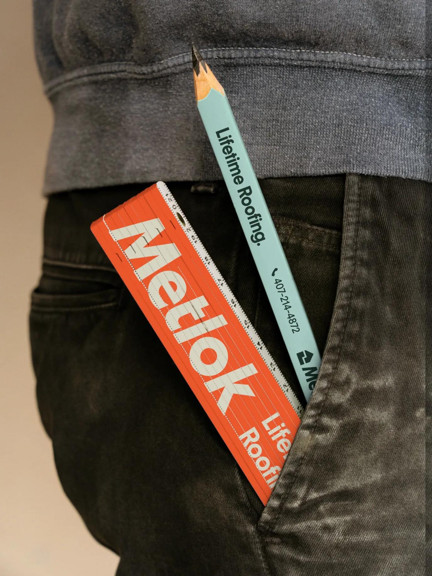
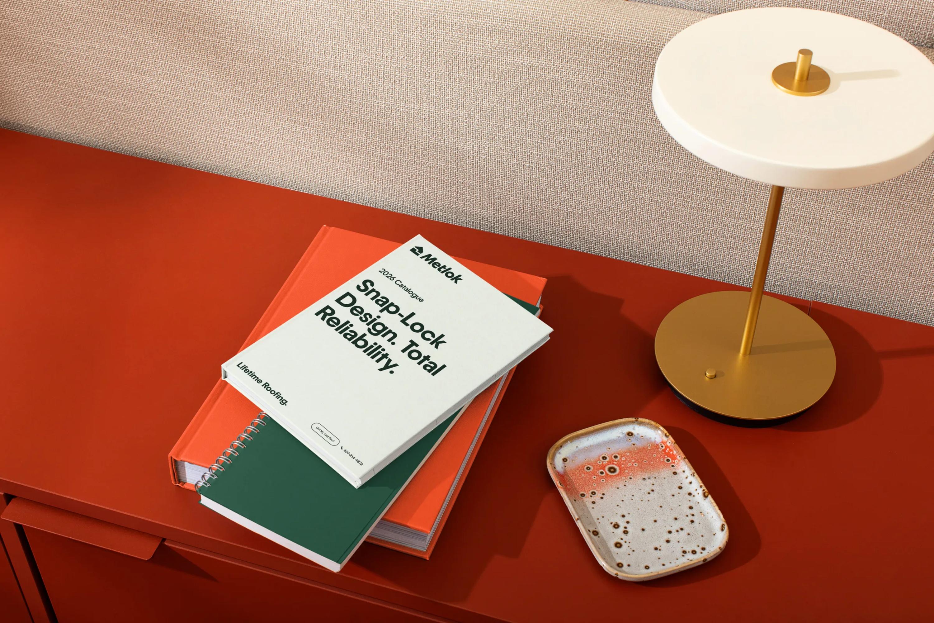
Brands like Metlok are the ones you see in everyday life: on the shelves at The Home Depot, printed on a truck on the highway, on a billboard in the street. They deserve to look beautiful and unique, because they're in our faces all day.

As designers, isn't it part of our mission to make the world around us look a little more beautiful?
A historical background

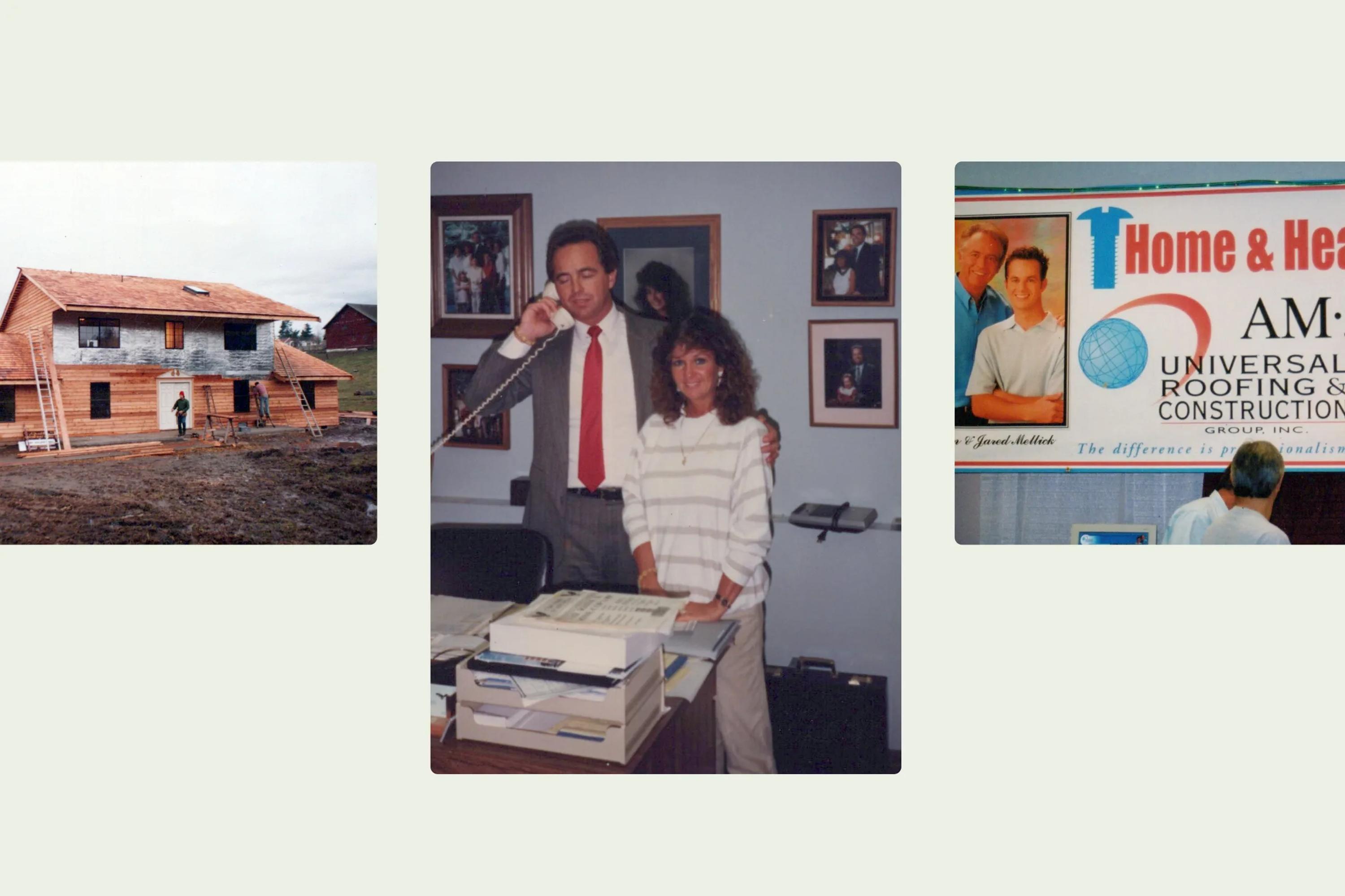
It's true that Metlok is a new brand, but what makes it so interesting is that it's the newborn of a historical player in the Florida roofing industry.

So let us put on our round glasses and sit our old designer asses down in a rocking chair to tell you that story.
It all begins when Jared and Jade's father founded Universal Roof & Contracting, a company installing roofs with shingles from the top brands in the industry.

For three decades, they did that with excellence and grew across all of Central Florida. Then they decided it was time to develop a product of their own. That's when Metlok came to life.

And that's what makes Metlok's identity so interesting: a brand new, highly innovative product that still holds its roots in heritage and history.

The mark

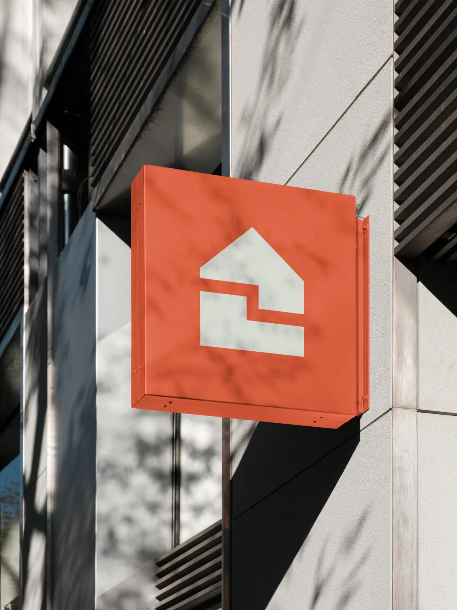
For this one, we really wanted to create a mark that was truly unique to Metlok. I mean, we're not talking about a classic roofing company here, we're dealing with an innovative solution that's very different from its competitors.

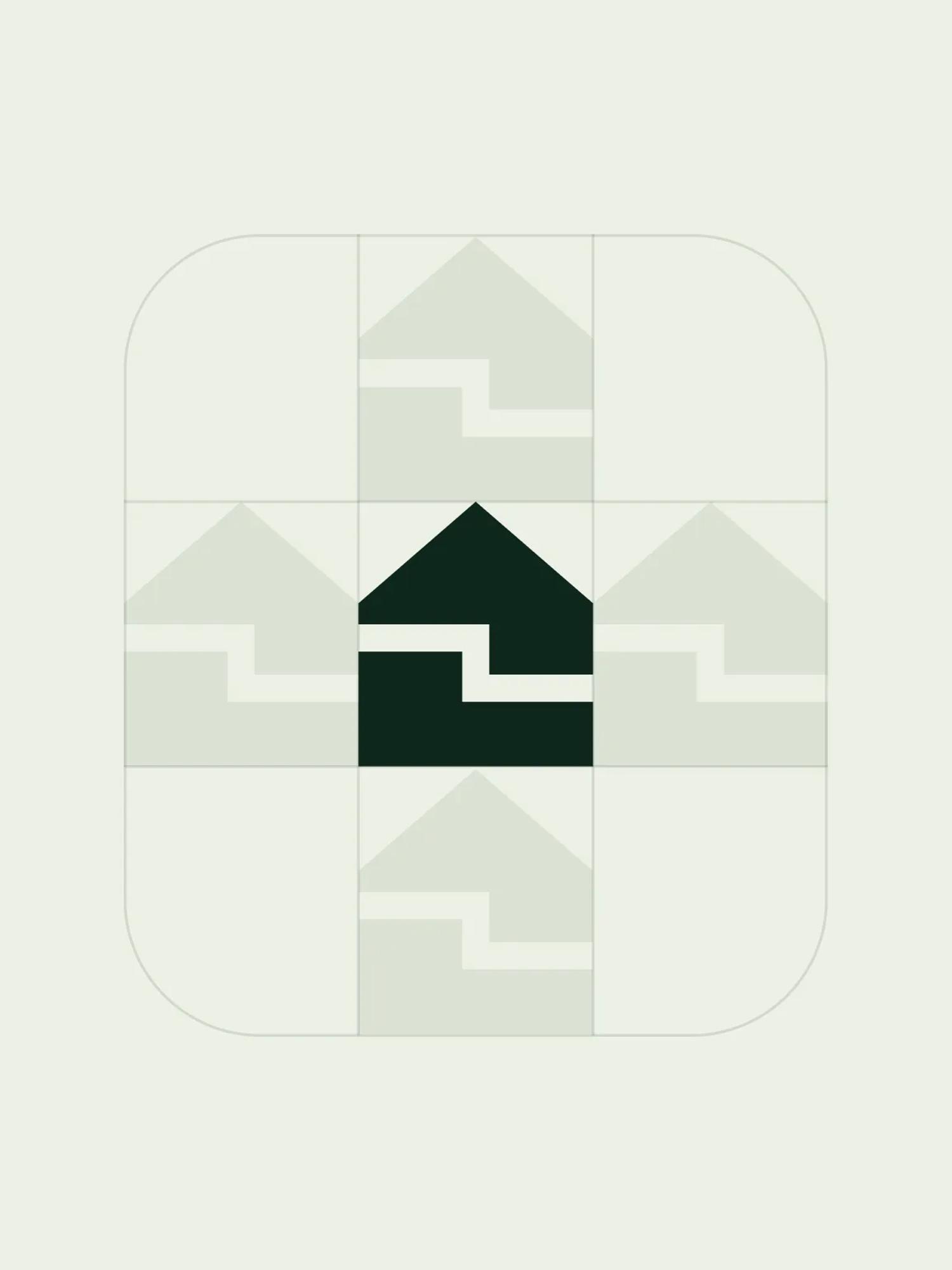
Metlok is two words combined together: 'metal' and 'lock'. I'm sure you already caught that, but worth mentioning for the slow thinkers. We really wanted a mark that tells exactly that story. We also wanted the logo to make it super obvious that Metlok was a roofing company.

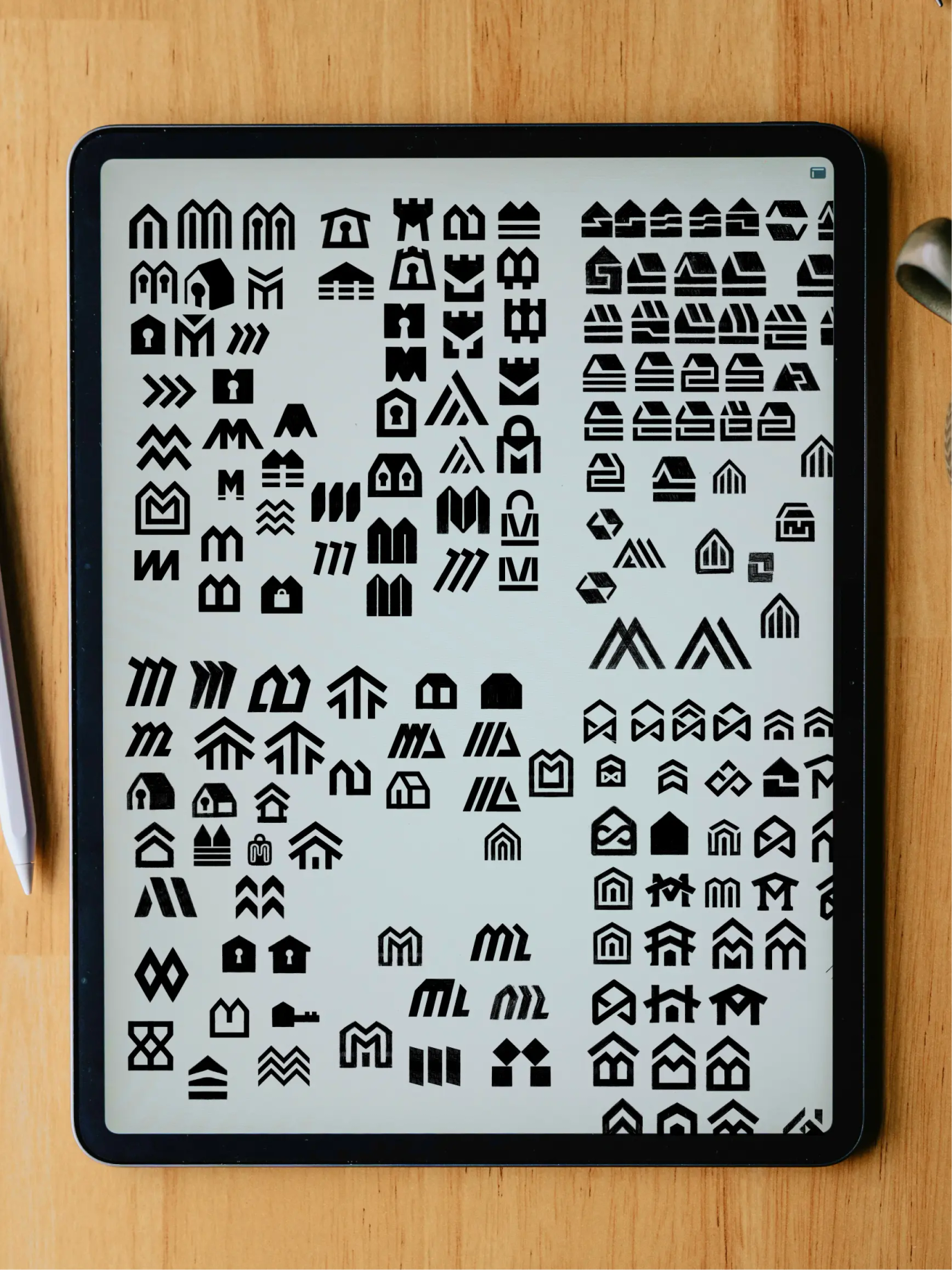
Finding the right idea can take a bit of time, and this one took, as always, a whole bunch of sketches. A few hundred, to be precise, before we landed on the right mark.


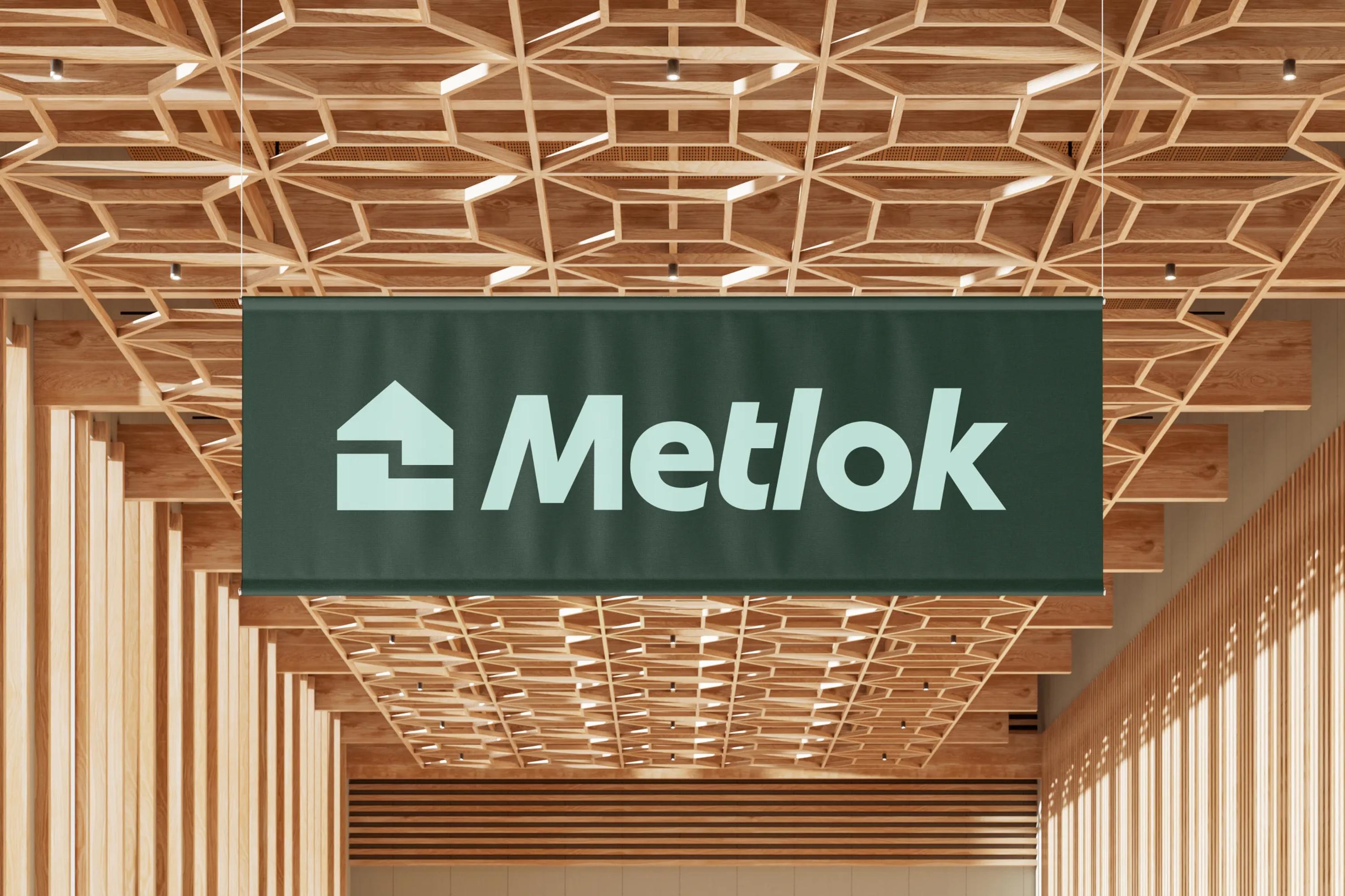
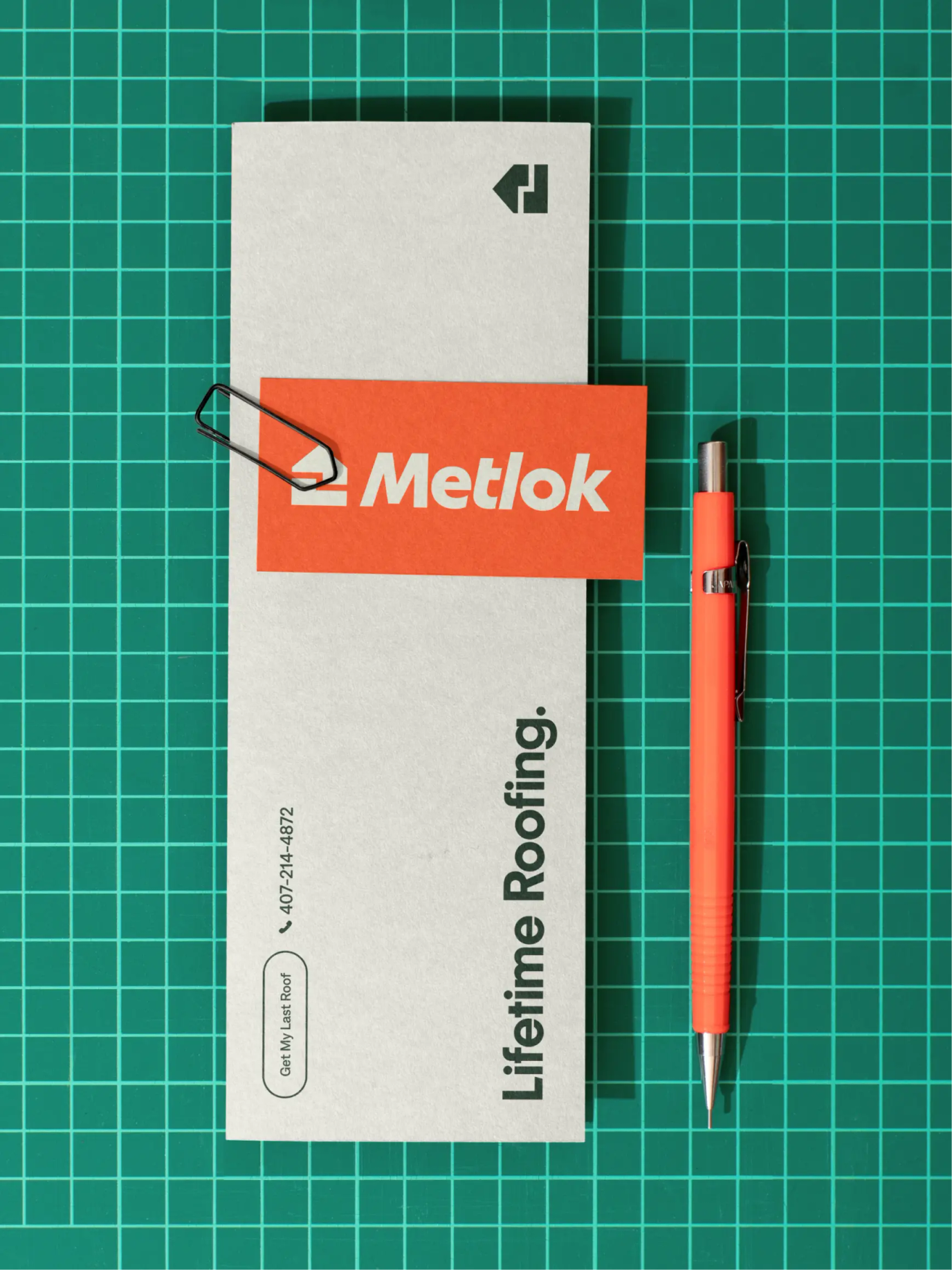
A house icon to represent the roofing industry, and two interlocking pieces to represent the locking system. It might seem super basic, but we truly believe this was our most efficient proposition.

After all, what's a good logo if not a mark that tells a complex story in the simplest way and sticks in your brain forever? As my French great-great-grandfather used to say, “If a child can't draw a logo from memory, then it's not a good logo”. He obviously never said that, but it's something we genuinely believe in.

The wordmark

Working on the Metlok brand was a tricky one, as we really wanted to tell the story of a heritage company while keeping that image of innovative technology.

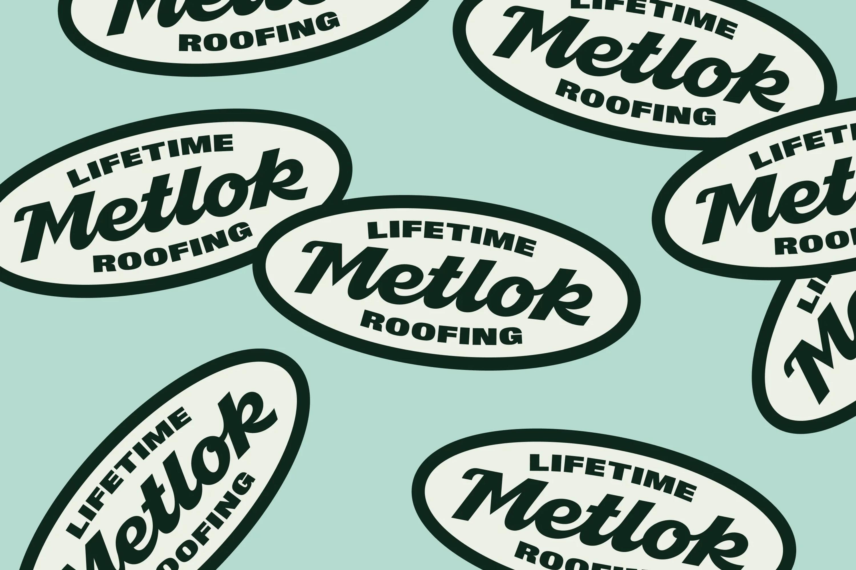
For the wordmark, when working for a heritage construction brand, the first idea that came to mind was to design a custom vintage wordmark. Something that carries the weight of history while screaming durability and trust. Something like the Milwaukee logo, but with a softer, more modern touch, to lean into the innovative side of the brand.

We landed on a cursive wordmark with a real vintage style, curved and friendly letters, but it didn't feel right. So we decided to keep it as a secondary mark, one that could live on badges and merch to help tell that heritage part of the story.

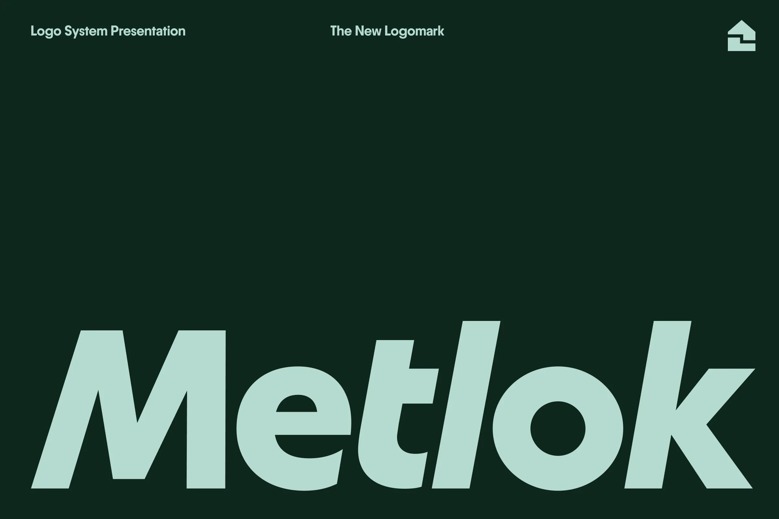
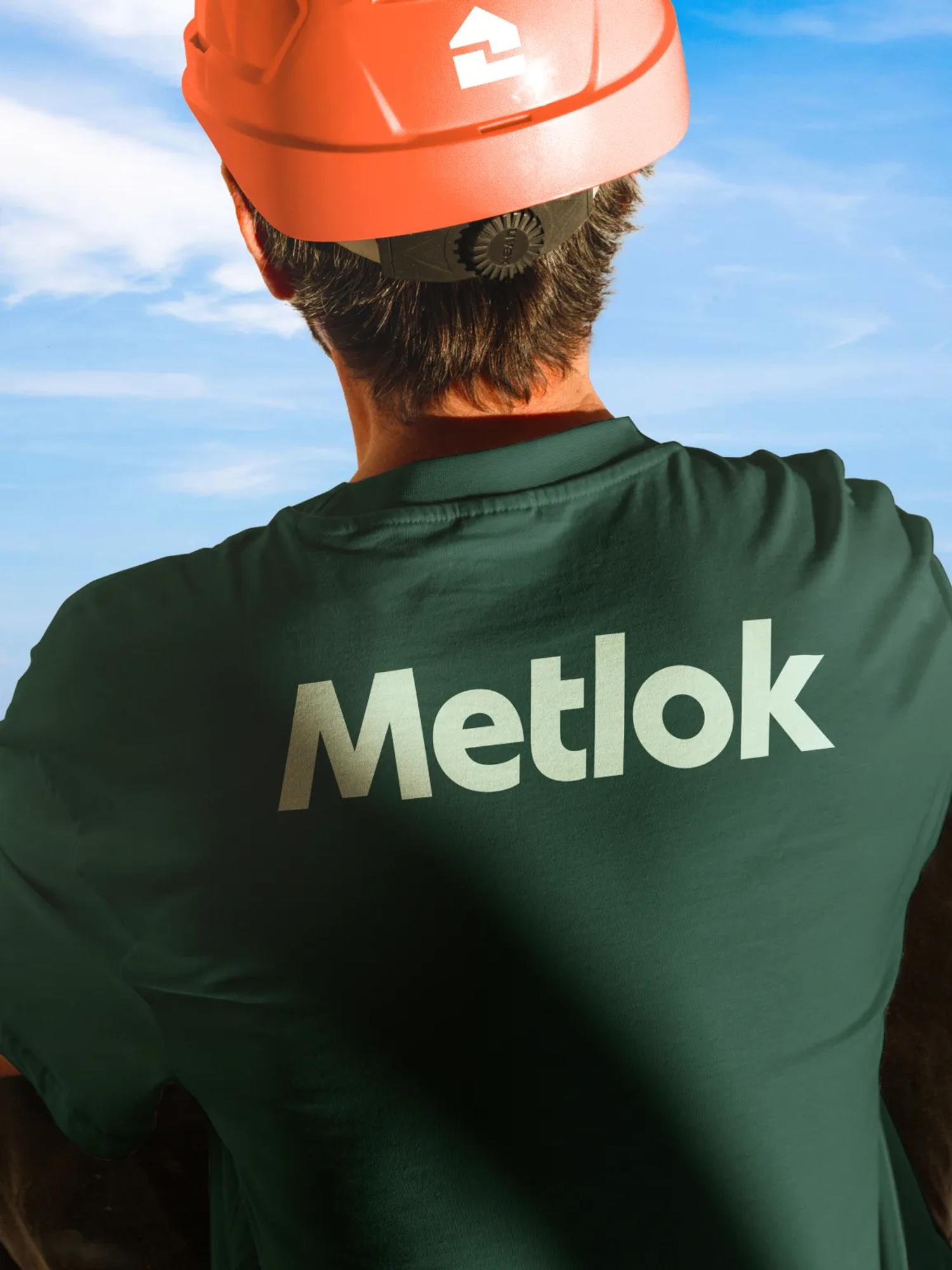
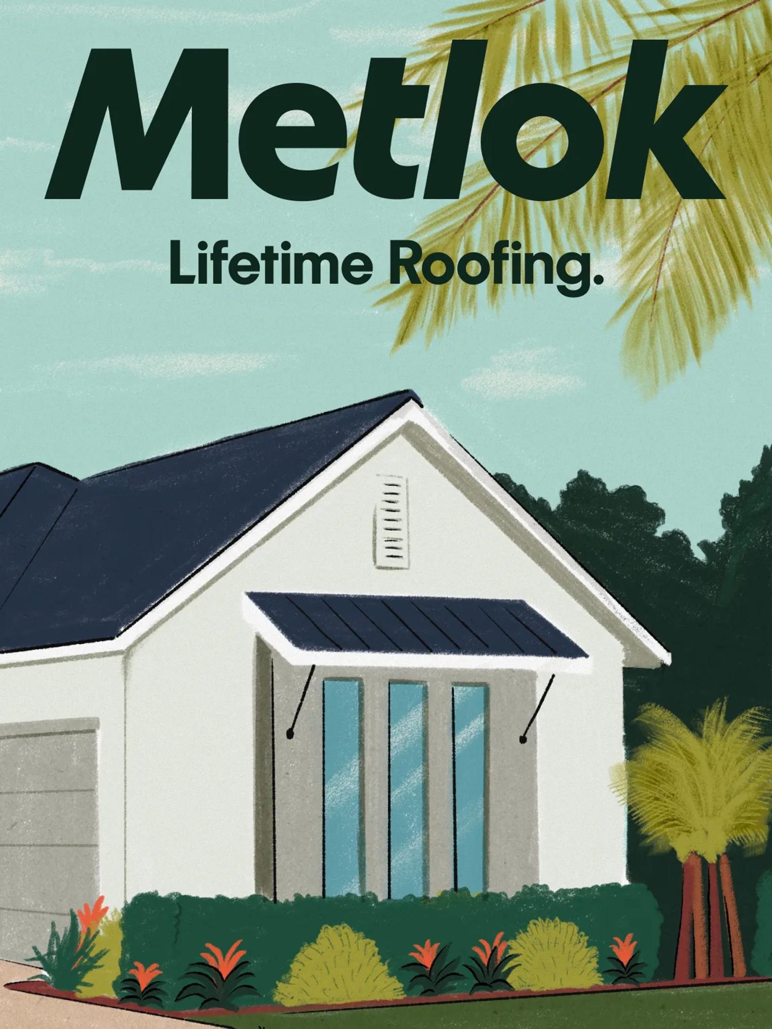
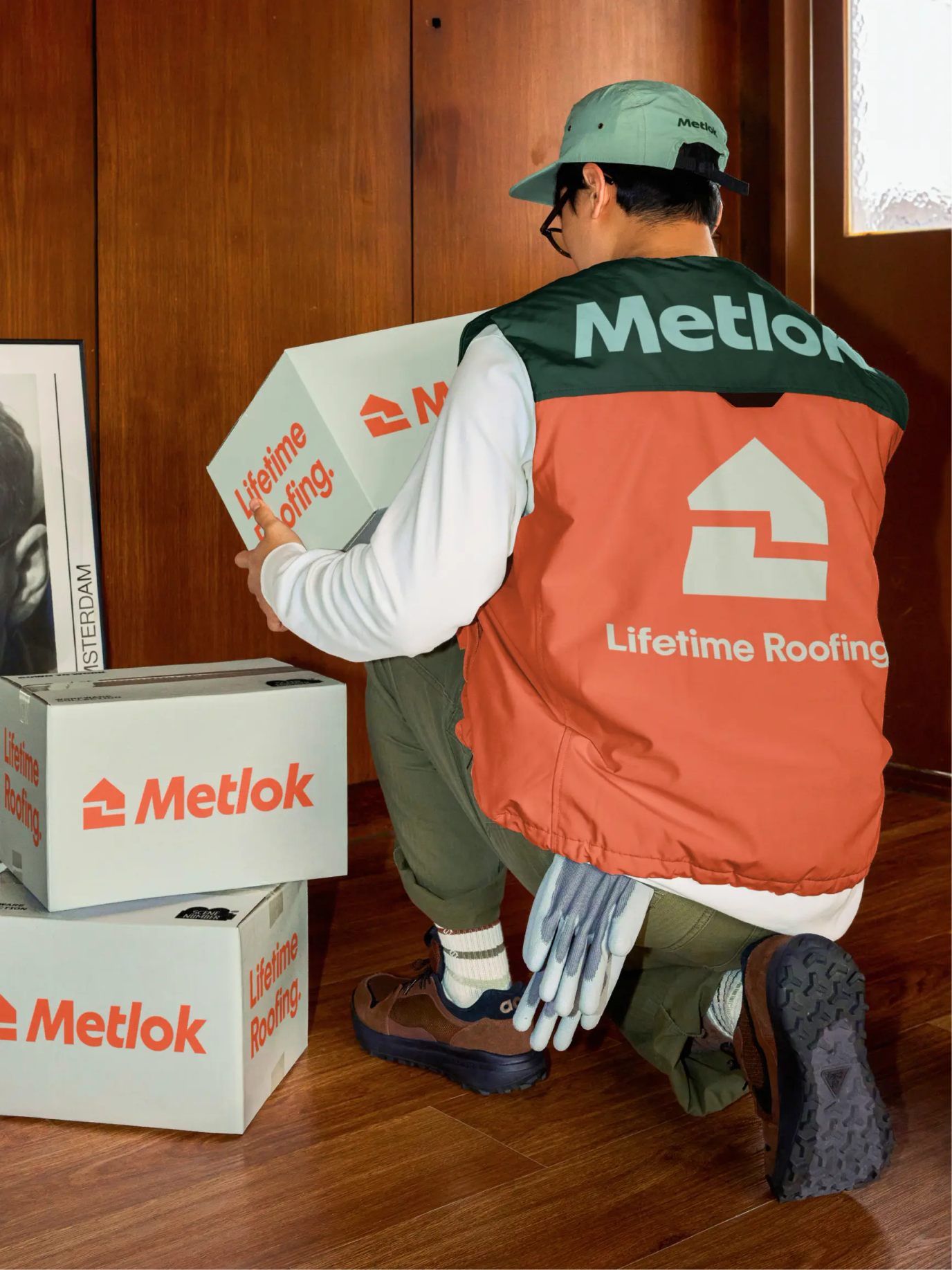
We then went back hunting for fonts and found Tumla Round Bold Slanted by Bloom Type. A stunning font that held all the characteristics we were after: friendly, technical, unique, with a slight vintage feel. The kind of font that looks like it could have been designed yesterday or back in the 80s.

The fonts

You're probably starting to know our work by now, and you're aware that fonts are our drug of choice. I mean, let's be honest with each other, is there any more exciting adventure on the planet than scouring the internet for the best designed fonts for a branding project?!

After some thorough digging, we finally got our hands on the two perfect fonts for Metlok. For the primary typeface, we picked Image Future Bold by Production Type. A super distinctive font full of character, bold and confident but with a slightly playful vibe. It also carried that balance of modern and vintage influences, supporting both the innovation and the heritage.

For the paragraph font, we went with Denim by Displaay, a clean and technical typeface that shares similar graphic qualities with Image Future, which keeps everything visually consistent.

The illustrations

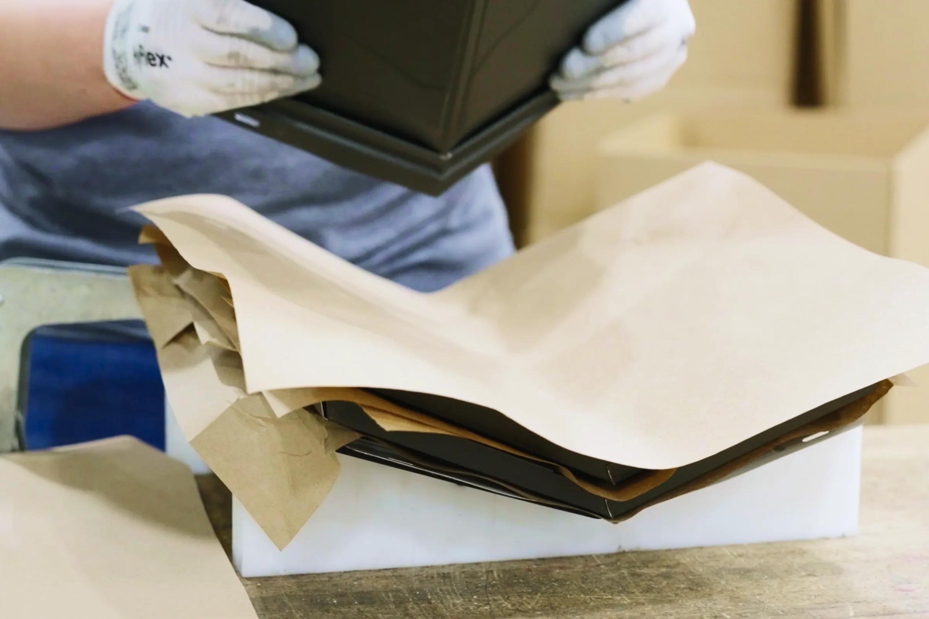
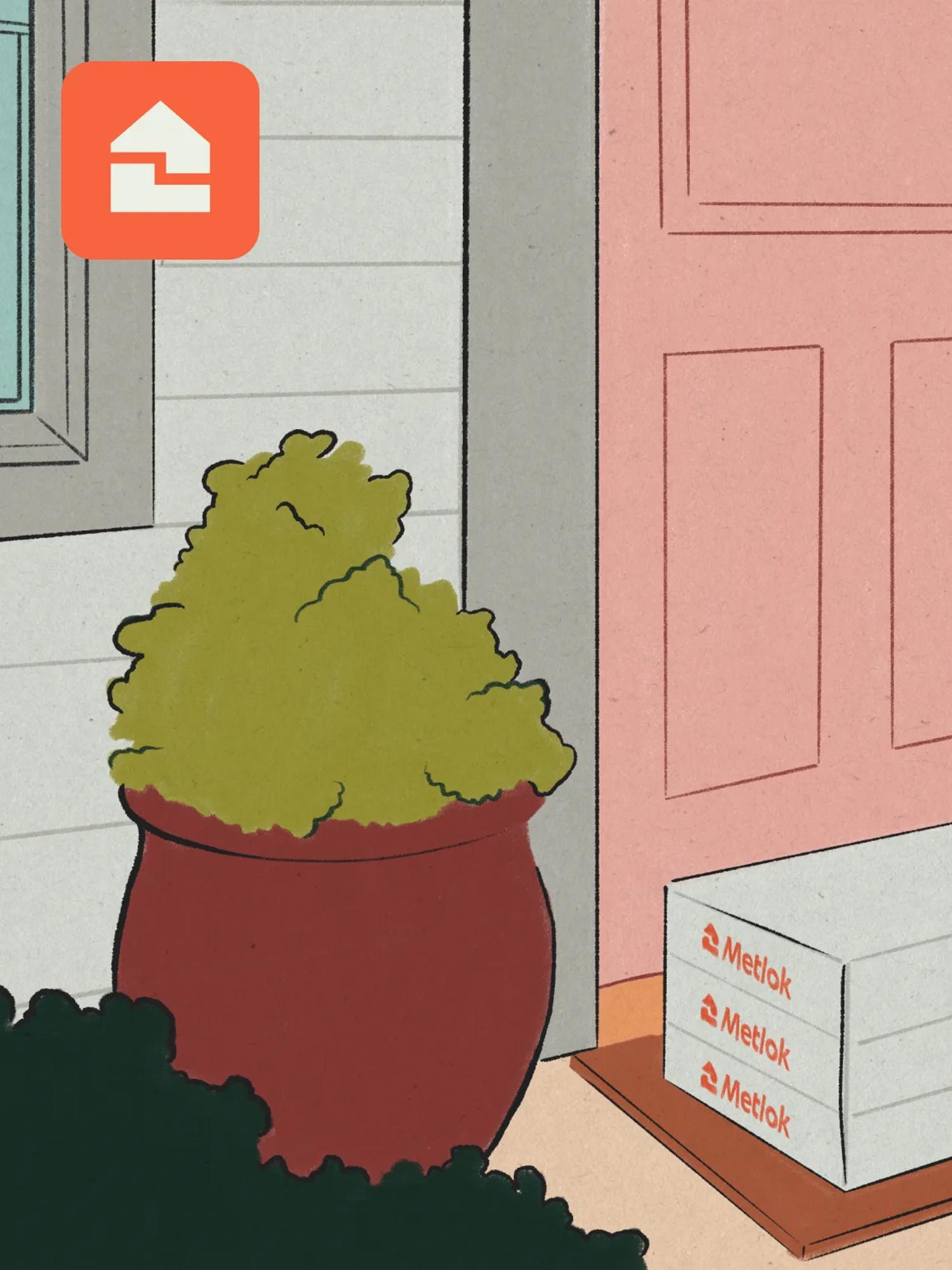
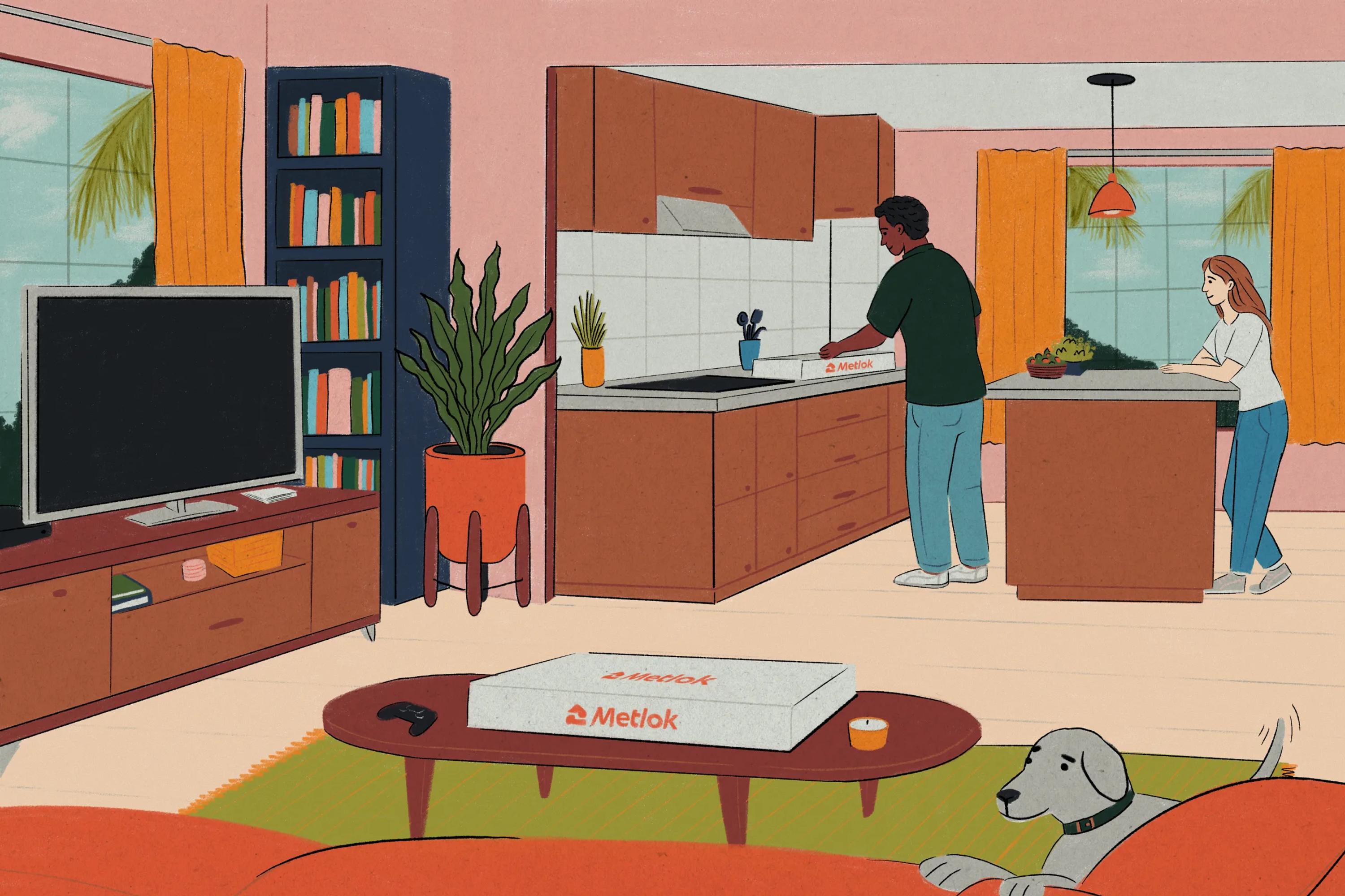
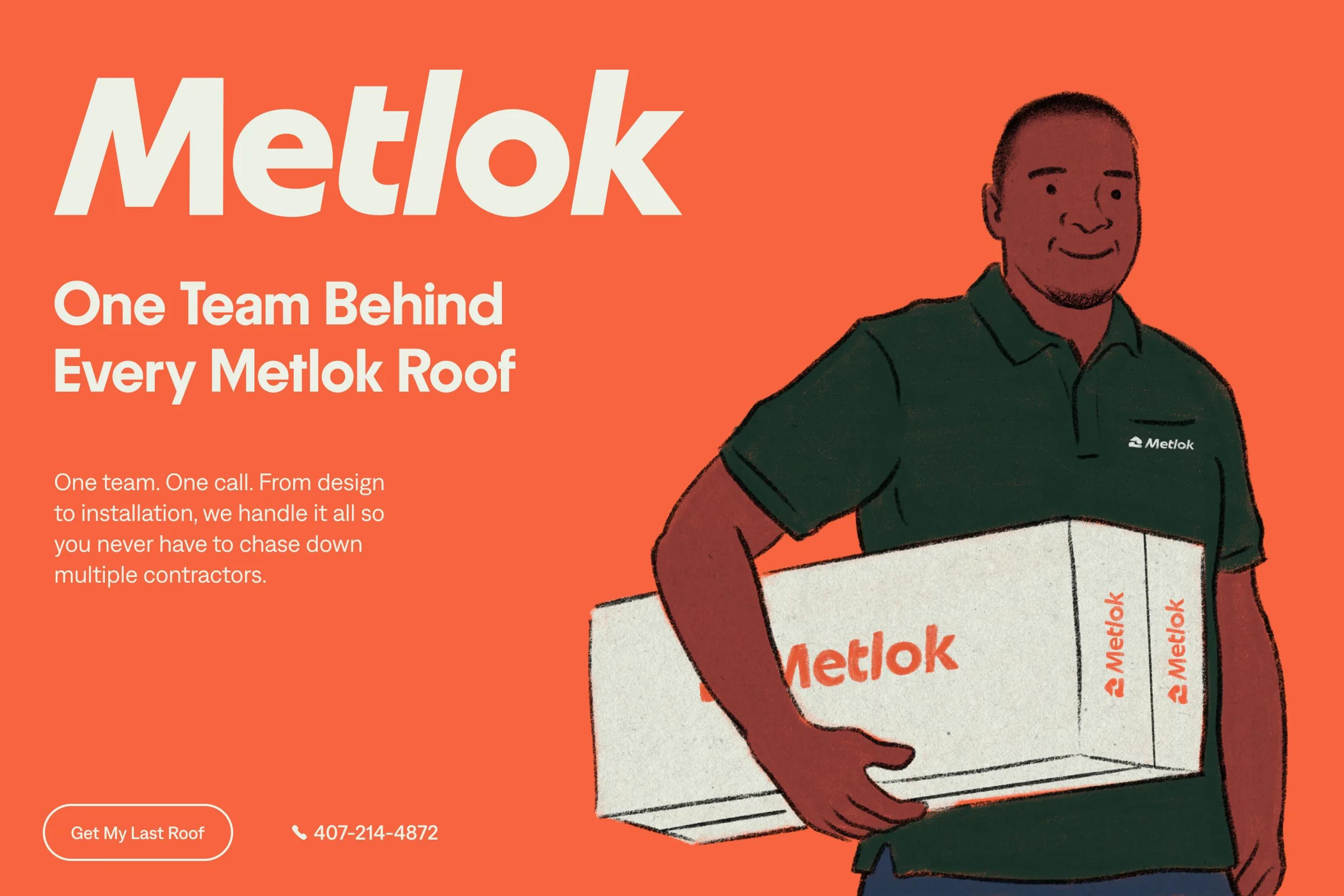
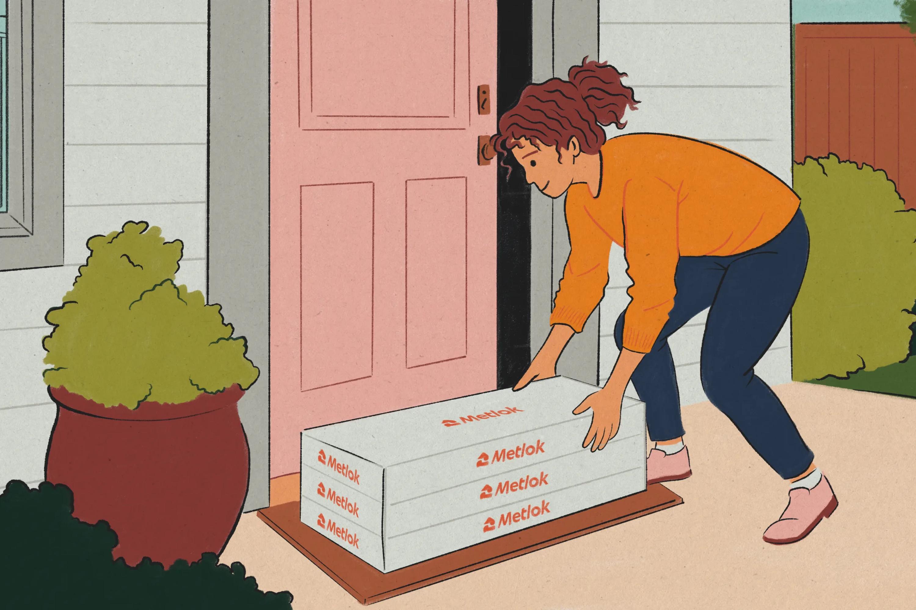
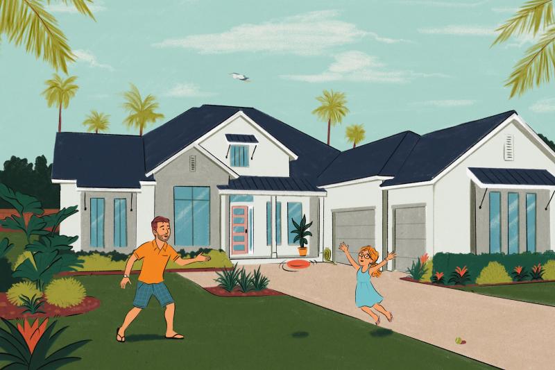
The whole concept behind Metlok is that the company produces AND installs the shingles on people's roofs. We wanted to find a way to tell that story in a human, approachable way.

Something that explains what Metlok is while conveying its values: a friendly team you can trust to install a roof that'll protect your home for a lifetime.

The idea that came straight to us was to create beautiful digital illustrations with a real hand-crafted feeling. Illustrations of families, customers, and staff members that could tell the Metlok story in the best possible way, while reinforcing the warmth of the brand.

The badges

American heritage service companies are such a cool aesthetic. These days, hipsters in Paris are fighting it out in thrift shops over who gets the chance to spend $60 on the destroyed tee of some obscure plumbing company in Arkansas.

You can laugh at them, but we belong to this curious crowd. Graphic design lovers who can't resist pulling out their iPhone 17 to photograph old shops and signs everywhere they go.

This is why we HAD TO design a set of vintage badges for Metlok. Because why not? And it definitely helped tell the story of a brand rooted in history.

The website

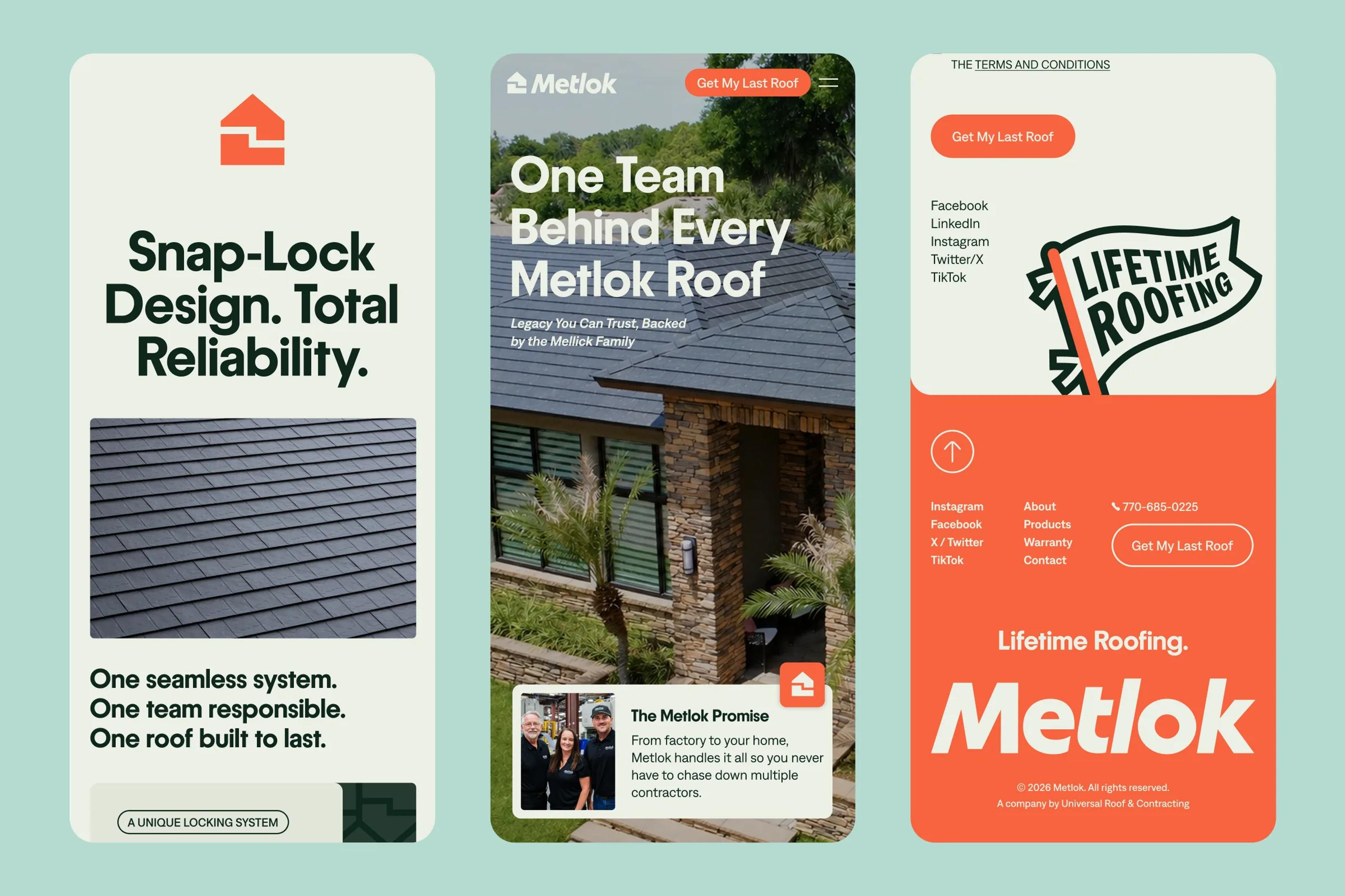
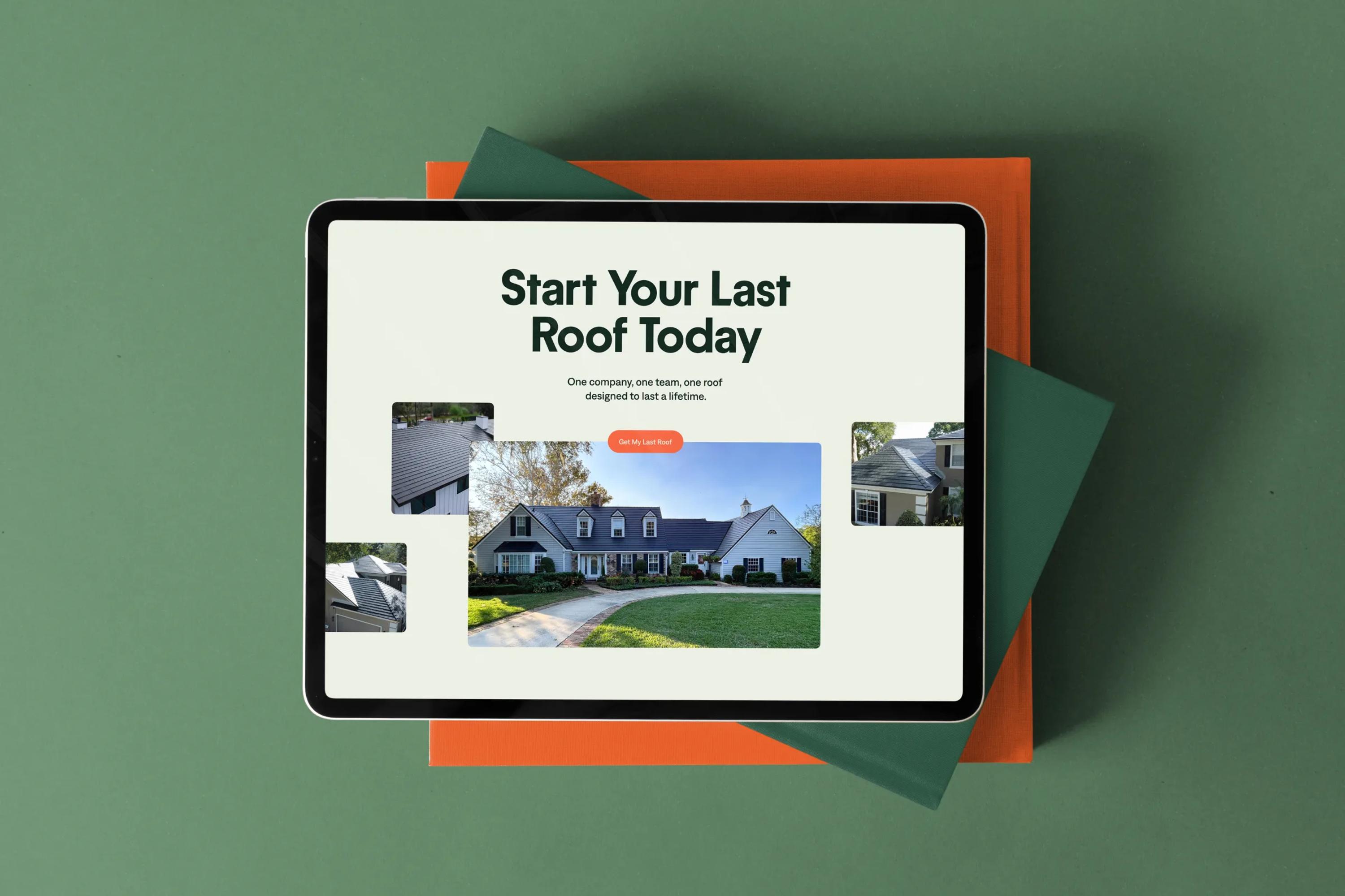
It's always a true pleasure when a company asks us to design their brand and their website all together. That's where we get to really express our creative vision across the entire visual identity of the brand, in the most cohesive way possible.

Metlok's products are genuinely innovative, and we wanted the website to reflect that. So we designed and developed sections with rich interactions and micro-animations to give the brand a really modern feel, without going too crazy and risking alienating the part of the audience that's less used to heavily animated websites.

The closing

Working on Metlok was a super fun and interesting project for us.
Jared and Jade really let us fully express our vision for the brand, and we couldn't be happier with the final result.

If there's one thing for any designer reading this to take away, it's this. There's no such thing as a boring or exciting industry to work in, just companies that let you express your vision for their brand, and companies that don't.

project type

  • Branding
  • Web Design
  • Development
  • Marketing

team

Jonathan Crowe

CEO

Jonathan Crowe

Bio:
Latest article: