We rebranded with purpose. Read the story

66degrees

Rebranding 66degrees

How to tell the story of digital transformation in the era of AI agents.

VIEW PROJECT

project type

  • Branding
  • Web Design
  • Development

team

Rebranding 66degrees

When Tommy Bliven, VP of Global Marketing at 66degrees, got in touch, we had a feeling this one would be good. 66degrees is a fast-growing consultancy that helps organizations navigate their digital transformation in the age of AI.

Basically, a big team of seriously smart people, operating across continents, working together on complex problems for some highly renowned clients.

They'd outgrown their existing branding, which felt a bit too basic and not quite premium enough, and they were looking for a partner to help them elevate the whole thing and reach the kind of look that would take them to the next level.
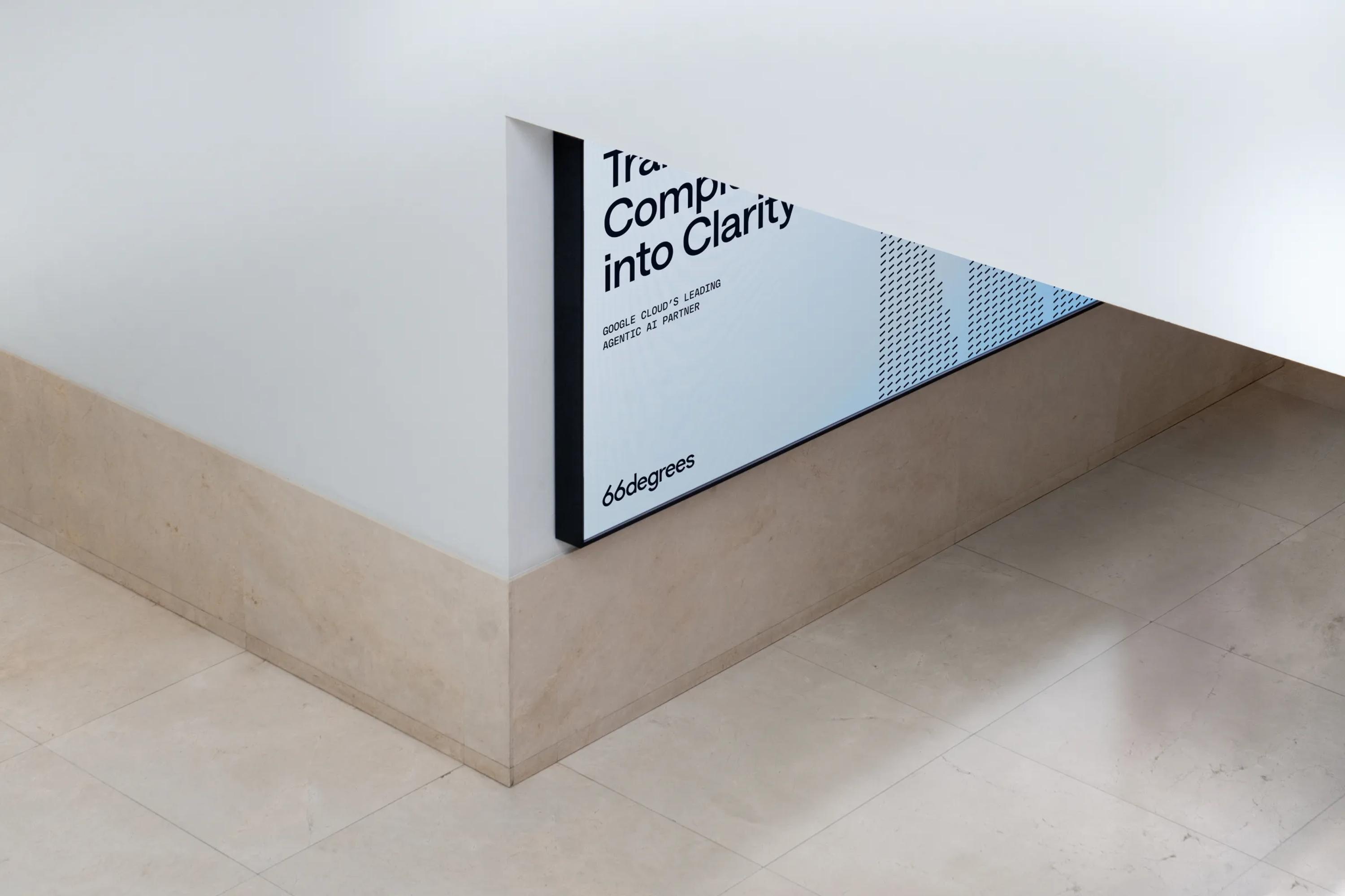
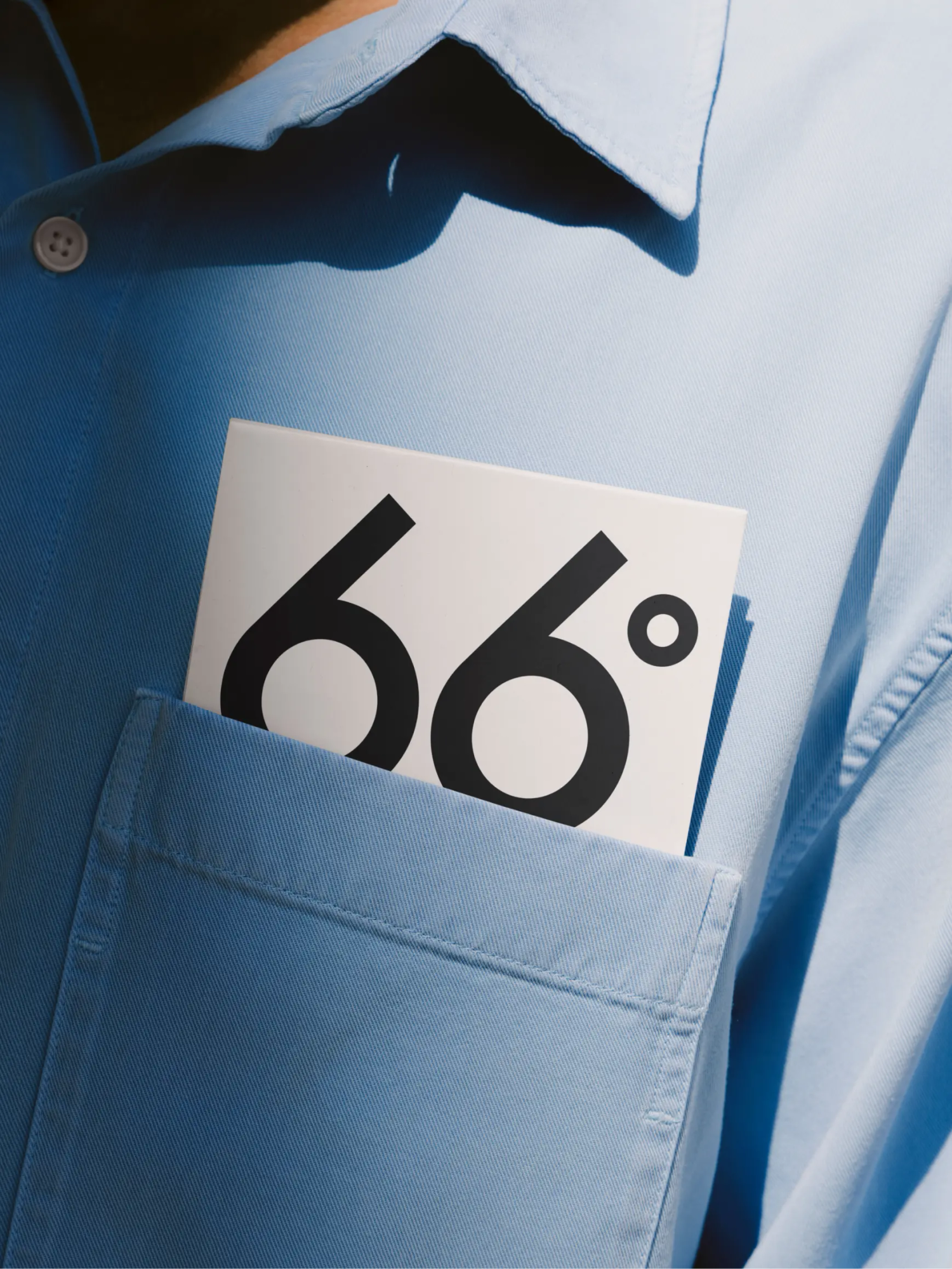
Clouds form at 66°

66degrees is a pretty mysterious name for a company, so one of the first things we asked Tommy was what it actually meant.

So here's a bit of enlightenment for you, dear reader: 66° Fahrenheit is the precise temperature at which water turns into cloud. Scientific, yet beautiful.
We were sold. This was going to be a great one for Juice.

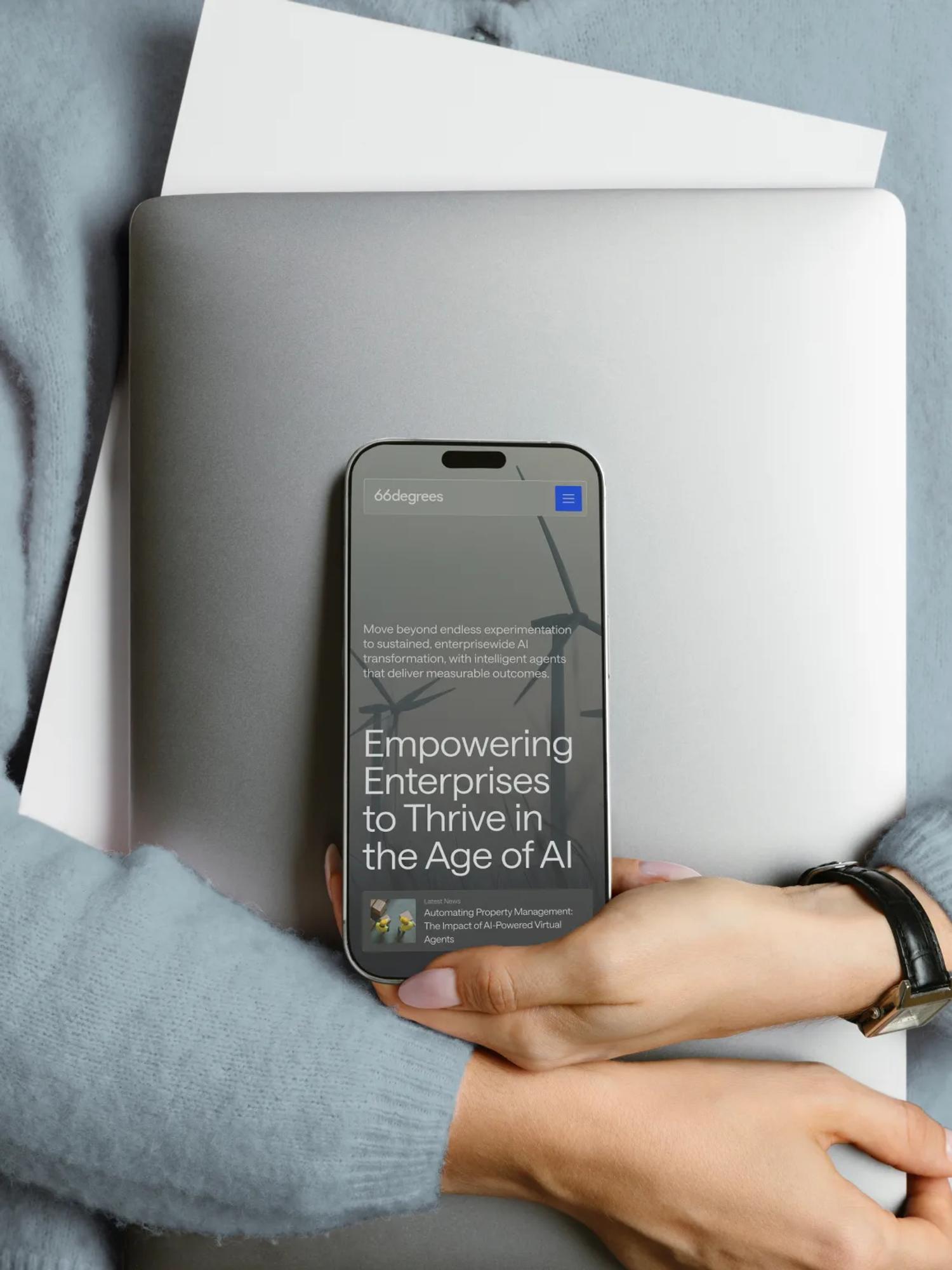
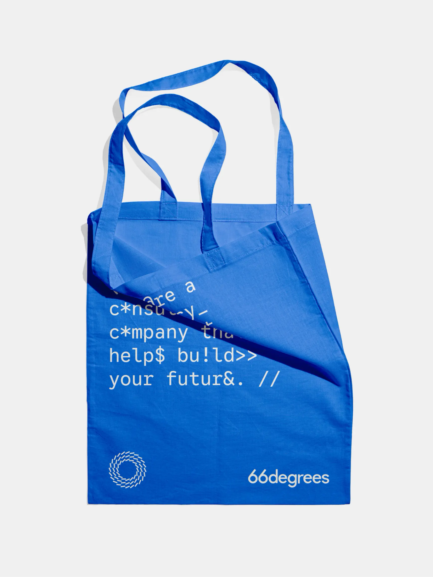
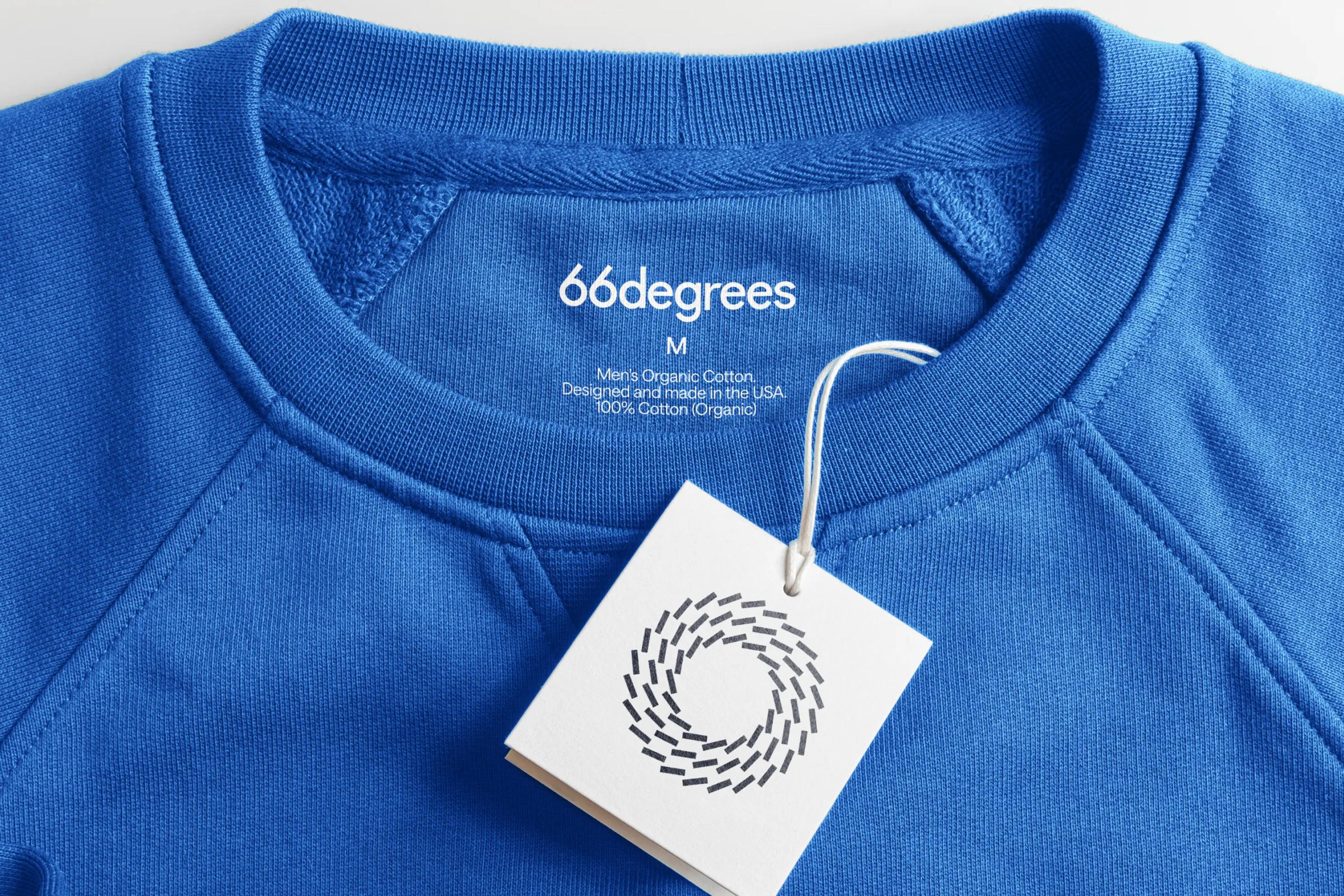
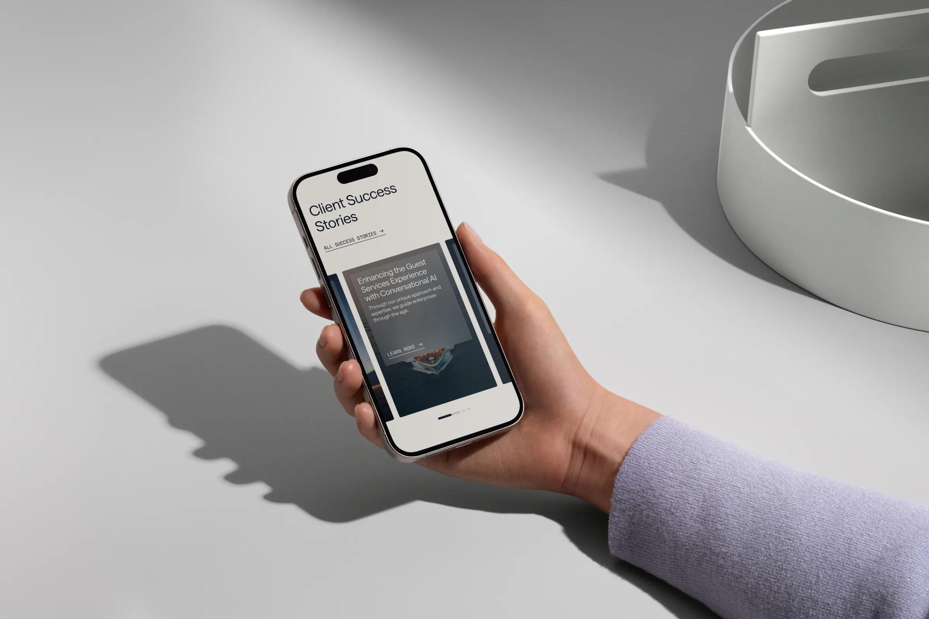
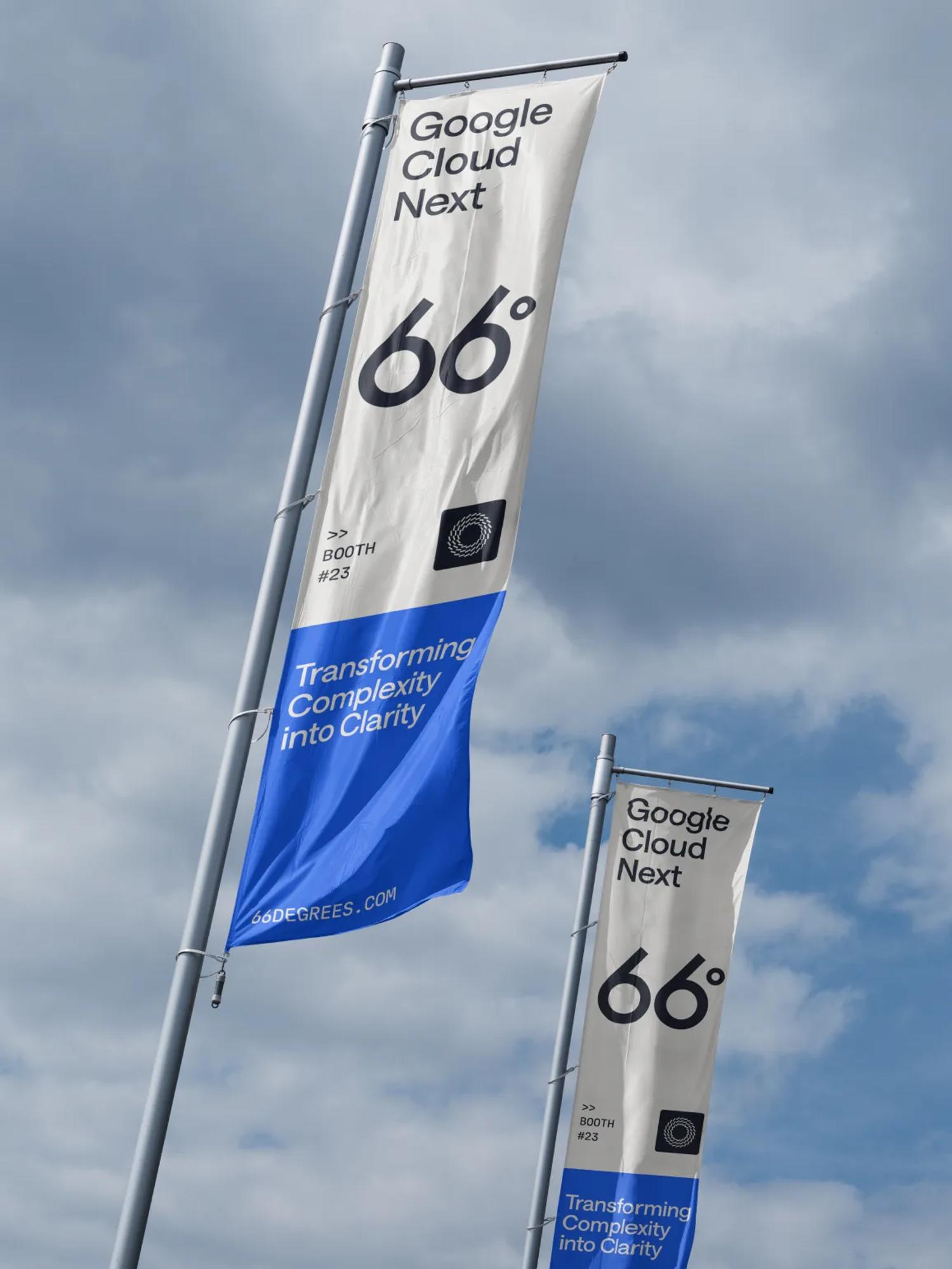
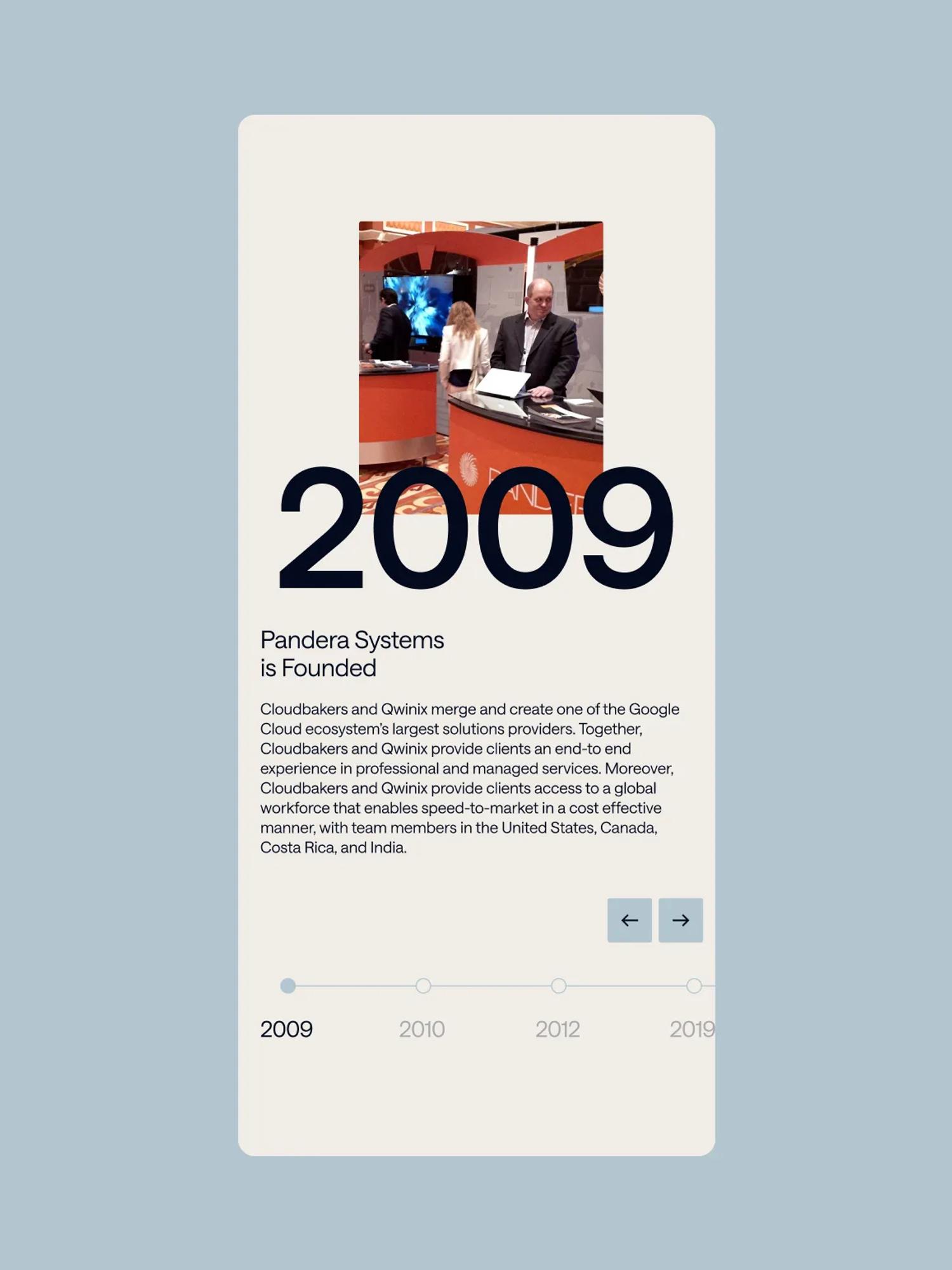
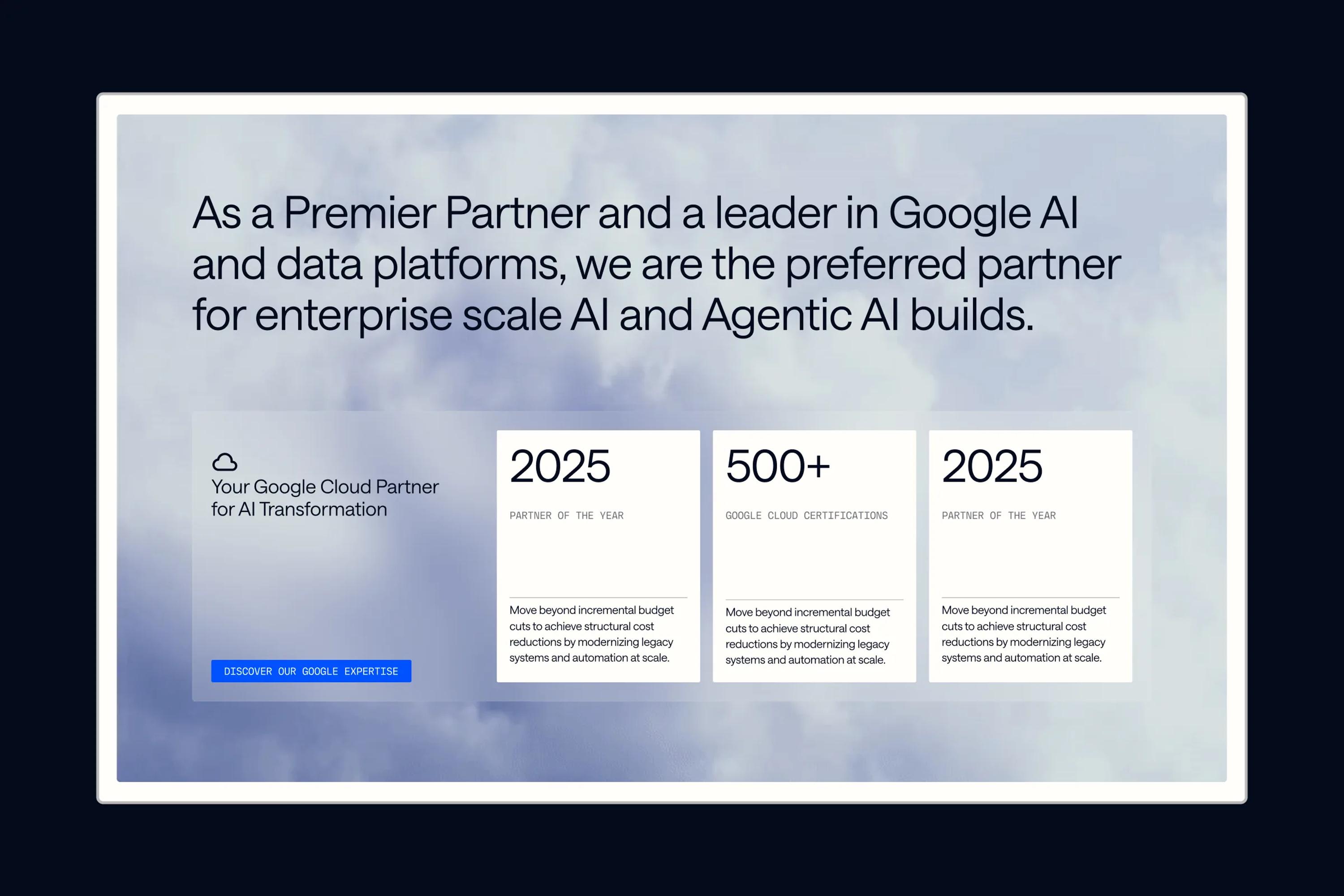
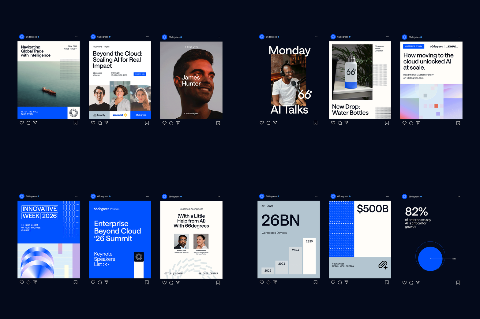
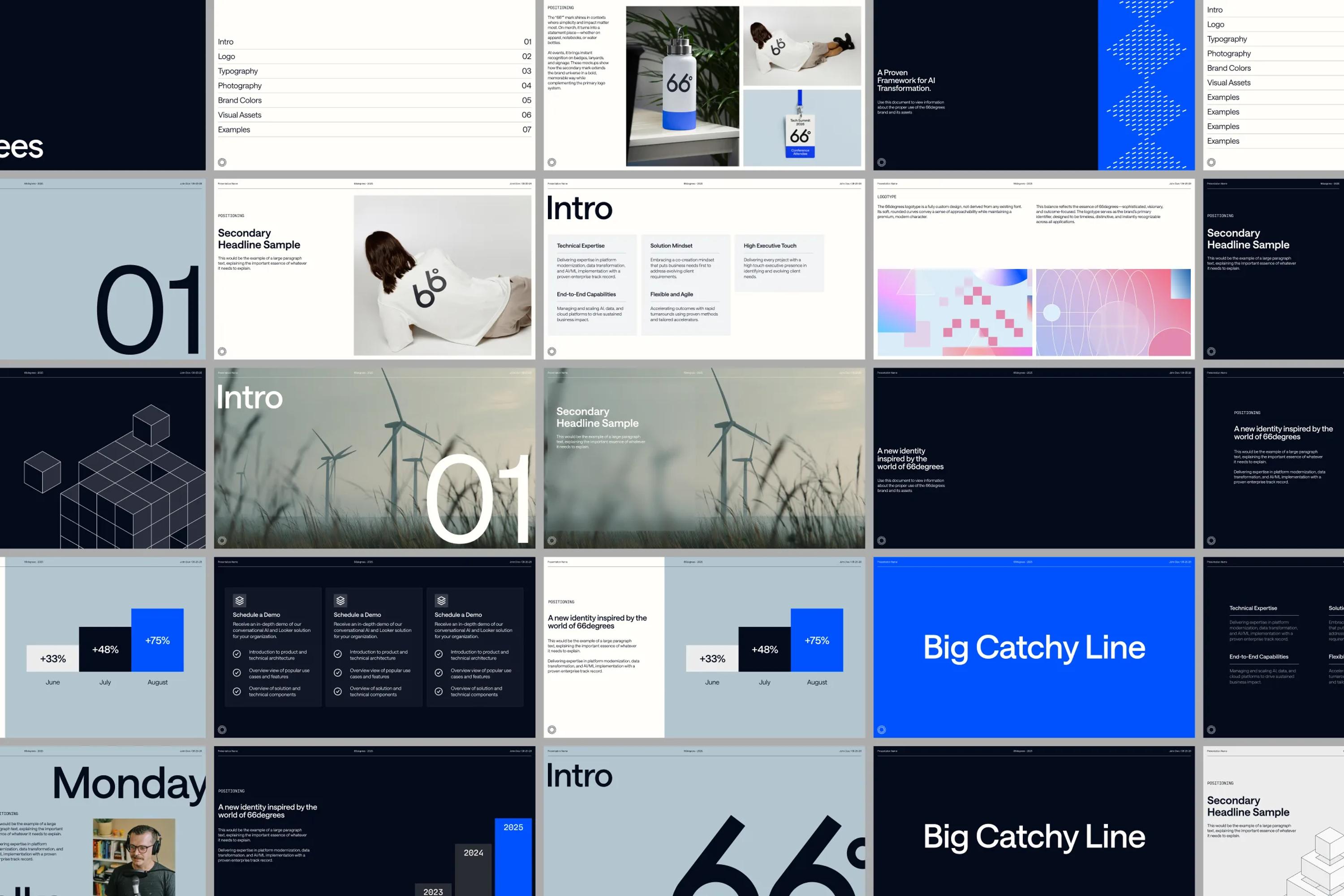
And the scope was wide, which is exactly what we love. Tommy wanted us to run a full rebrand of 66degrees, design a whole set of communication asset templates, work on merch, and help their team with the creative direction for the new website.

The logo

The original 66degrees logo was just a wordmark with the name fully spelled out. Nothing very flexible. The brand needed a more versatile logo system.

The first task we took on was a full redesign of the wordmark. Every letter in the new logo was drawn custom by Juice, sketched on iPad, then vectorized.
Looking at the name fully spelled out, one idea jumped at us. Why not drop the "degrees" and turn it into a "°"? It sounds obvious now that you see it, but at the time it felt like a real revelation.

On top of this system, the client wanted an extra symbol. Something more graphic, no letters, no numbers. So we ran through hundreds of sketches, trying to capture the right dynamic to represent water turning into clouds, and fragmented data coming together into a unified foundation.

We landed on a whirl symbol that connects both ideas at once: the natural element, like a whirlwind, and fragmented data pulling together into a unified system. Turning complexity into clarity.

The fonts

For the fonts, the goal was to pick ones that would perfectly represent the pillars of the brand: innovation, technology, and a premium feel.

We started by looking for a beautiful, elegant, modern sans serif to embody the innovation and premium side of things. Saans by Displaay quickly became our font of choice. Its design is clean and refined, with every character beautifully drawn.

To pair with it, we wanted a second font with a techier edge, something to express 66degrees' cutting-edge business. We went with MD IO by Mass Driver, a really interesting take on a mono font, full of unusual shapes and ink traps.

The color palette


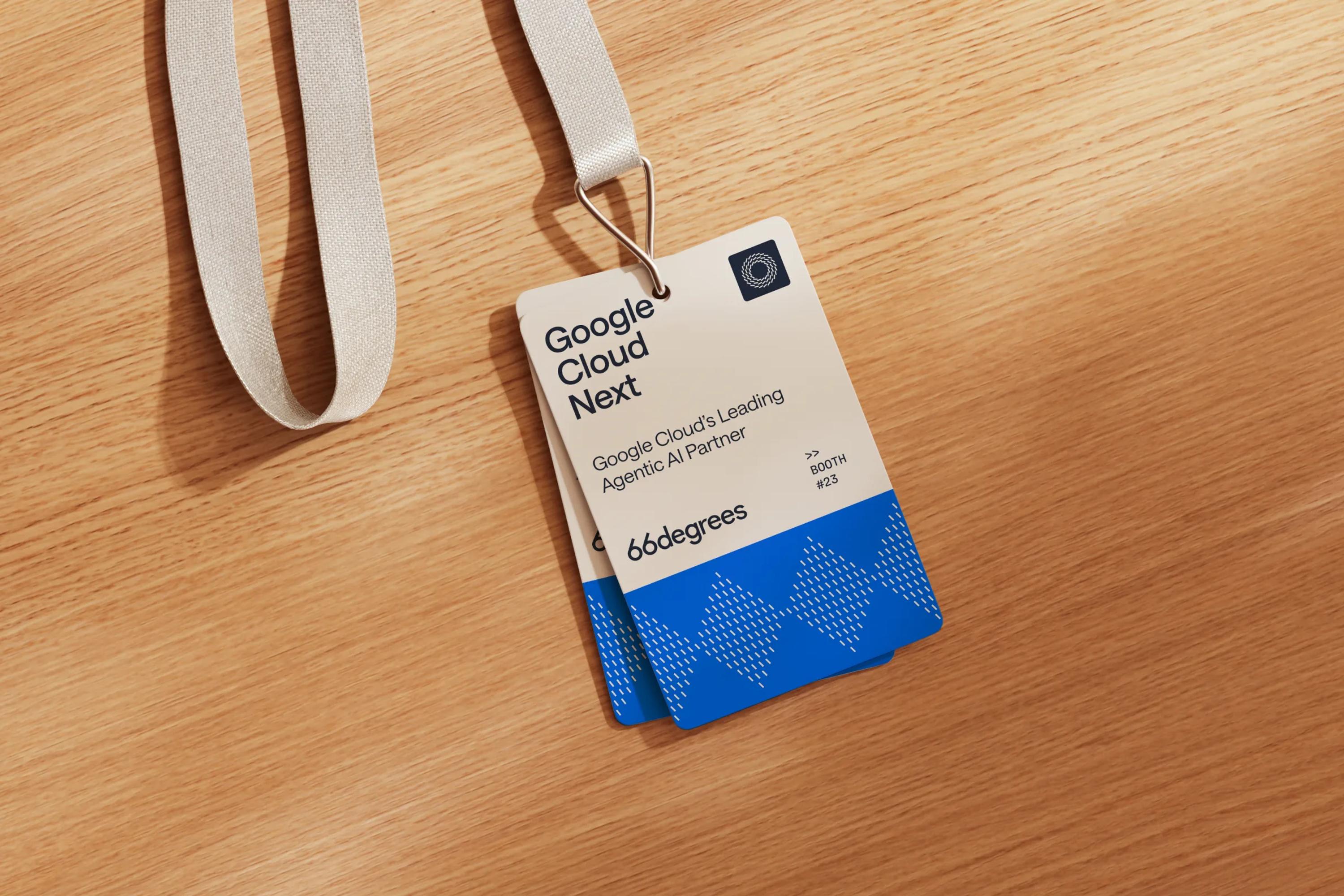
66degrees has a big presence at conferences and trade shows, so they needed a color that would make them instantly recognizable.

The whole meaning behind the 66degrees name revolves around the water cycle, water turning into clouds. So we built the palette around blue. The 66° Blue, the brand's leading color, is an electric blue: a highly recognizable tint that evokes water, power, and technology. This isn't still water. This is water traveling at light speed.


With blue at the center of everything, we then brought in a dark navy and a shark grey with blue undertones. Finally, we selected a series of grey tones for contrast and depth.

The pattern

66° is a temperature, but it's also a geometric angle. We wanted to play with that idea to build graphic elements that could belong to 66degrees alone.

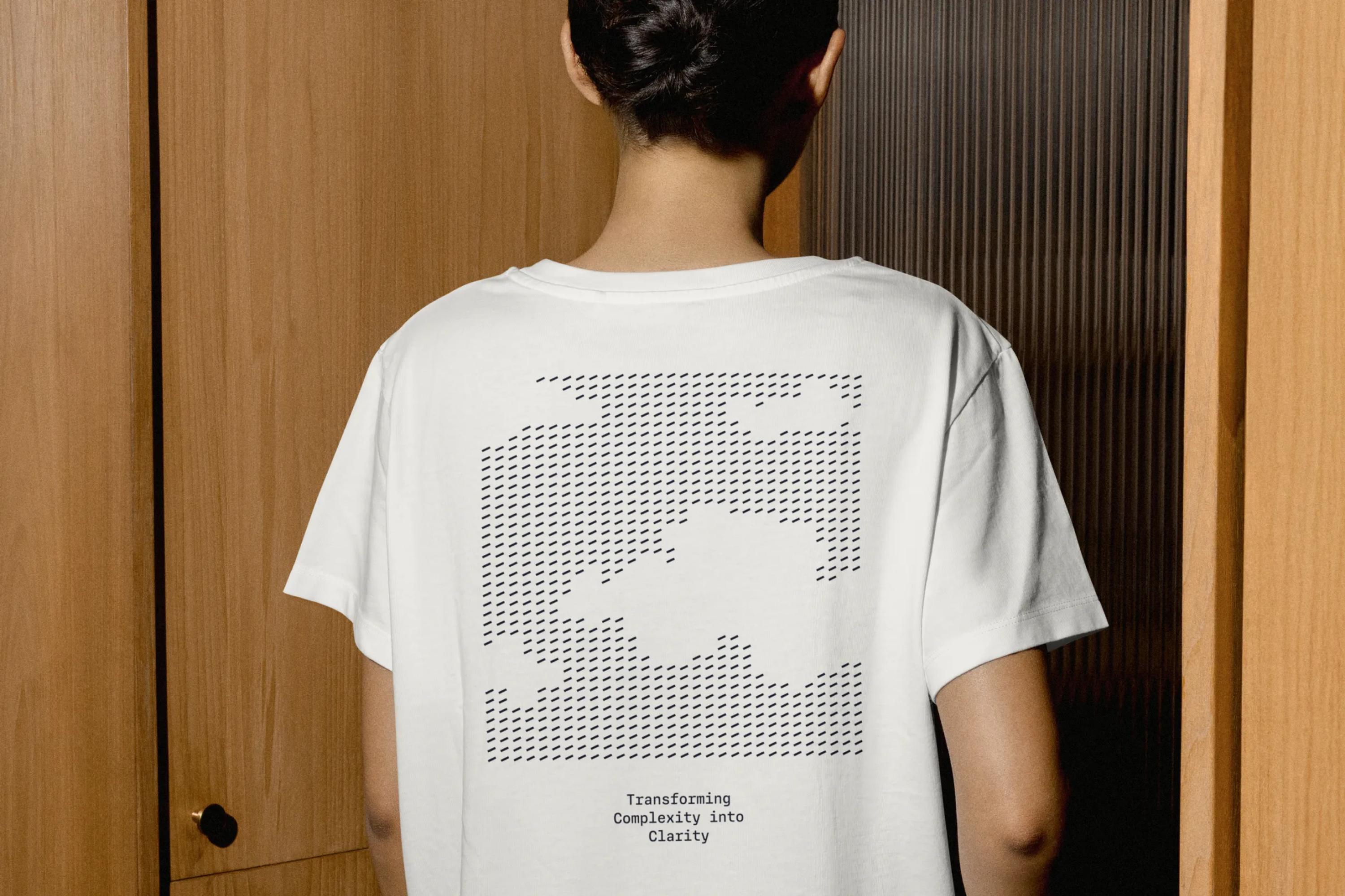
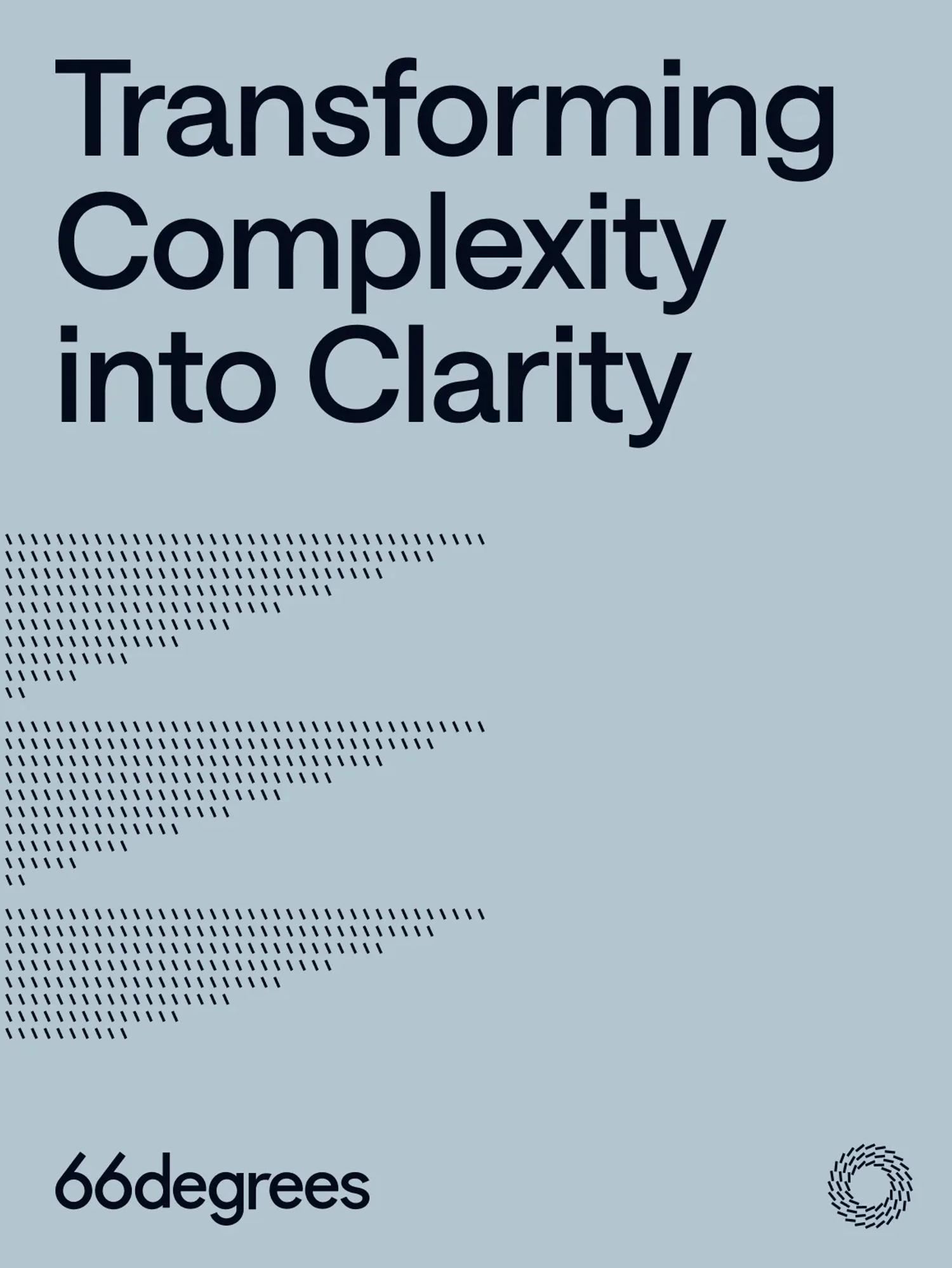
The idea we landed on was to reuse the shape that makes up the whirlwind logo symbol, a rectangle, and rotate it on a 66° axis. That rotated rectangle then became the basis of the whole pattern system. Multiplied across a seamless canvas and colored in different shades, it could suddenly illustrate all kinds of concepts through a single system.

We're talking abstract geometric patterns, sure, but it also opened the door to representing natural shapes like clouds, just by playing with the negative space.

The isometric illustrations


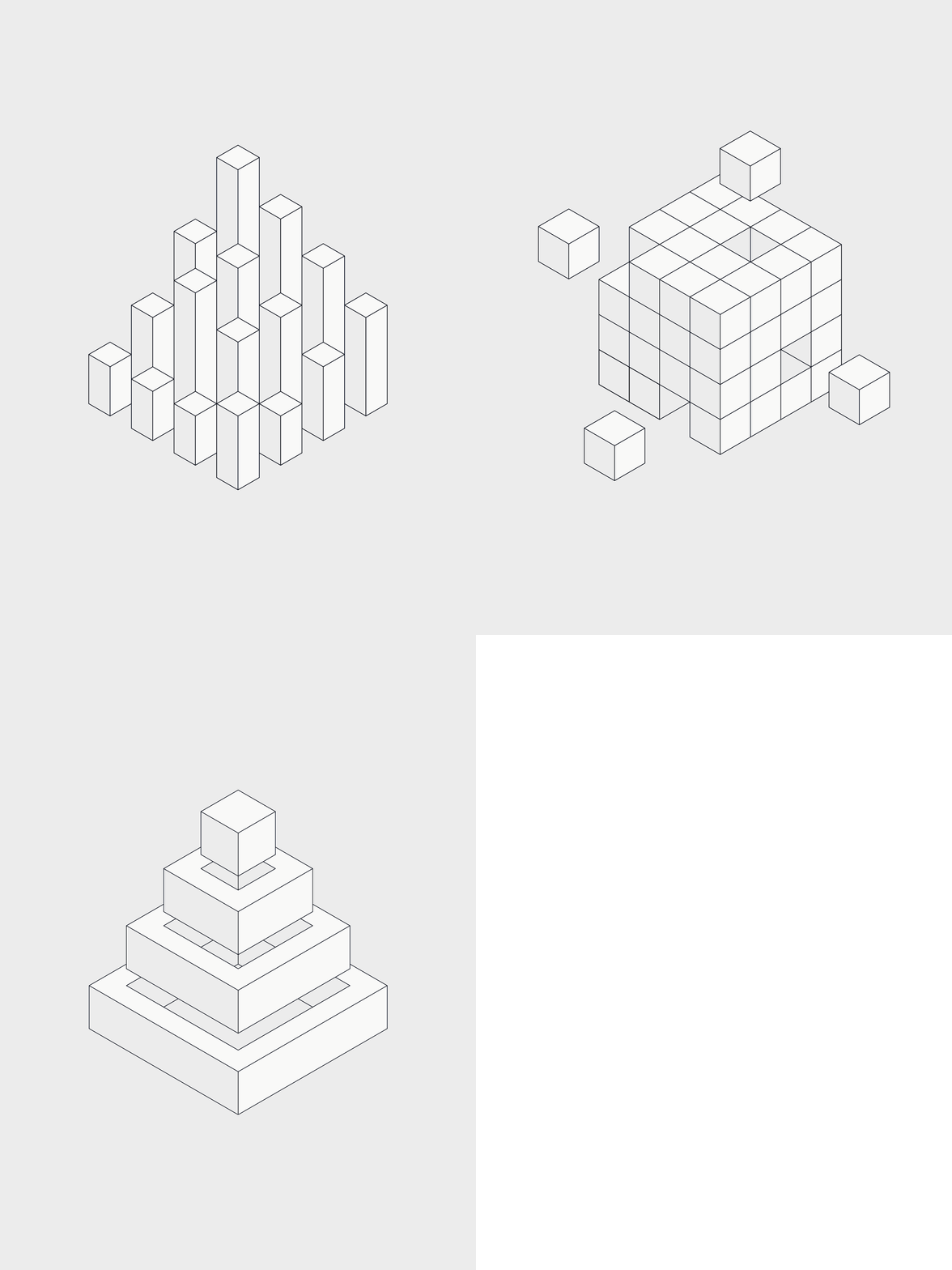
Using photos in the brand imagery is great, but relying on them alone can get a little boring. To enrich the brand, we needed illustrations to add visual interest whenever 66degrees communicates.

So we created a series of isometric illustrations to tell the technological side of what 66degrees does in a more engaging way.

Closing

Working alongside Tommy on such a fascinating brand was a real pleasure. It's great to team up with companies building this kind of technological edge, because it lets us push the boundaries of creativity and find unique ways to tell their story.

A big thanks to Tommy and the whole team at 66degrees for trusting us on such a great, wide-ranging project.

project type

  • Branding
  • Web Design
  • Development

team

Jonathan Crowe

CEO

Jonathan Crowe

Bio:
Latest article: