We rebranded with purpose. Read the story

Swish

Rebranding Swish

Because data marketing agencies can also flex like 90s Florida lifestyle brands.

VIEW PROJECT

project type

  • Branding
  • Web Design
  • Development

team

Rebranding Swish

As you might know, Juice is an Orlando-based company. Obviously. We only say it in every post.

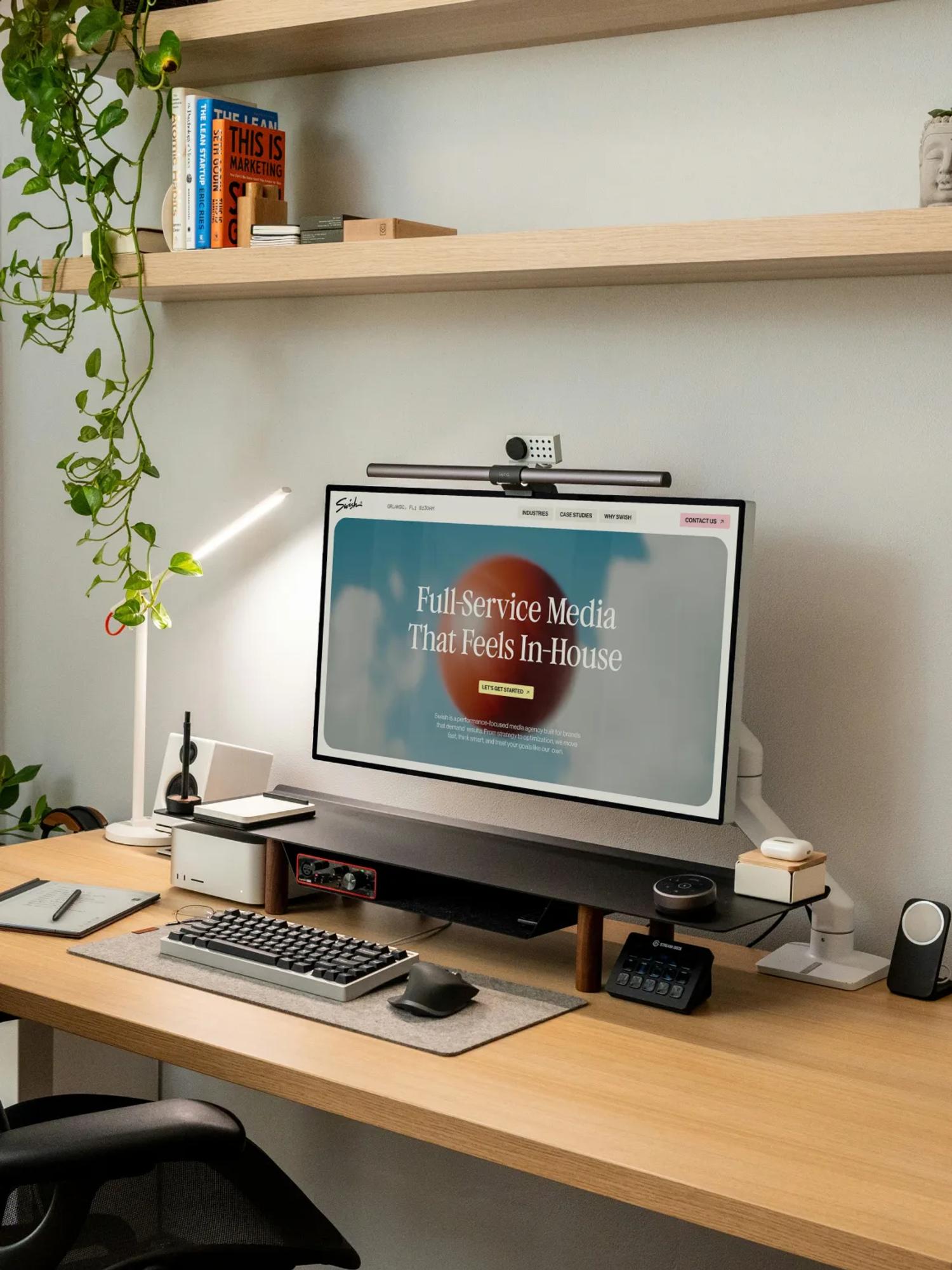
Anyway, that means we love to play local. And what a pleasure to work with other Orlando teams like Swish, a full-service media agency built on performance and data. If you follow our work, you might also know we're big basketball fans. That's one thing our friends at Swish share. Hence the name. If you know basketball, you're already getting it.

What makes Swish stand out from their competitors, and we deeply respect this, is their willingness to look and sound different. Brands are like people: some are quiet and invisible, others are flamboyant and loud. And honestly, it's like life, you're better off staying true to who you are. People will love you more for it than for trying to be someone else.

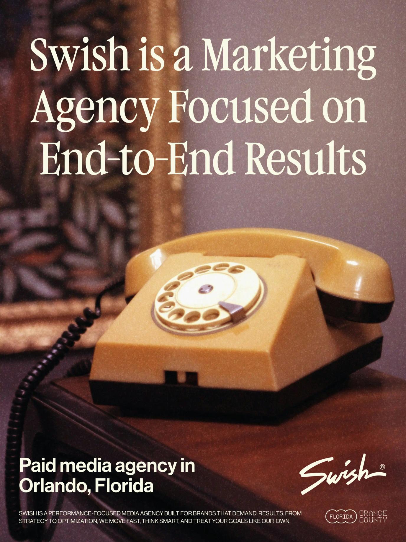
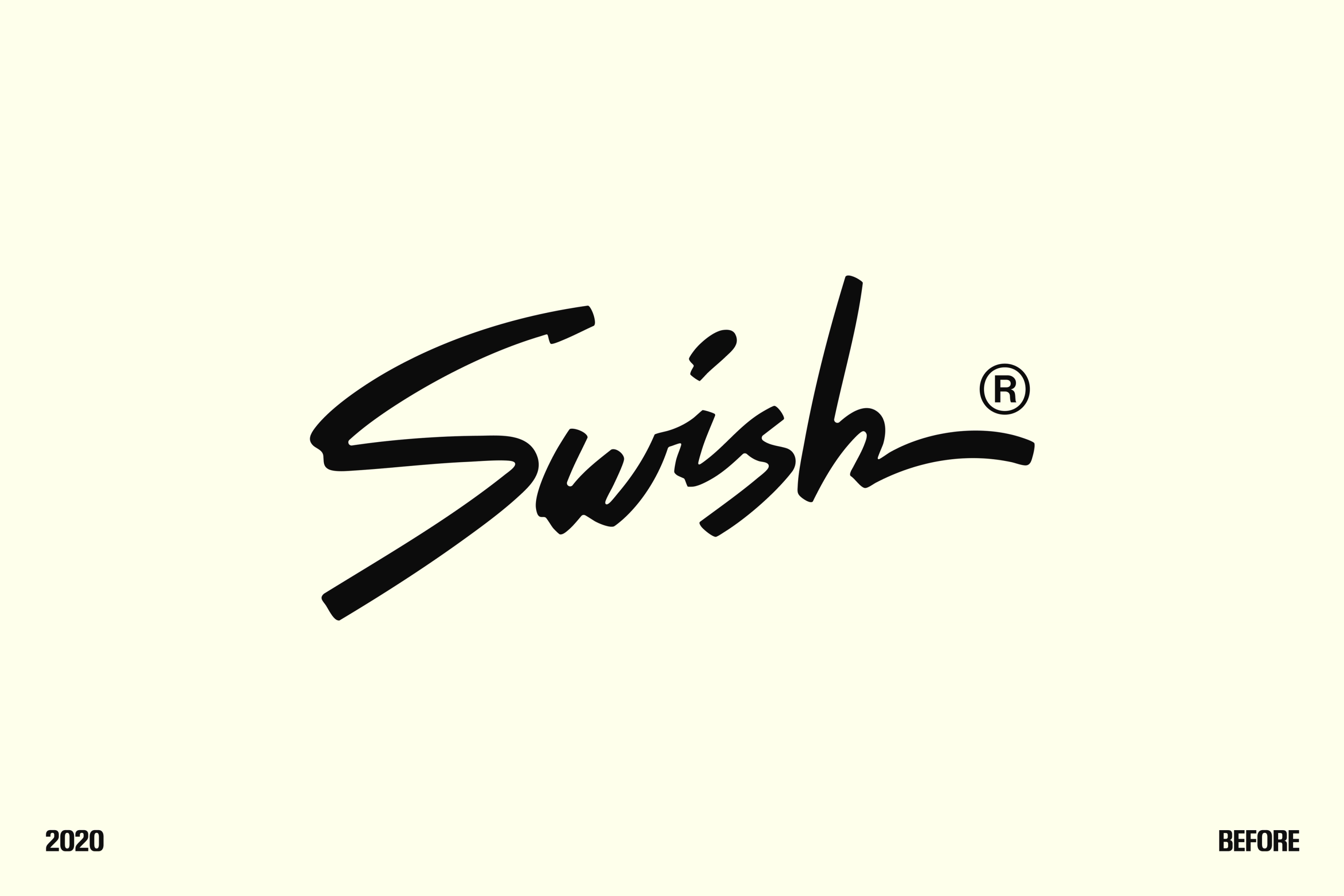
Their original branding was built a few years back on some cool principles: a 90s Florida vibe with a touch of basketball, but without leaning on it too hard. After all, Swish is a media agency. It's cool to be different, but you still want to stay relevant to your audience.

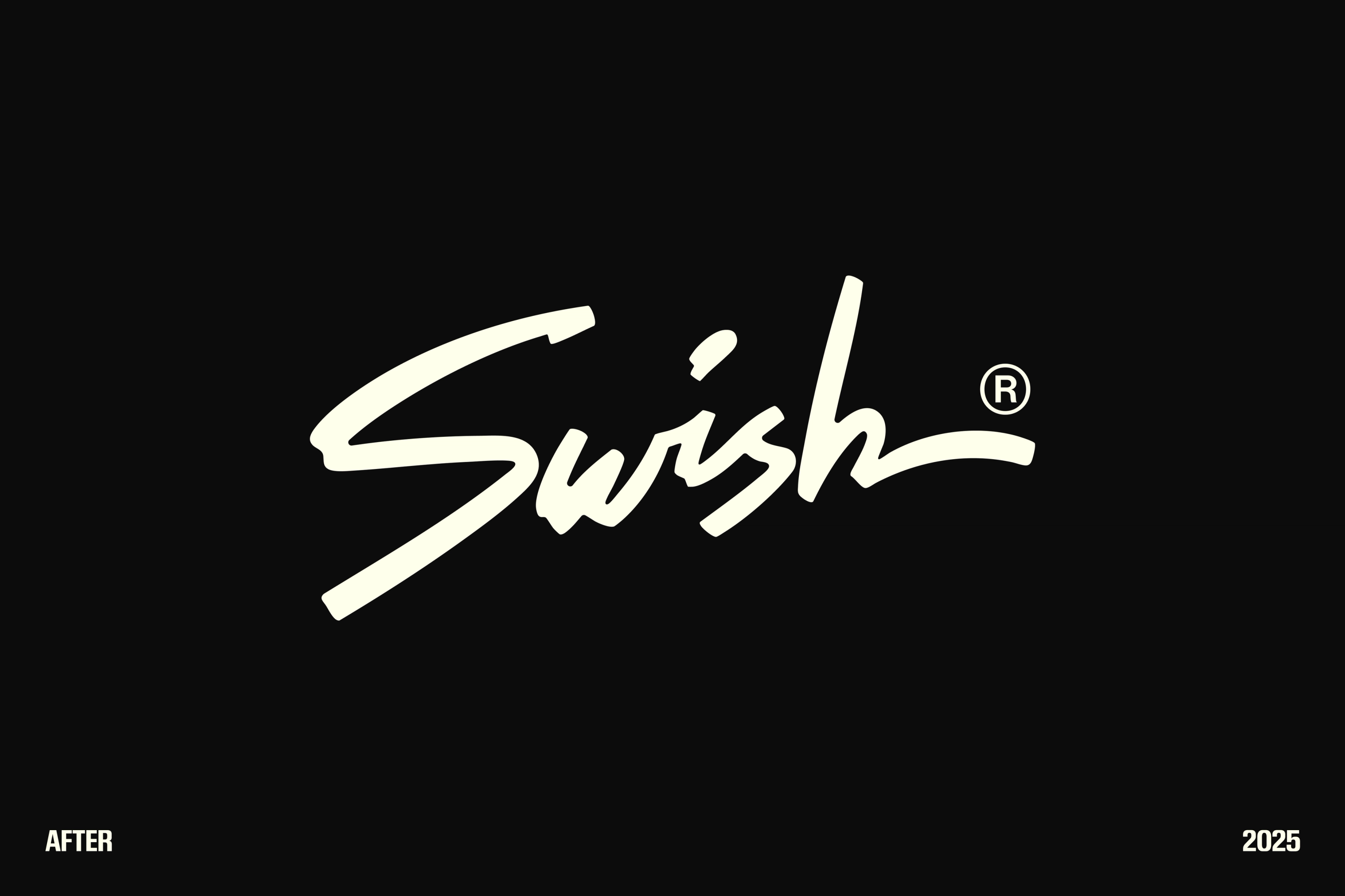
After a few years rocking that identity, they called us in to give it a fresh look while keeping its foundation.

Video thumbnail

Never compromise between cool and smart, be both.

Branding a company is always a complex exercise. There's a balance to strike between being relevant to your market and looking different enough to be recognizable. Looking exactly like everyone else is rarely the best move, since you become instantly forgettable.

Take a room full of people in black shirts. Wear a red one and you'll automatically stand out. But if the goal is to look like the best tango dancer, baggy jeans and a big 50 Cent NY hat won't exactly sell it. Better to pair that red shirt with patent shoes and a silky blazer. Suddenly you look the part.

Damn, my comparisons are the worst on earth, but whatever, you get the idea.
That was the balance we had to find for Swish. Staying true to who they are while still making them look like a serious partner for serious marketing work. The coolest kid in class who also turns out to have the best grades.

Video thumbnail
Video thumbnail

The logo system

The first piece of any branding is the logo. But why settle for one logo element when you can have three? Logo systems are flexible, and the usual rules don't really apply here. There are two main objectives to keep in mind.


The first is brand recognition. You want your audience to recognize and remember your logo elements. When they see your logo, they should think of you, not some other company.

The second is flexibility. A long, horizontal logo is great if you want to throw it on a letterhead or print it on a bus (not that many brands get the occasion to do that, but you never know...). But try using that same long logo as your LinkedIn profile pic and you'll run into trouble, it'll be so tiny nobody can read it.

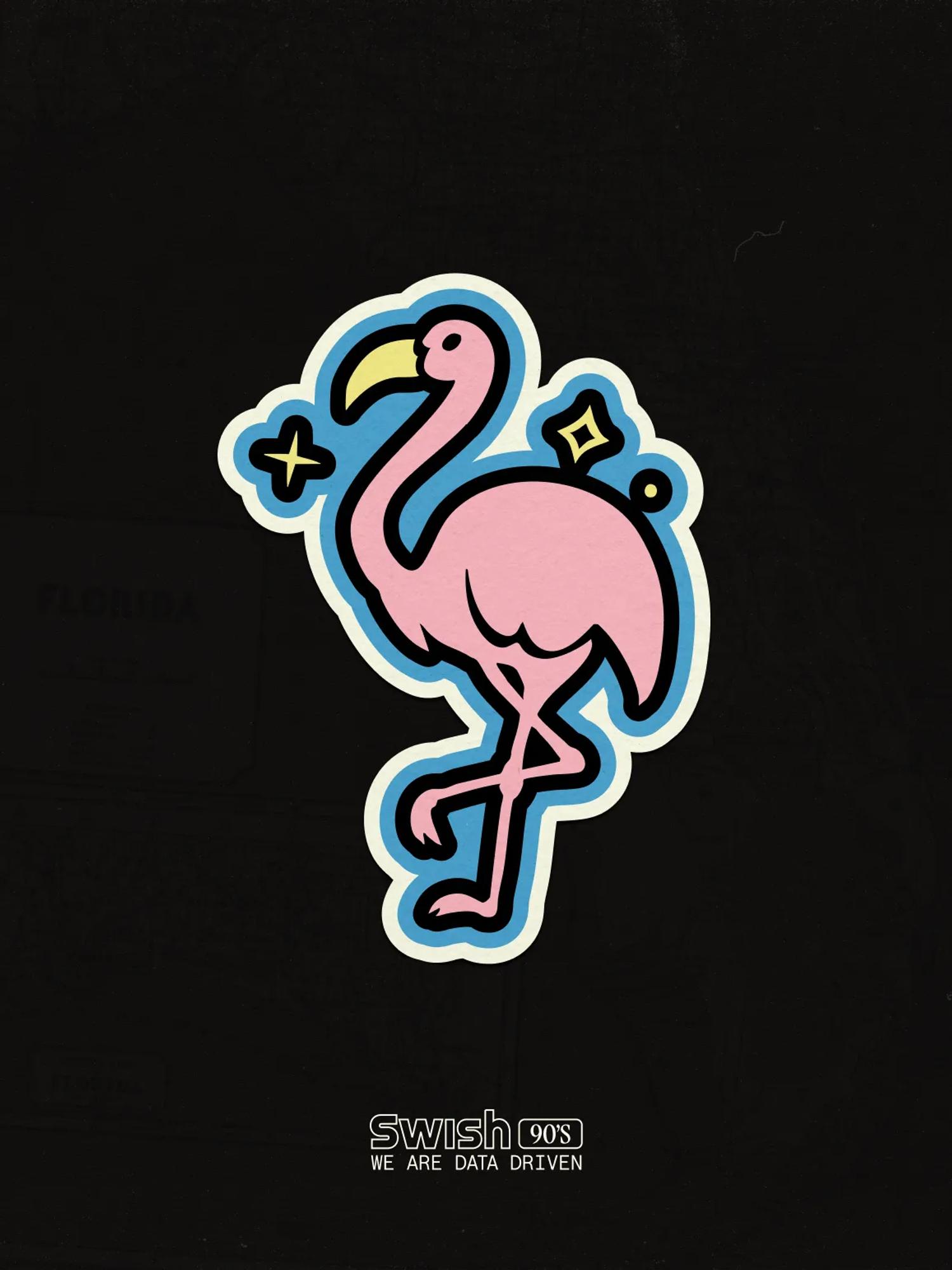
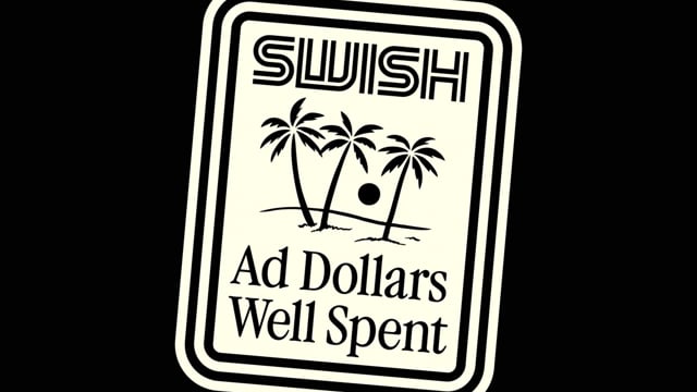
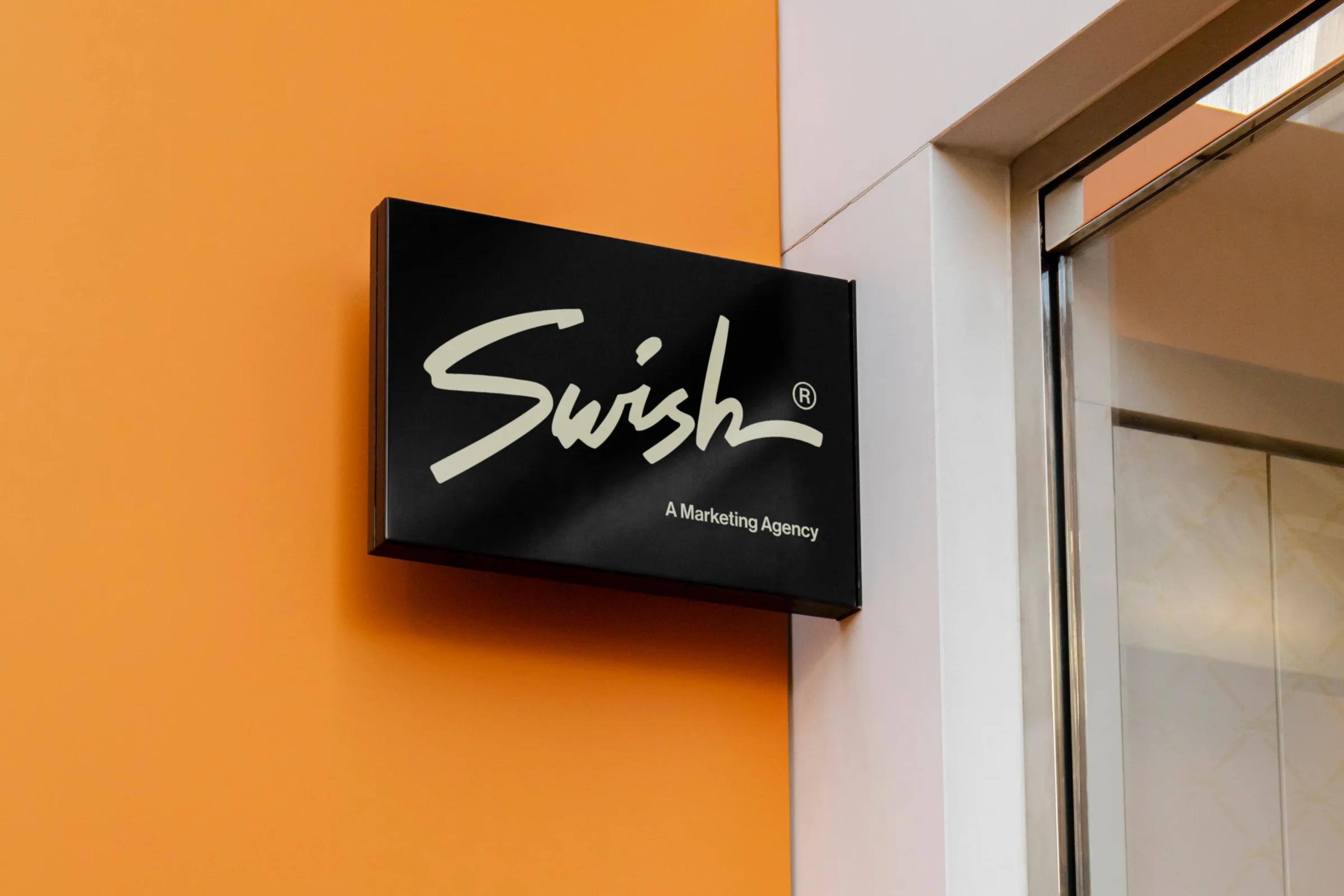
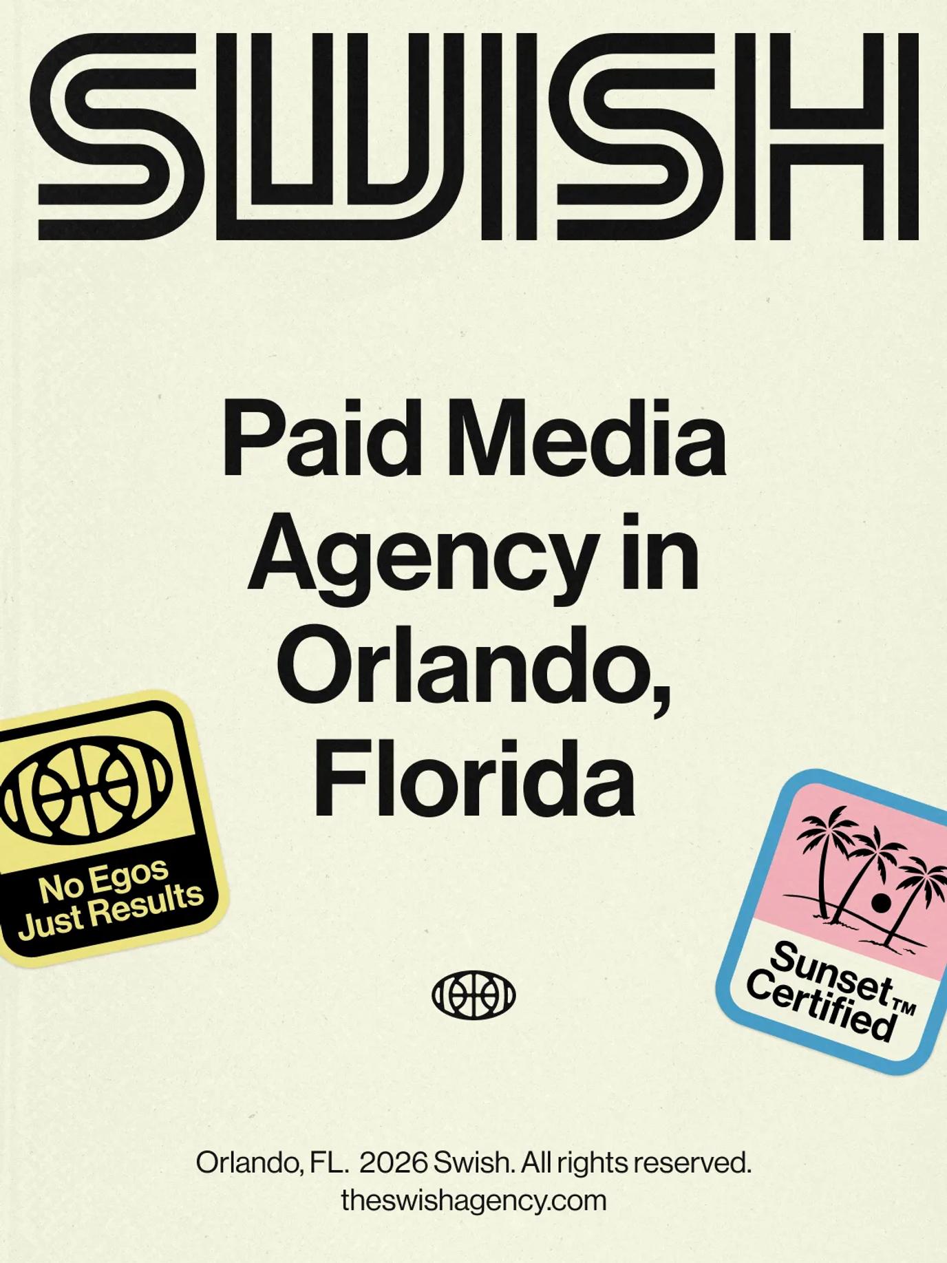
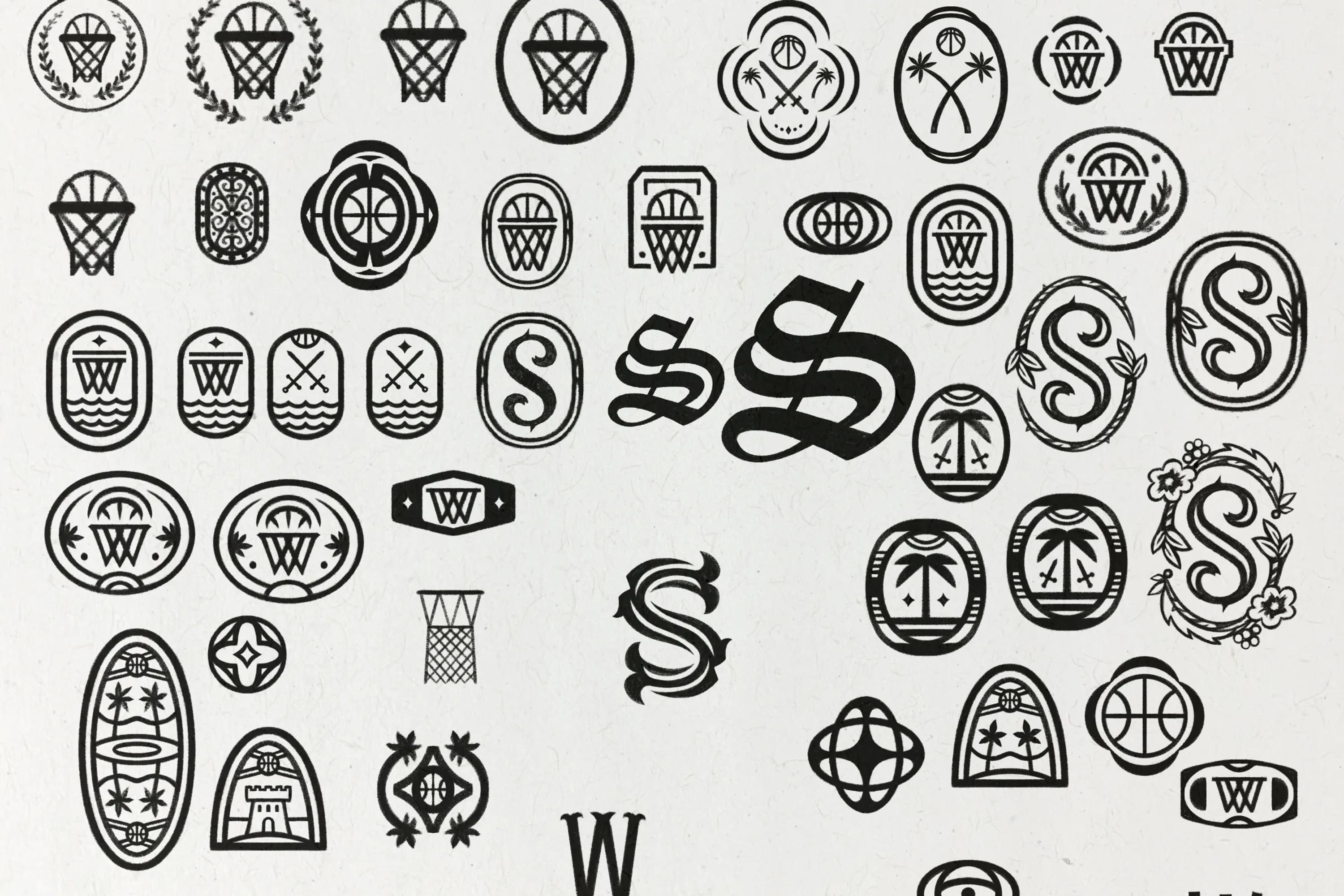
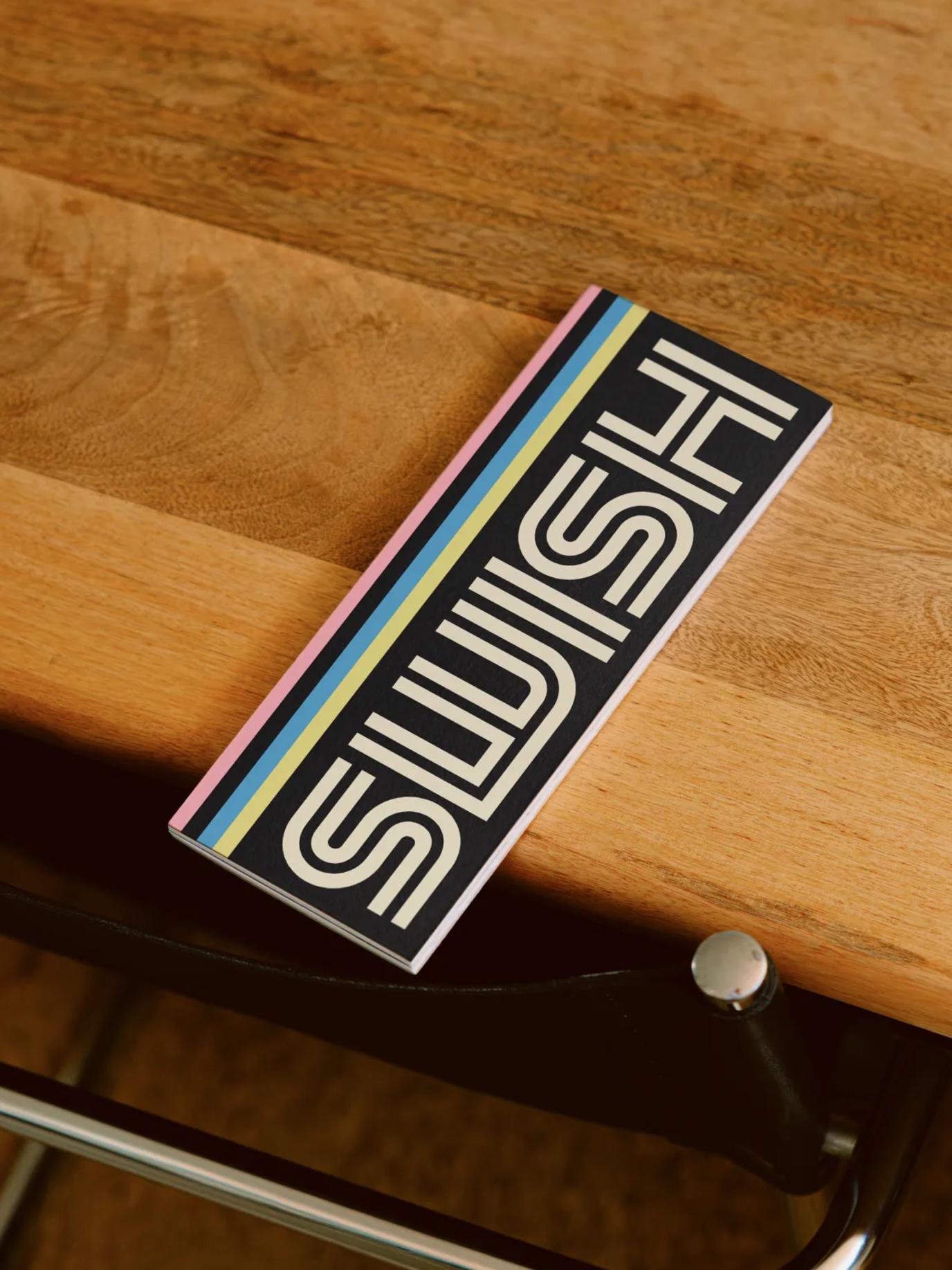
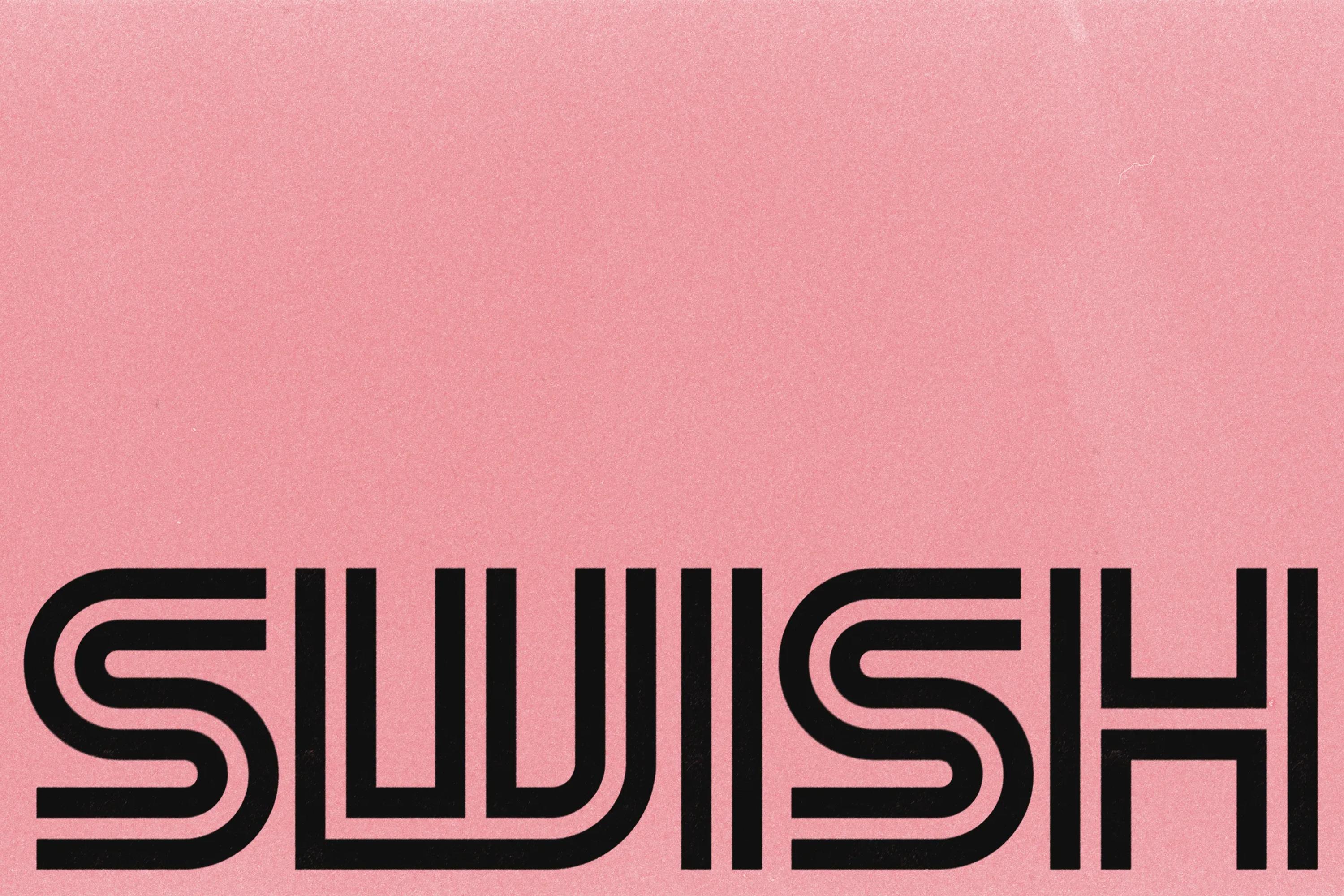
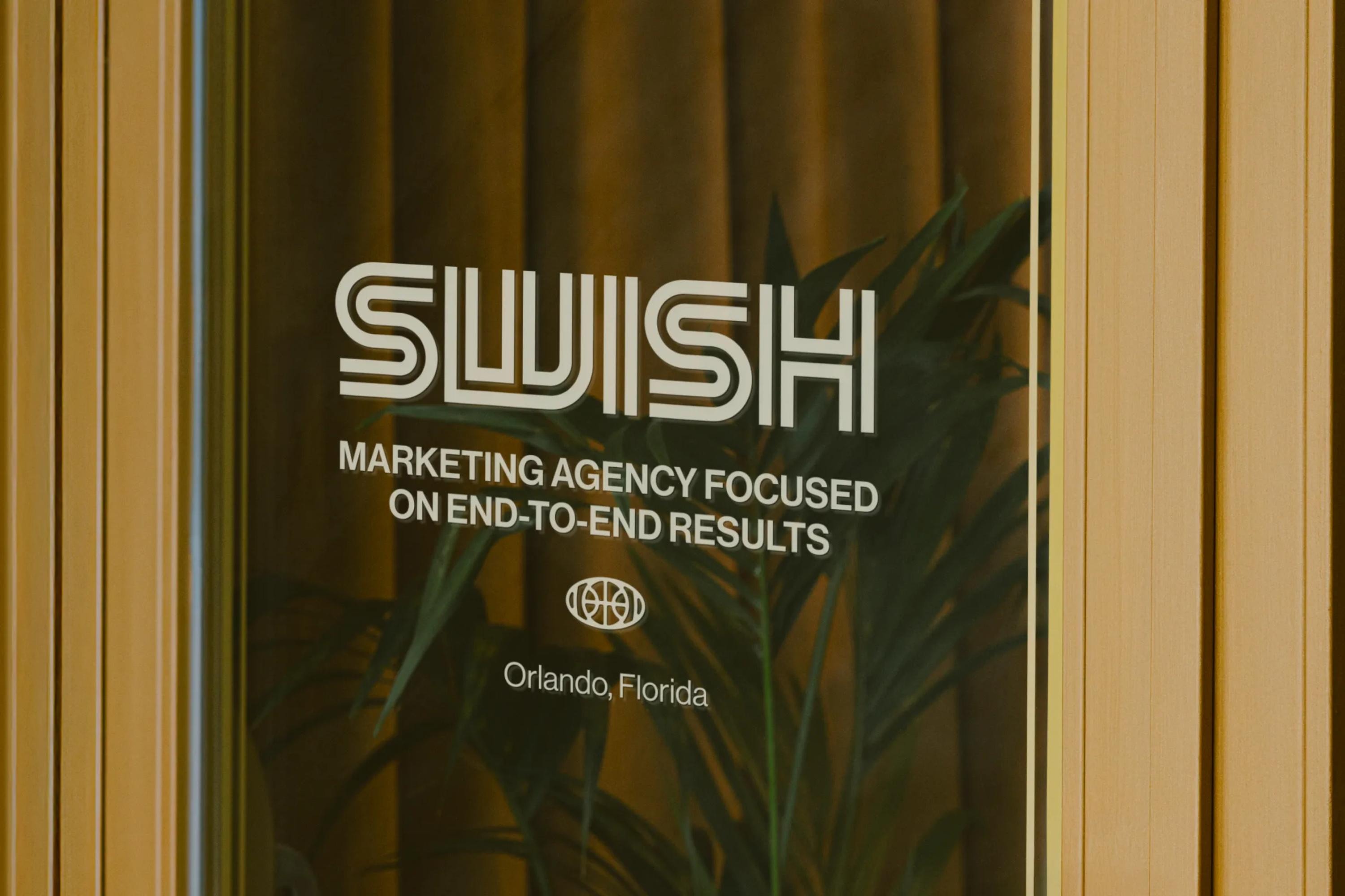
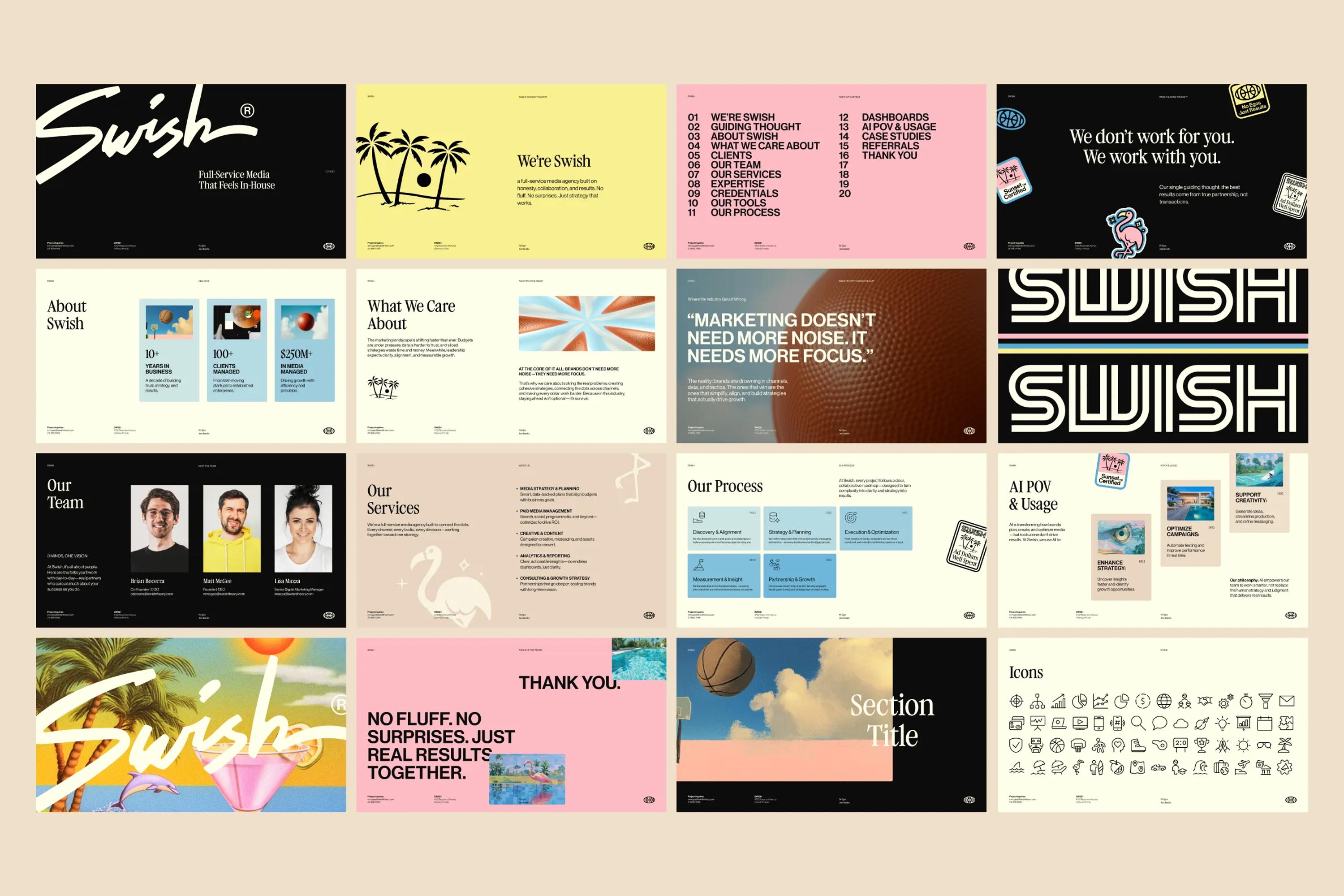
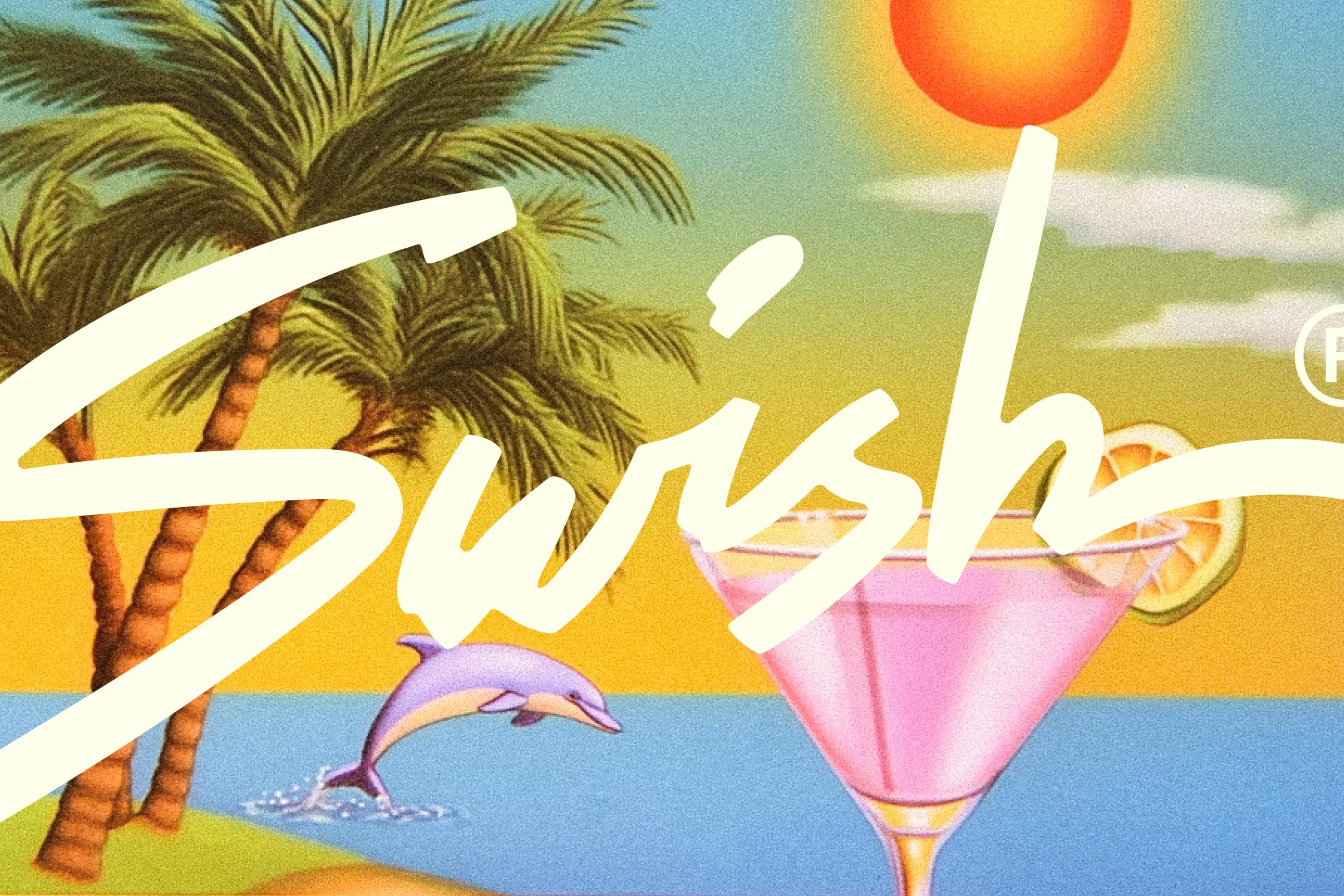
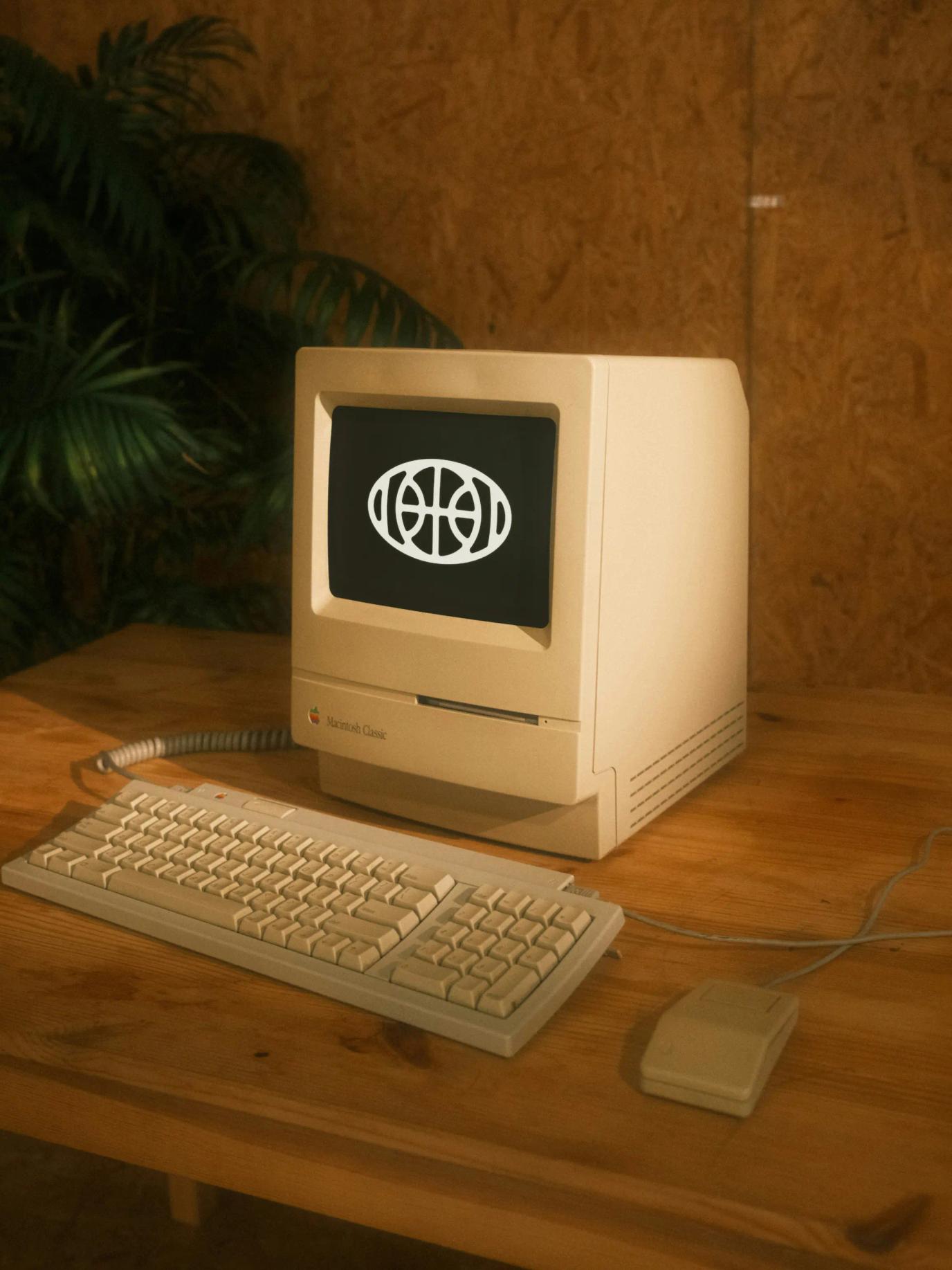
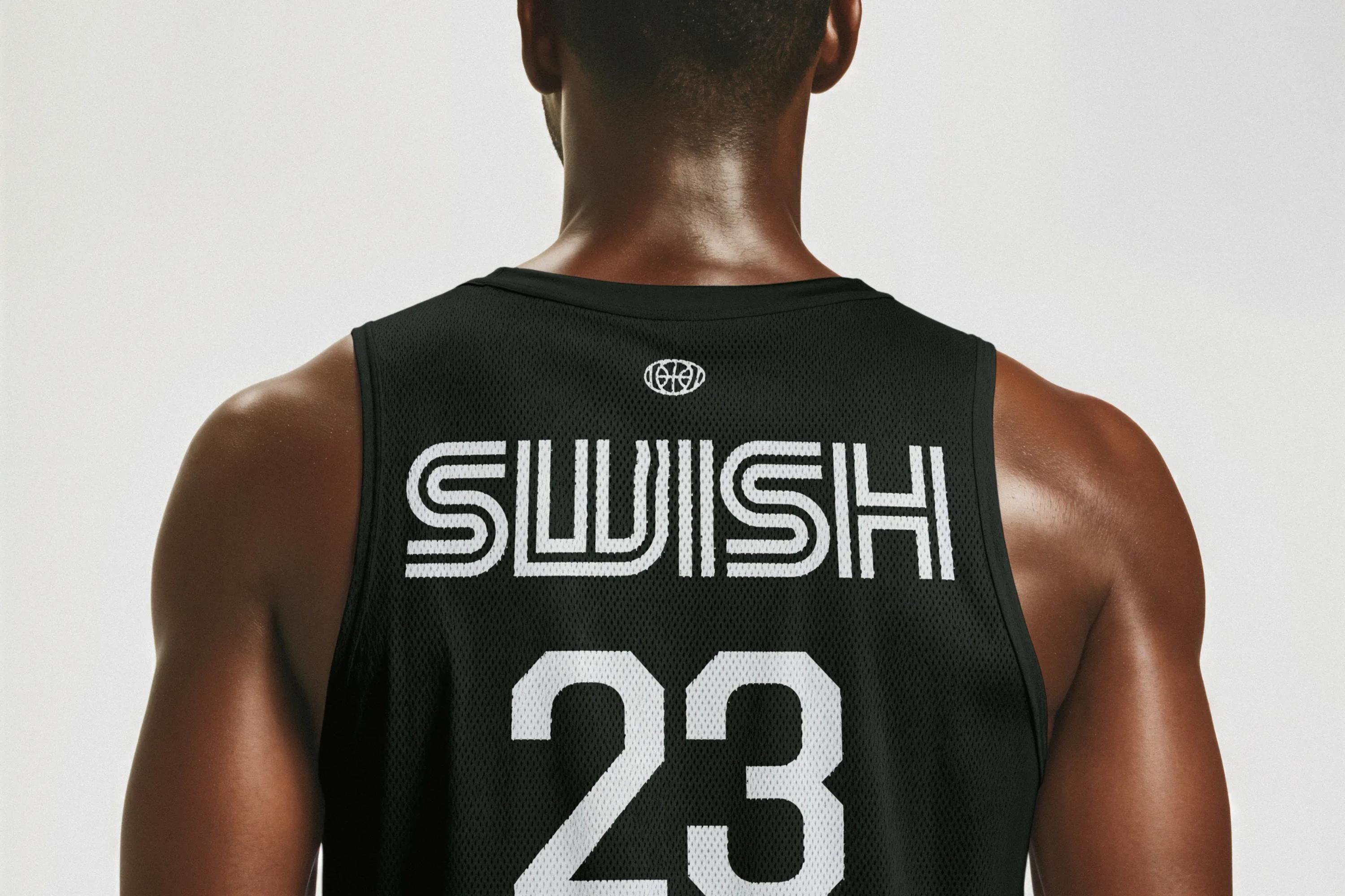
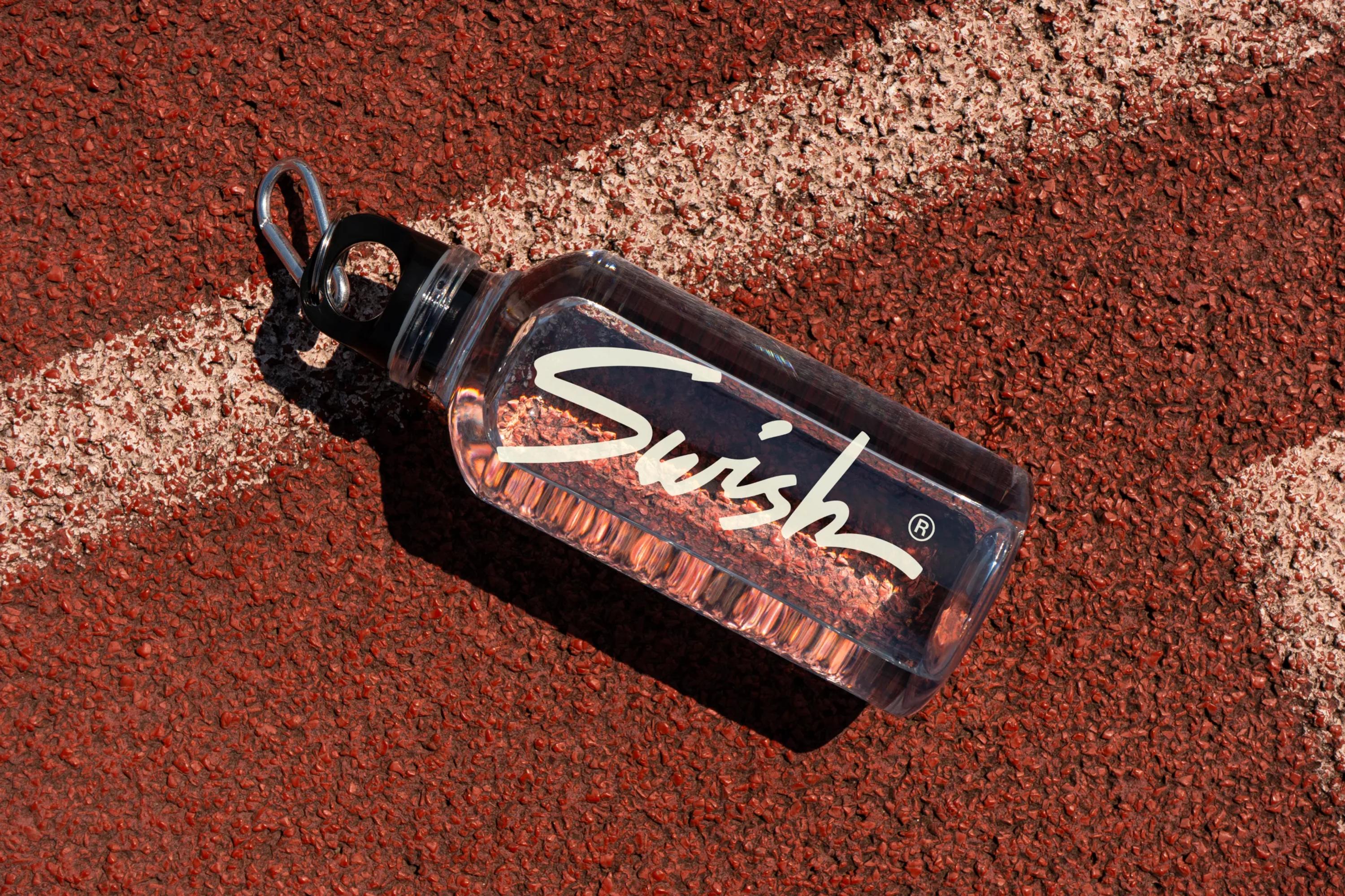
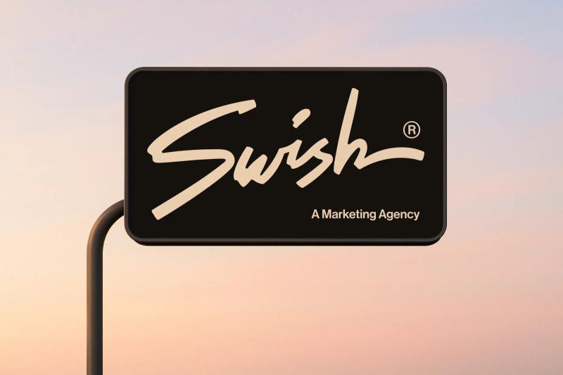
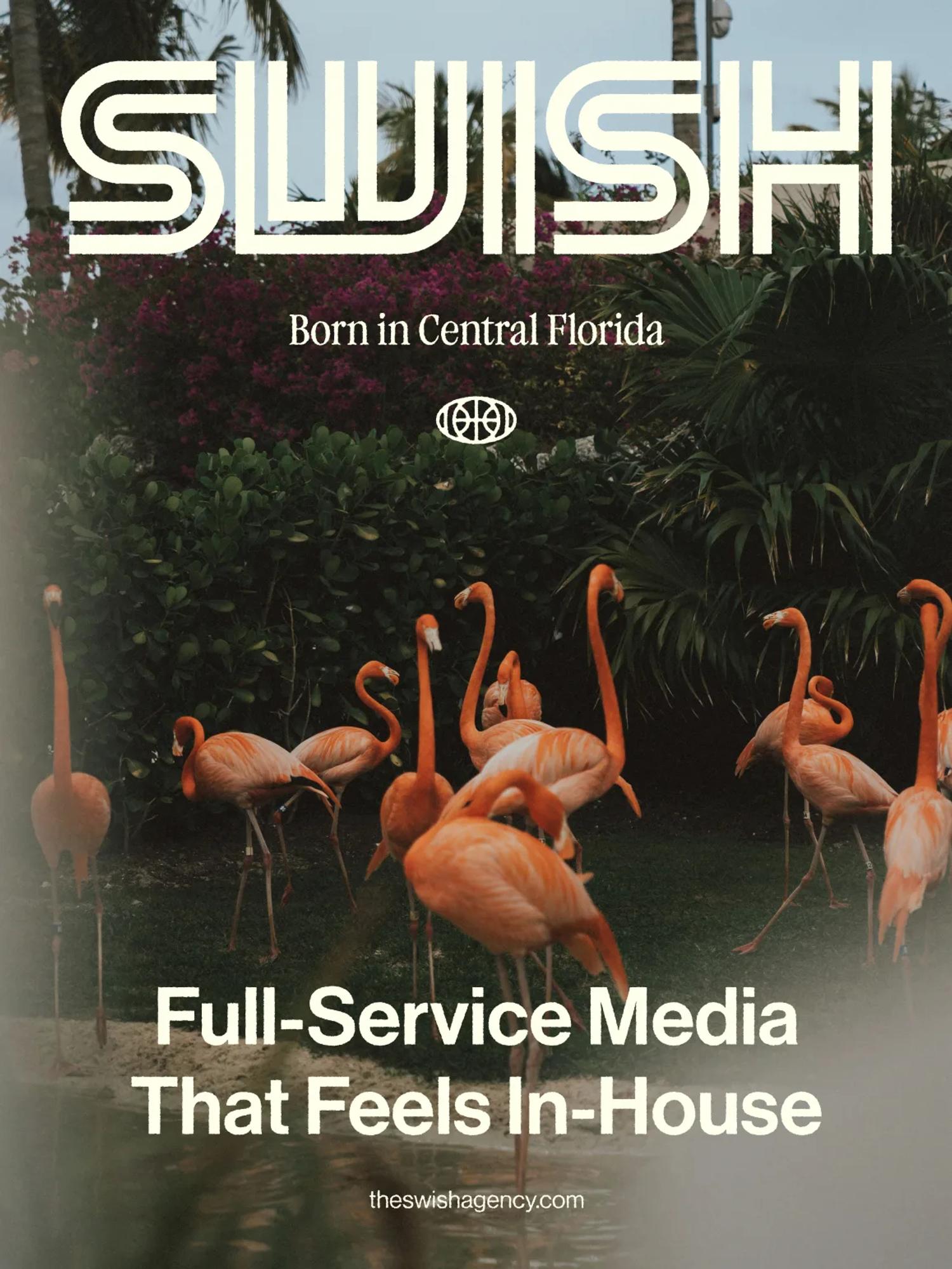
That's why Swish has three logos. The signature logo, the main one, used almost everywhere. The logo mark, which blends a basketball and a target (because Swish's work is all about teamwork and precision). And the blocky secondary wordmark, ideal for editorial formats and merch since it fills the full width of a canvas. The signature logo is really cool but naturally a bit unbalanced, which is exactly why we added the secondary wordmark, for the designs where the main one wasn't quite working.

Branding is art, I'm telling you.

Video thumbnail
Video thumbnail

The fonts

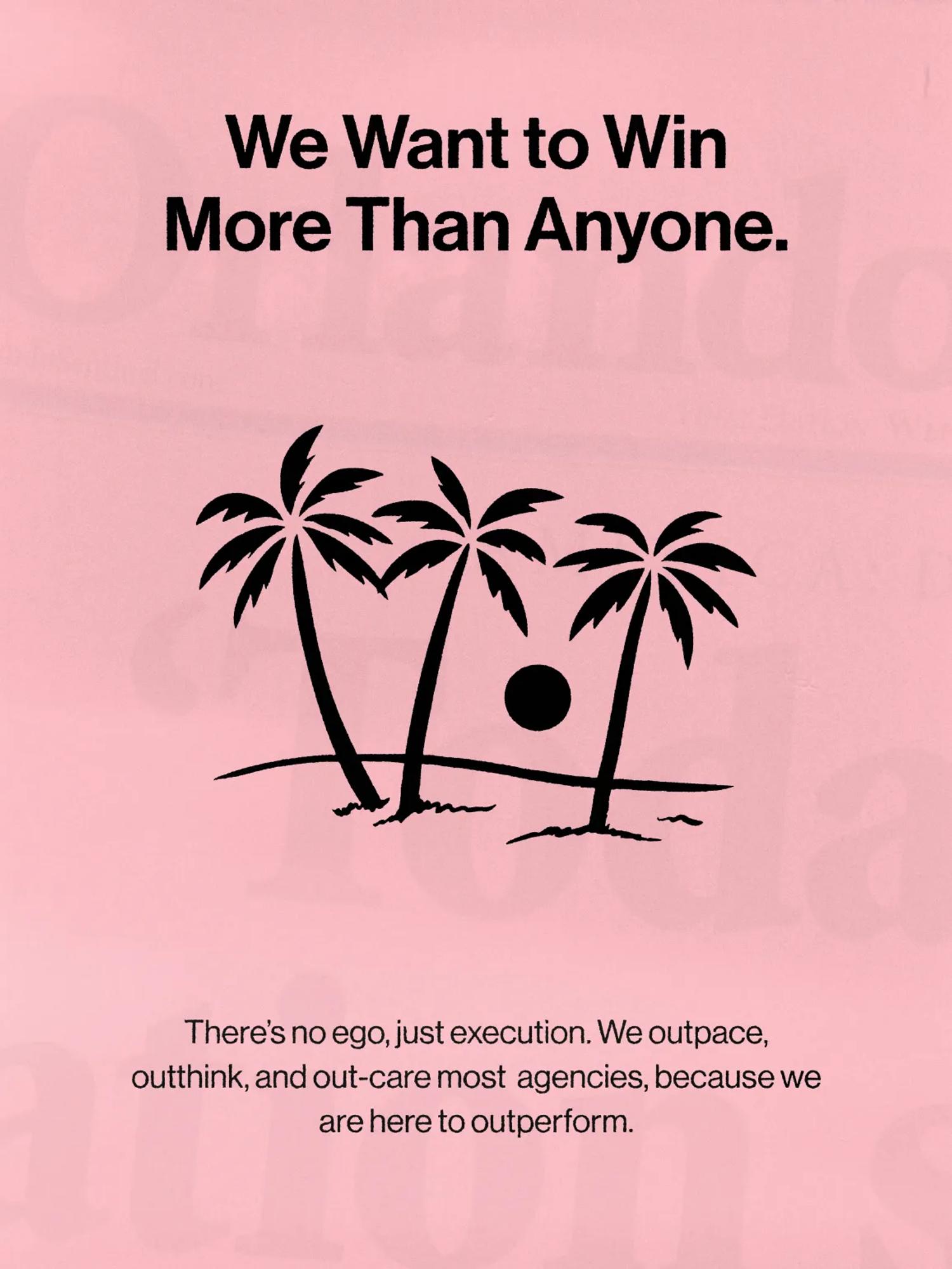
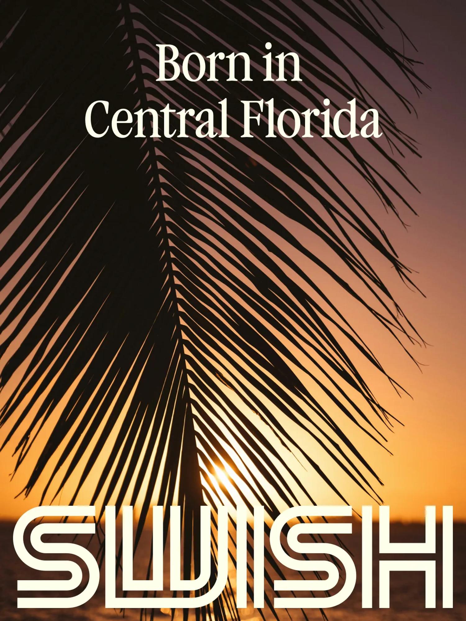
90s Florida is the main thread of the Swish identity. That's what we wanted to push to build out their visual universe.
If you're reading this, you're probably as passionate about design as we are. And if that's true, you surely love fonts as much as we do! You want to talk fonts? Let's talk fonts.

The Swish brand runs on two:

  • Garamond Condensed Regular by Very Cool Studio
  • Neue Haas Grotesk by Commercial Type


Garamond Condensed handles the titles. It's a beautiful condensed serif that screams the 90s. You can picture it on the cool ads of the era, tanned people on the beach sipping margaritas while Whitney Houston plays in the background.

Neue Haas Grotesk is a close cousin of Helvetica. Helvetica was drawn in the 50s and has been THE timeless font ever since, so much so that it fits any era you throw it at, the 90s included. This one carries the subtitles and paragraphs across the Swish branding.

Video thumbnail

The color palette

For the colors, we wanted a selection that could tell the story of who Swish is. Colors that take you straight to 90s Florida. Colors that feel like sunsets on the beach and gritty early-internet office life.

So how do you cook up a palette like that, you ask? Here's the chef's recipe.

We started with a trio of pastels: blue, yellow, and pink, like the wooden houses you see all along Florida's coast. Then we brought in a bone off-white and a carbon black to balance the pastels, add a bit of refinement and seriousness, and give the whole thing a slight vintage twist.

Et voila!

The patterns

To keep our time-travel journey going, we decided to add some patterns to the equation. Let me introduce you to Speed Lines and 90s Checked. Yes, we named them. And so what?

Speed Lines takes its cue from the patterns you'd often find on blank VHS boxes back then. The checked pattern pulls mainly from the Memphis Group, a cool squad of Italian designers who widely popularized a certain 80s and 90s aesthetic.

Everything's referenced here, OK?

Video thumbnail

Micro-graphics

When we think about 90s design, we think about micro-graphics. Why? No idea... But they take us right back to that era. Think the backs of VHS boxes, the small print in the corner of a car window, the credits rolling at the end of a movie...

Micro-graphics are such a vibe, and we knew we wanted them in the Swish branding.

So here's a collection of three. Because when you love something, you just go with it, right?

Video thumbnail

The varsity jacket

A branding project at Juice means merch. It feels almost sad to create a brand without designing the clothes too. I mean, they obviously go hand in hand.

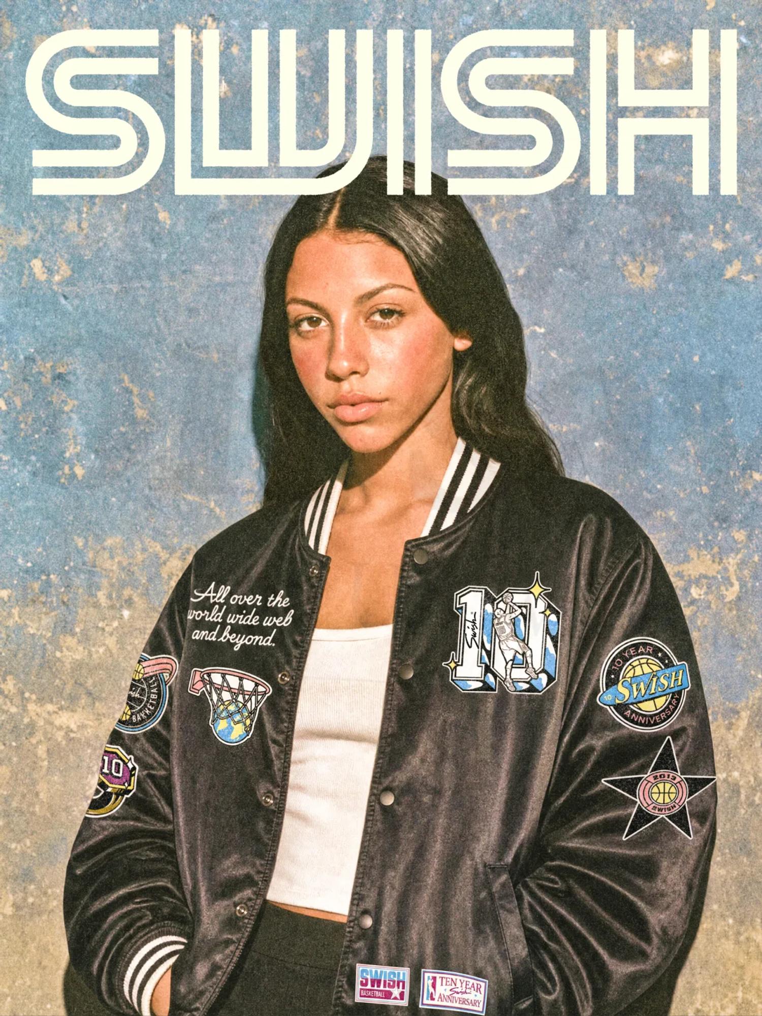
And if you put sport, 90s Florida, and a team spirit in a shaker, what do you get? A varsity jacket! So we designed one for the Swish crew, a nod to their love of basketball, so they can all look like a team of hoopers ready to take the court on their way to a coffee break at the office.

Closing

I feel like this design project was really meant for us. It tied together all the things we love most in design: basketball, vintage everything, and Florida sunsets. Couldn't be more Juice. We also got to design a varsity jacket, which, I'm not gonna lie, had been a box we wanted to tick for a long time.

Huge thanks to the whole Swish team, Matt, Lisa, Bryan, and Tegan!

project type

  • Branding
  • Web Design
  • Development

team

Jonathan Crowe

CEO

Jonathan Crowe

Bio:
Latest article: