We rebranded with purpose. Read the story

United by Nature

Branding & Website We’re Going Public

Uniting Americans on both sides of the political chess to protect their lands and the nature. Yes that’s possible

VIEW PROJECT

project type

  • Branding
  • Web Design
  • Development

team

Branding & Website We’re Going Public

Some projects land closer to the heart than others. We're Going Public! is one of them, so when Benji from United by Nature reached out to bring their new campaign to life, we were in without a second thought.

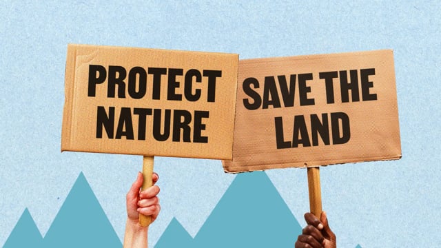
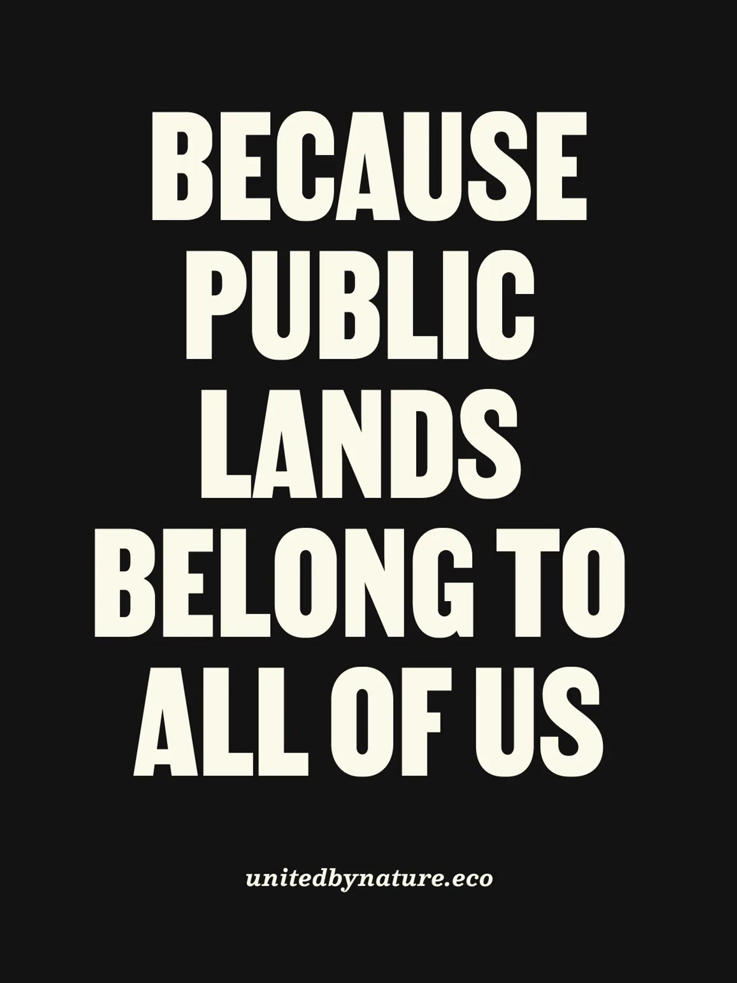
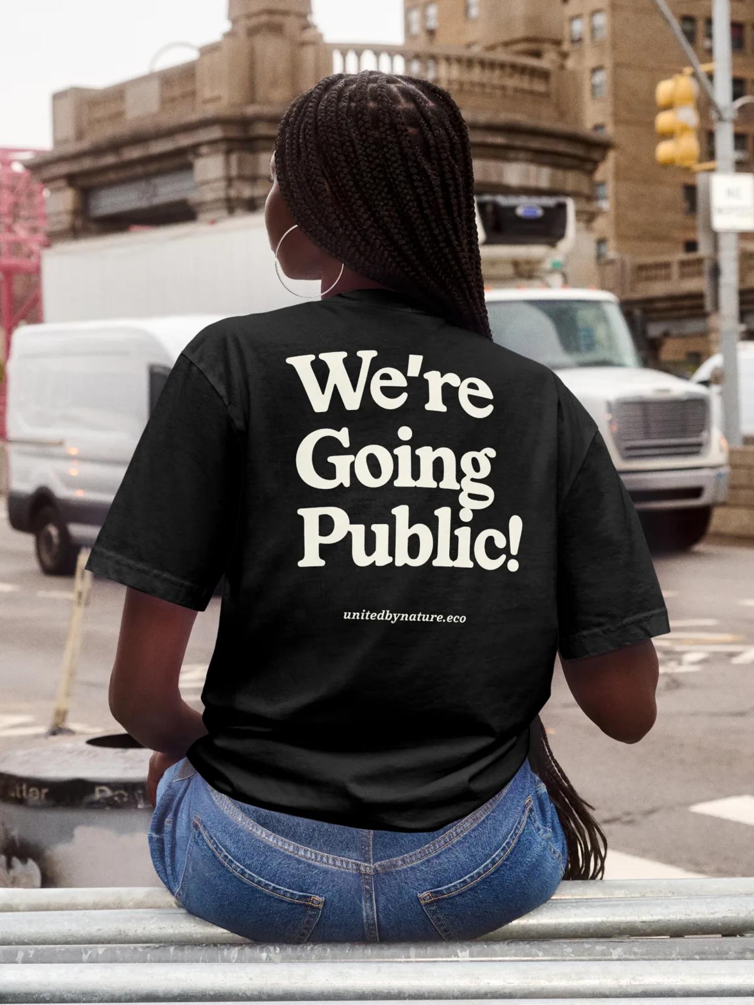
United by Nature is an NGO built on one idea: protecting nature shouldn't be a Democrat-only cause. Nature belongs to every American, and Benji believes the fight should be trans-partisan, pulled out of the culture war. Public land belongs to people, not corporations, so all of us should be fighting for it.

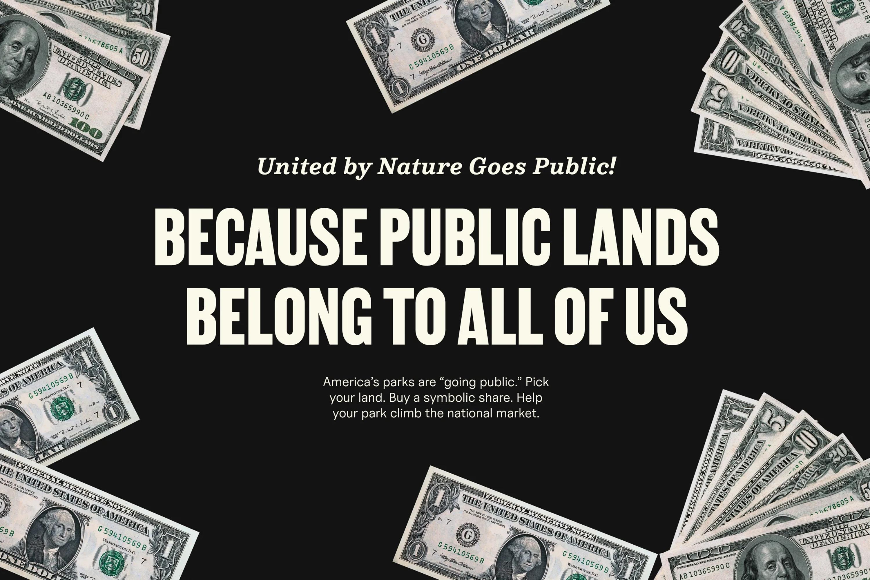
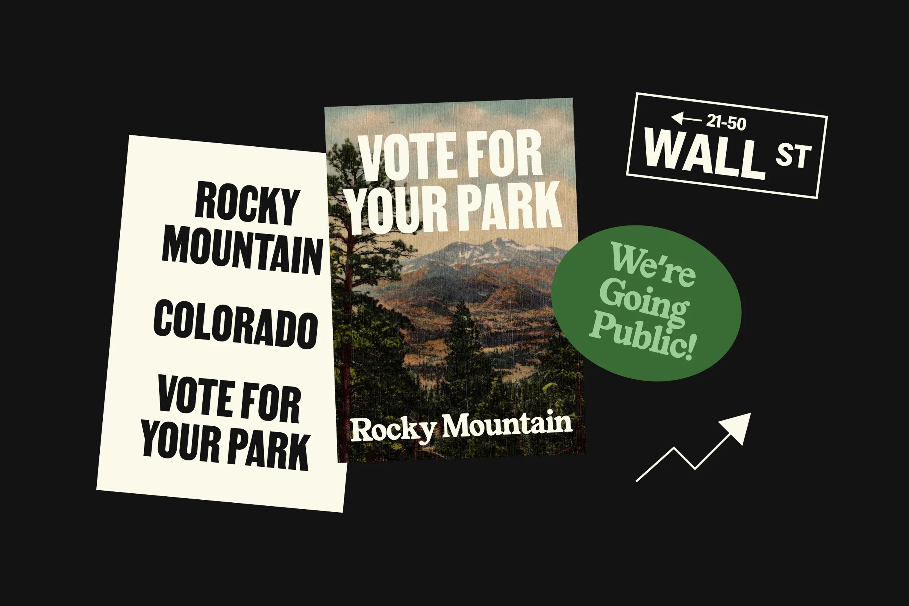
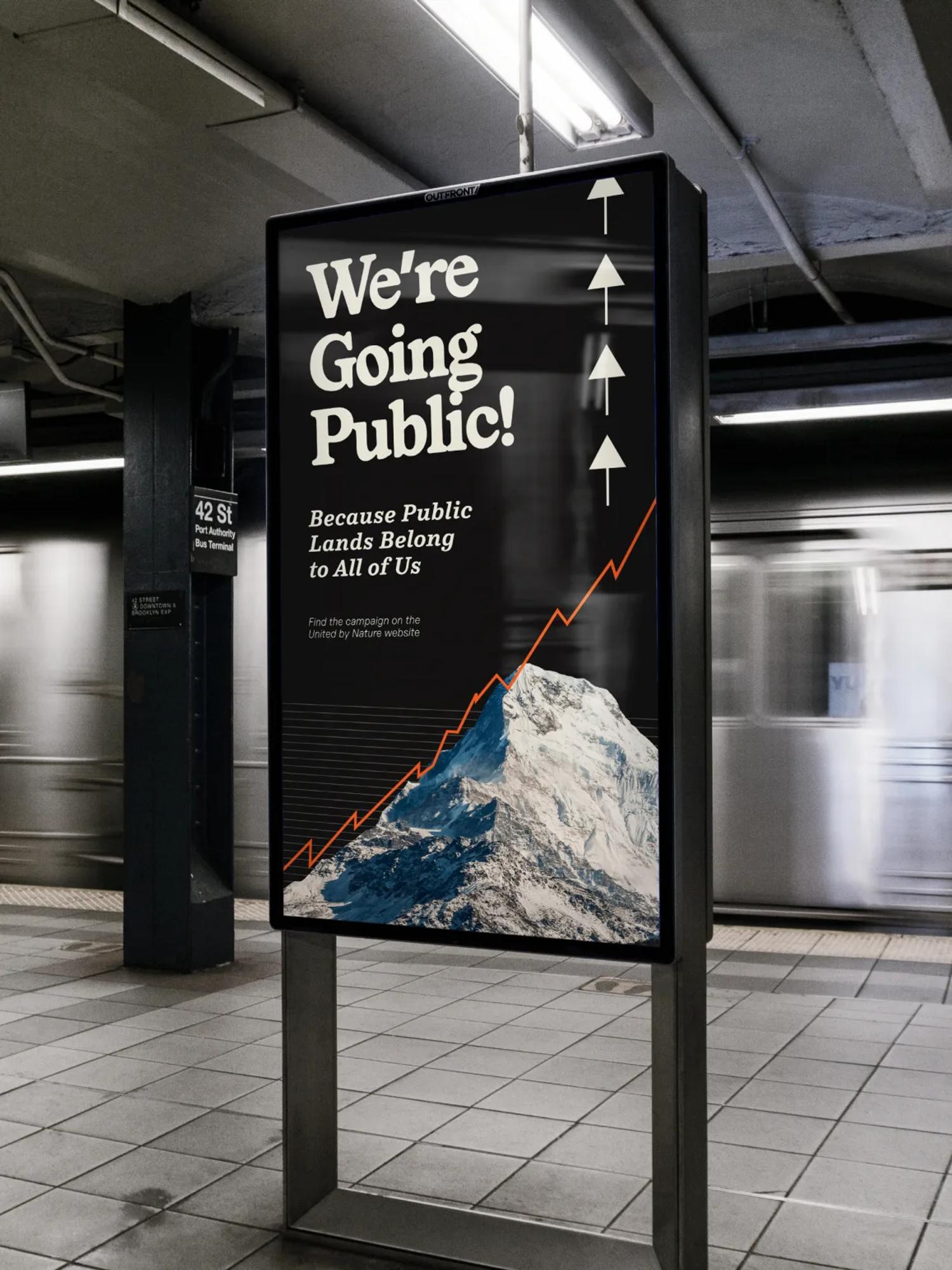
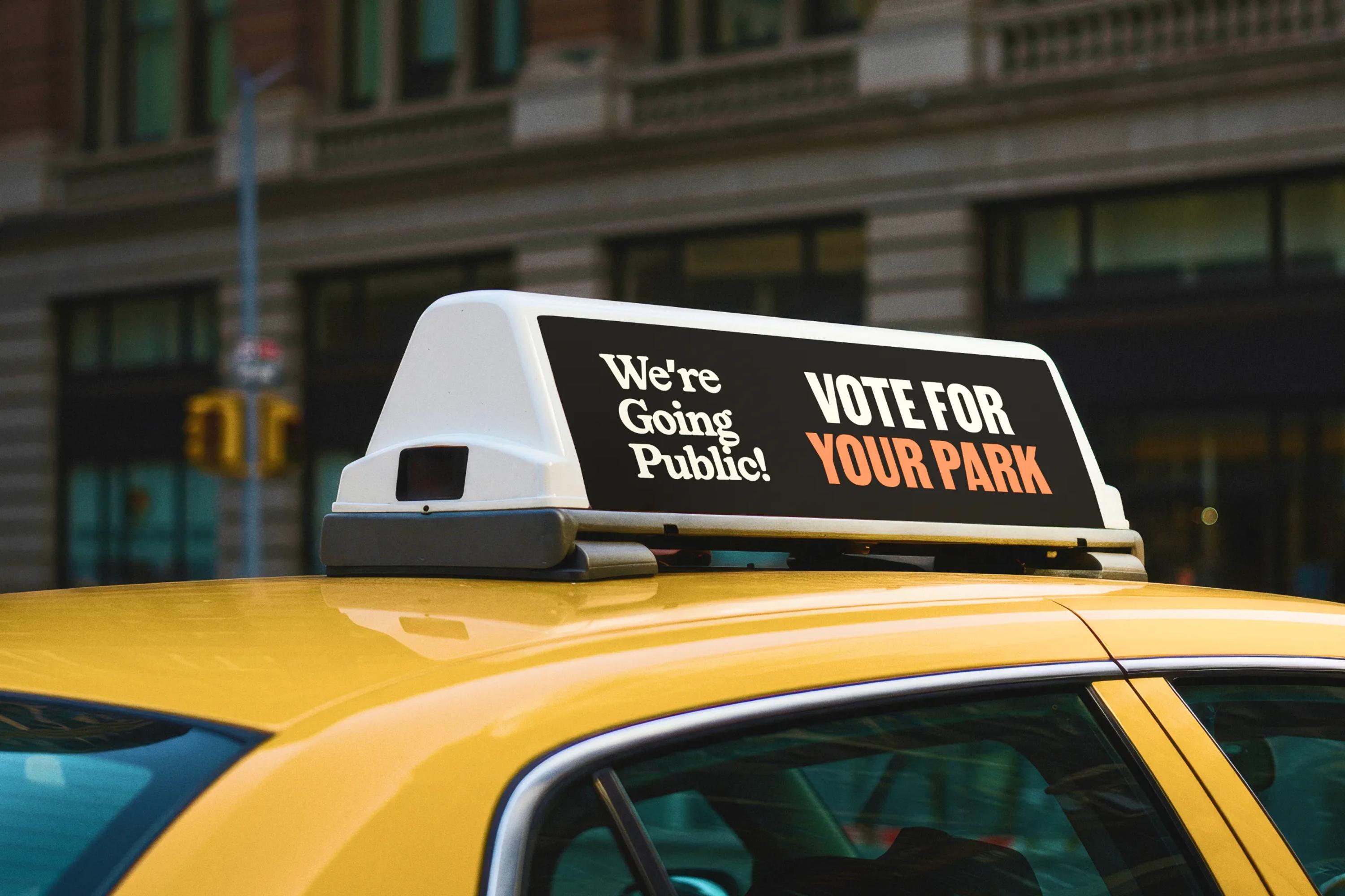
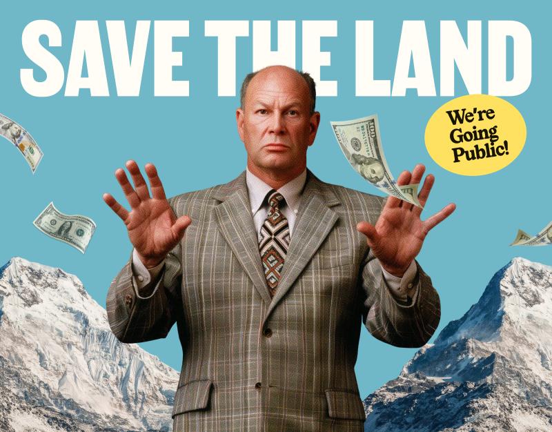
It's a beautiful idea, but a beautiful idea isn't enough. To get people to act, you need a hook. That's where We're Going Public! came in: borrow the visual universe of 1980s Wall Street and let people "buy" virtual shares of public land, like bidding at a stock auction.

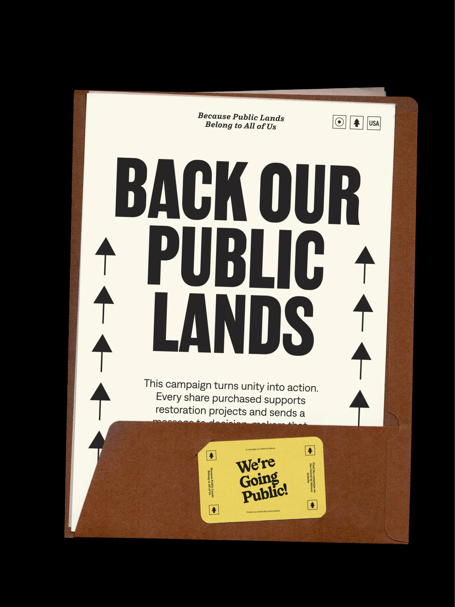
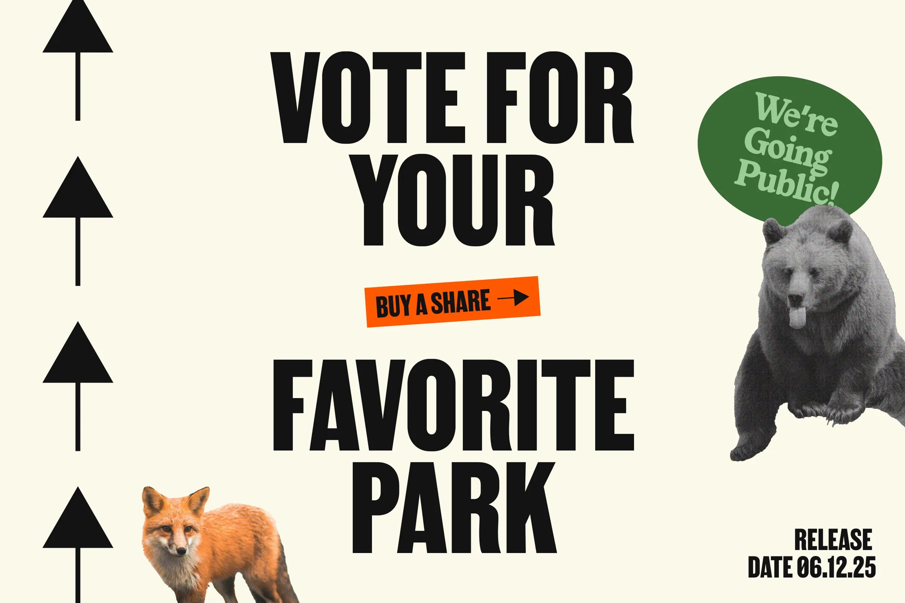
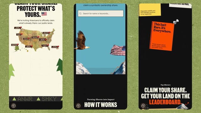
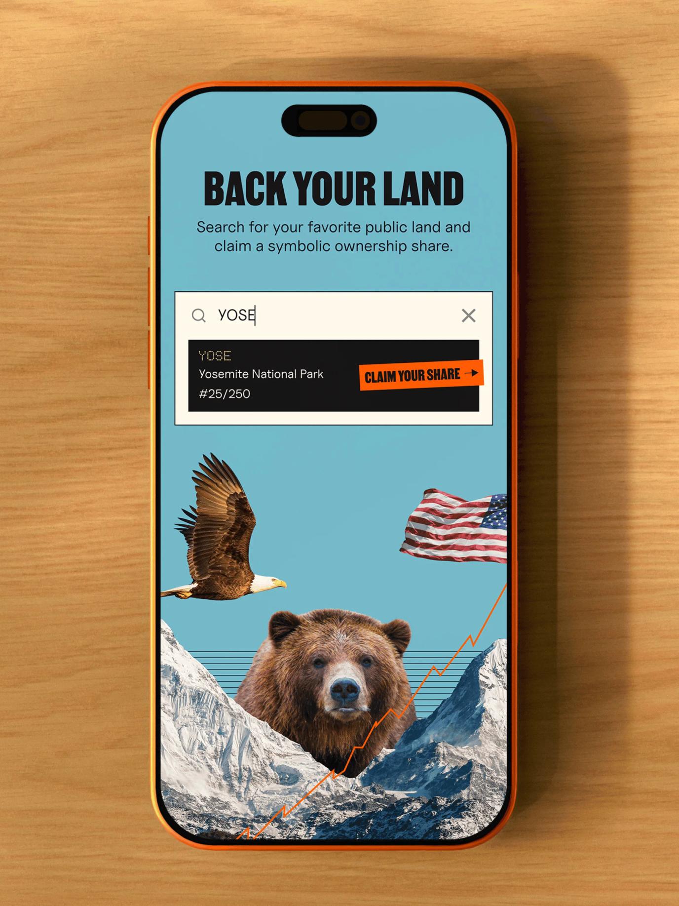
The mechanic is simple. You claim a symbolic share of your favorite public land, get an official certificate with your name on it, then rally friends to "invest" in the same spot and watch its stock climb. When the market closes on June 1st, the lands with the most shares earn a contribution toward restoration, the rest funds public lands nationwide, and every share becomes a voice pushing for real policy change.
Video thumbnail
Video thumbnail

Taking up NYC by storm

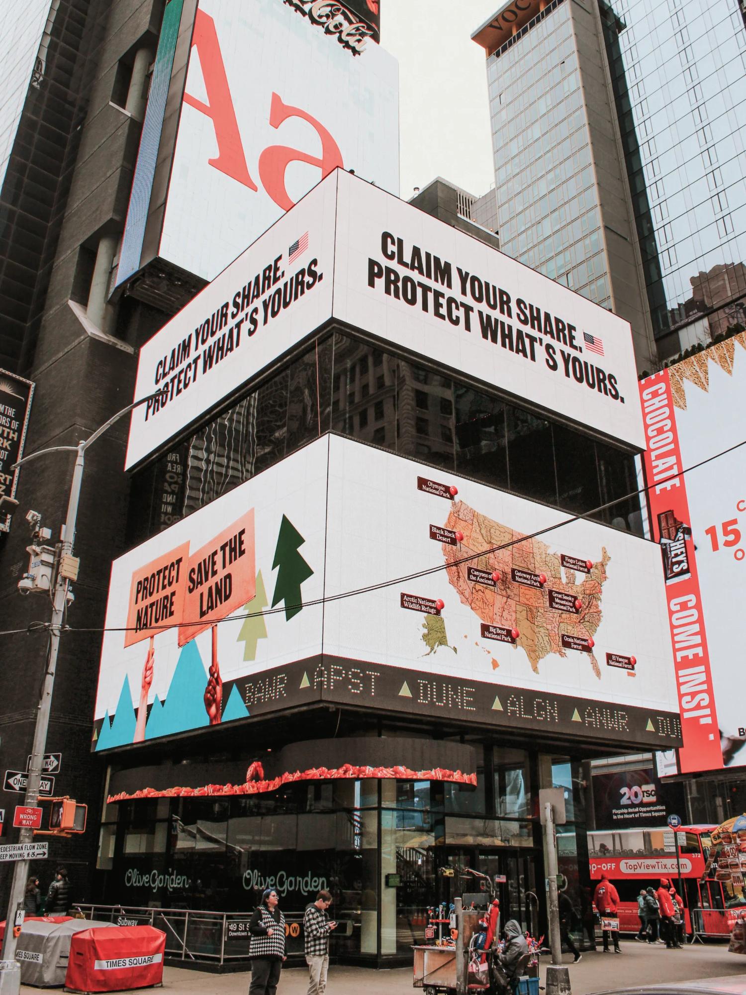
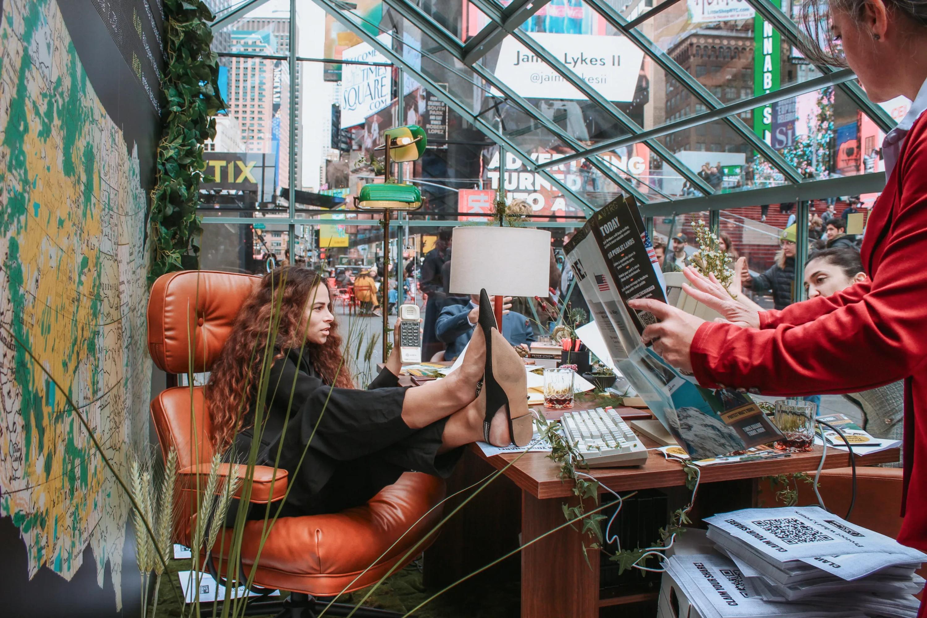
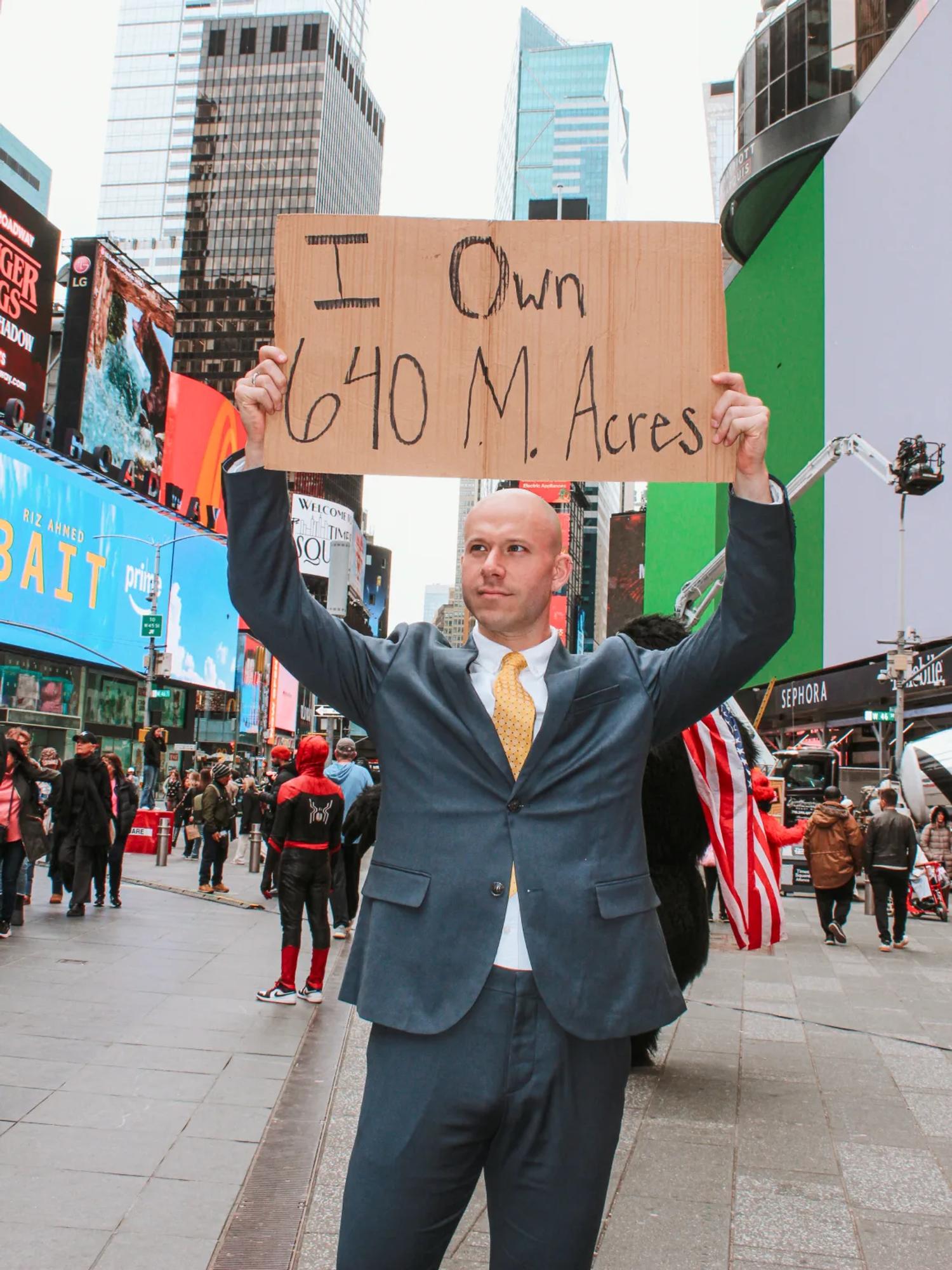
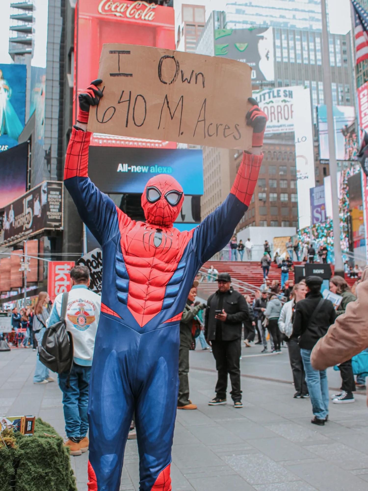
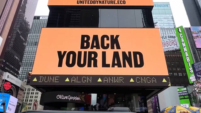
When the United by Nature team briefed us on the project, something got us more than slightly excited. On top of building the website for the campaign, they wanted to stage a big happening in Times Square to grab the attention of the public and the media. The idea: a greenhouse planted in the middle of Times Square to host the event, with the campaign designs projected up on the screens.

In a designer's career, there are different levels of the "we've made it" feeling, but I can assure you that seeing your work on the big screens in Times Square is high on the list.

Video thumbnail

The Fonts

Being overly excited by a branding project is one thing. Landing on the right identity is another accomplishment entirely.

Here, the objective was to create a fun identity that could hook people and push them to participate, all while mixing two very distinct visual universes: 1980s Wall Street and National Parks.

When we started diving into the 1980s Wall Street aesthetic, the first design cue that caught our attention was the vintage newspaper, the kind of look you'd find in the Wall Street Journal or the Daily News. And what makes those papers so distinctive? The fonts. They don't use one, they don't use two, no no no... they use way more than that! That's exactly what makes them so visually interesting, despite relying so heavily on text.

That was the starting point for the campaign's identity. We selected five fonts to use across the whole design:

• Martin XBold by Vocal Type for the main titles
• Lastik Black by That That Type for the logo and secondary titles
• Colroy Bold Italic by Nouvelle Noire for the eyebrows and subtexts
• Uncut Sans by Uncut.wtf for paragraphs
• Doto Bold by Google Fonts for the bitmap/LED screen texts

1980s Wall Street Graphic Elements

The fonts were a good start. Now we needed the elements that would make the project feel unmistakably Wall Street.

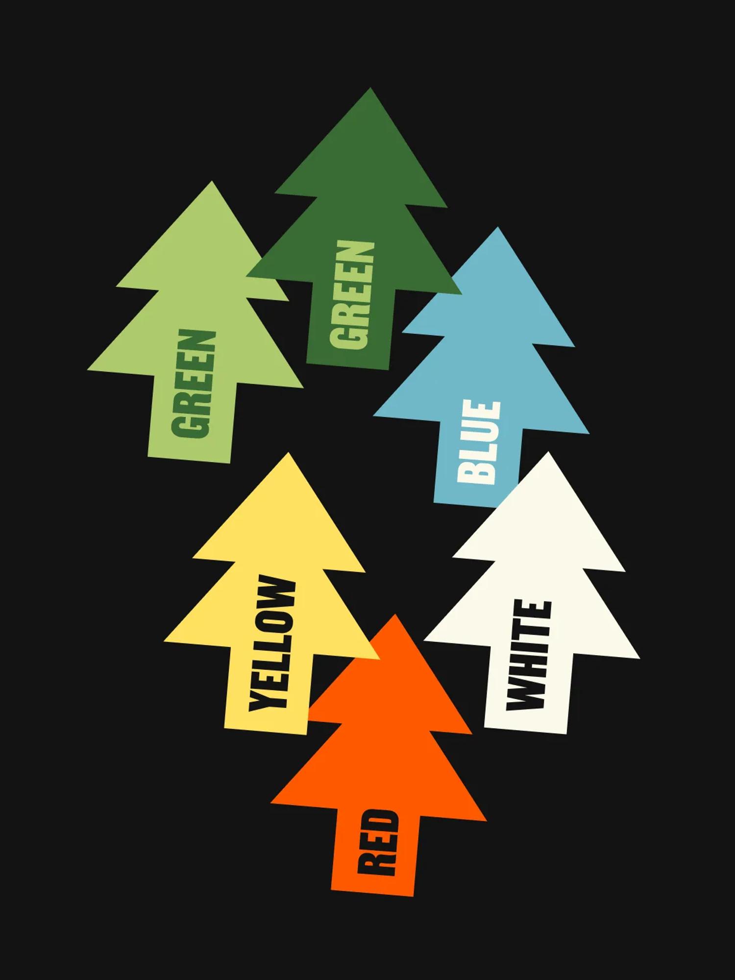
If I say 1980s Wall Street, what comes straight to mind? I mean, apart from the the private jets and the overly expensive suits. I'm talking graphic elements here: graphs, grids, arrows, and of course tickers.

The decision to use tickers turned out to be pivotal. Since we wanted the audience to buy symbolic shares of public land, we renamed each piece of land the way tickers work, giving every one its own four-letter code.

The Collages

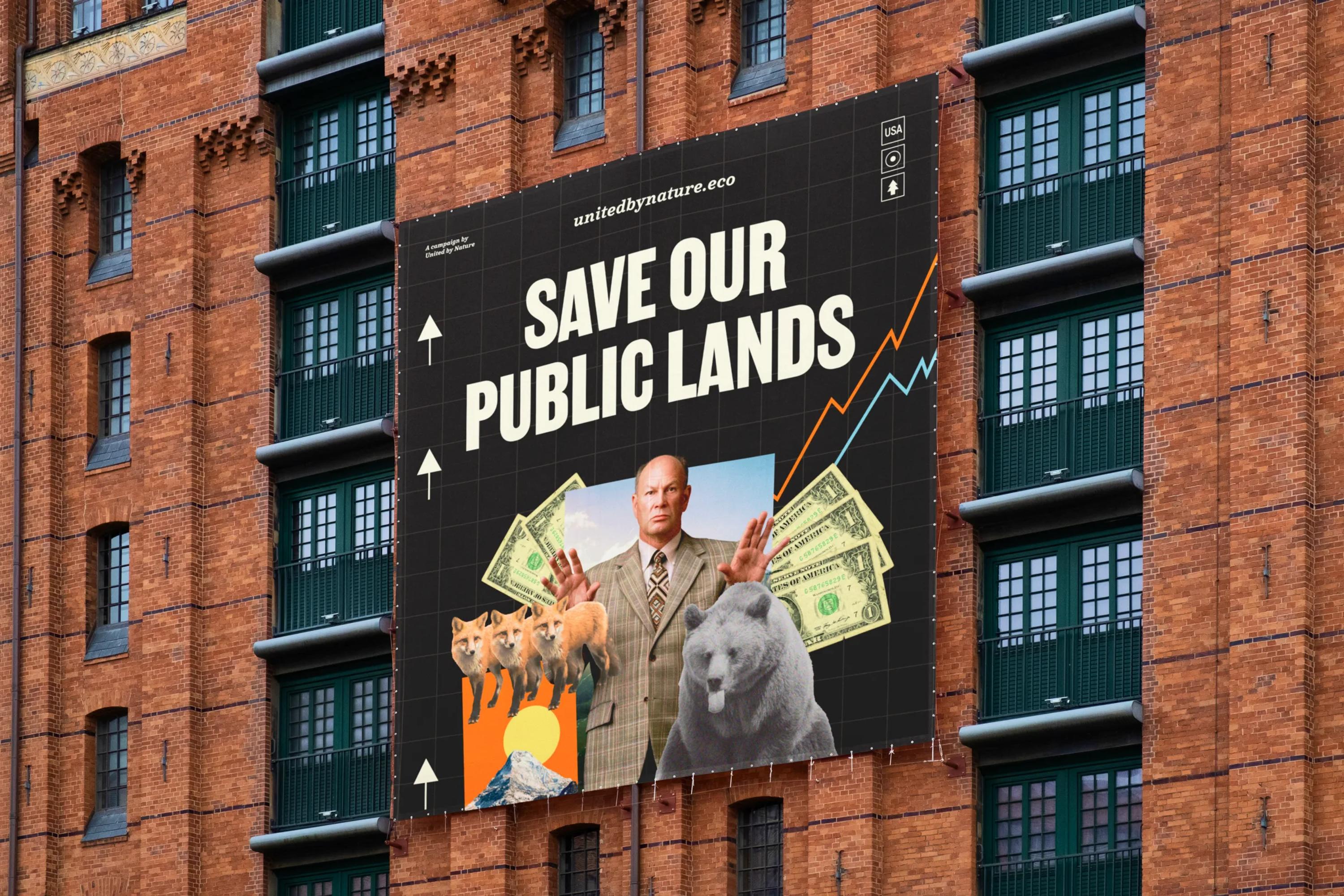
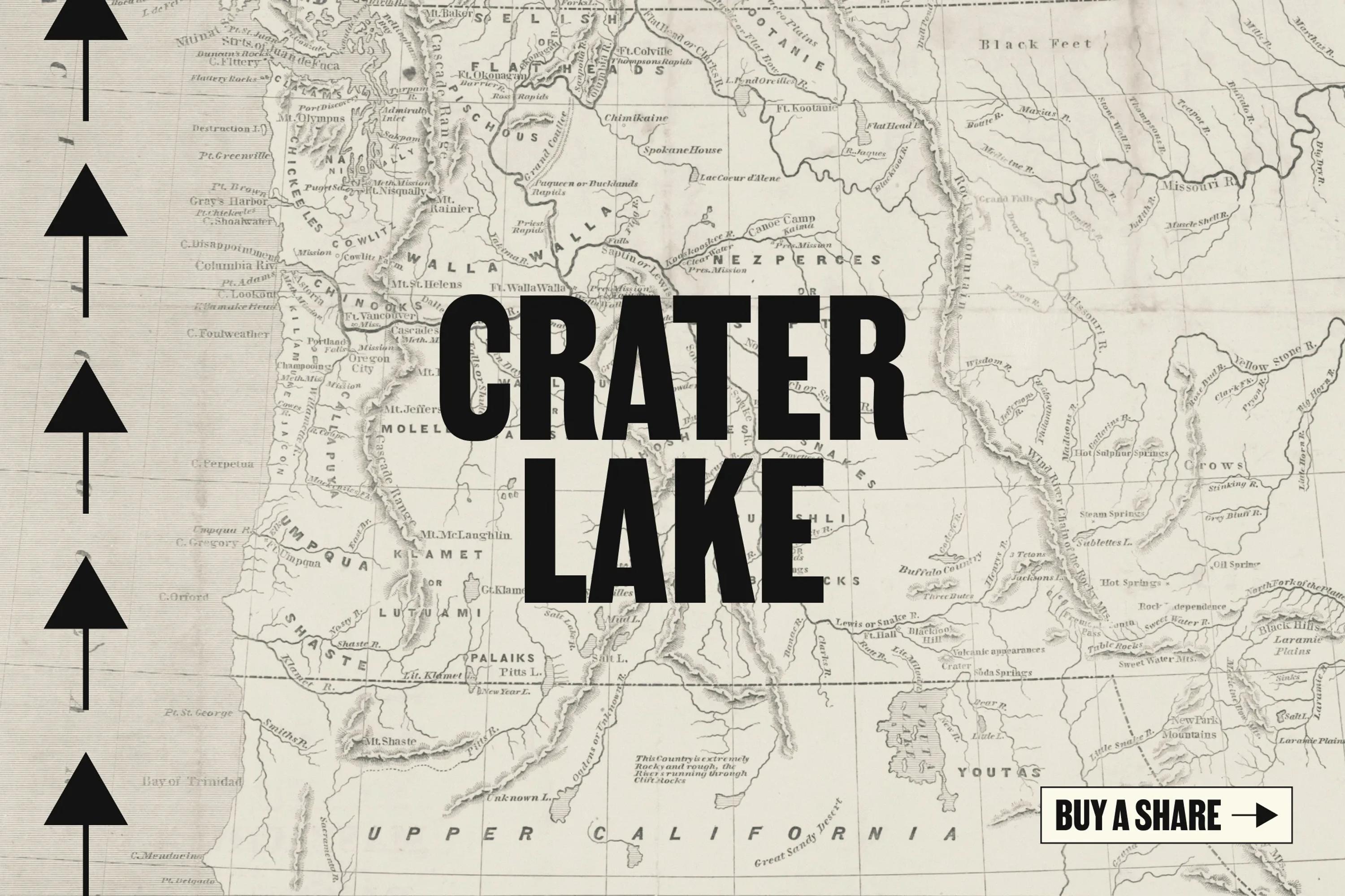
The campaign identity had to be entertaining, so now we needed some visuals to make it fun. The main question: how do you combine both aesthetics, 1980s Wall Street and national parks, into a single visual?

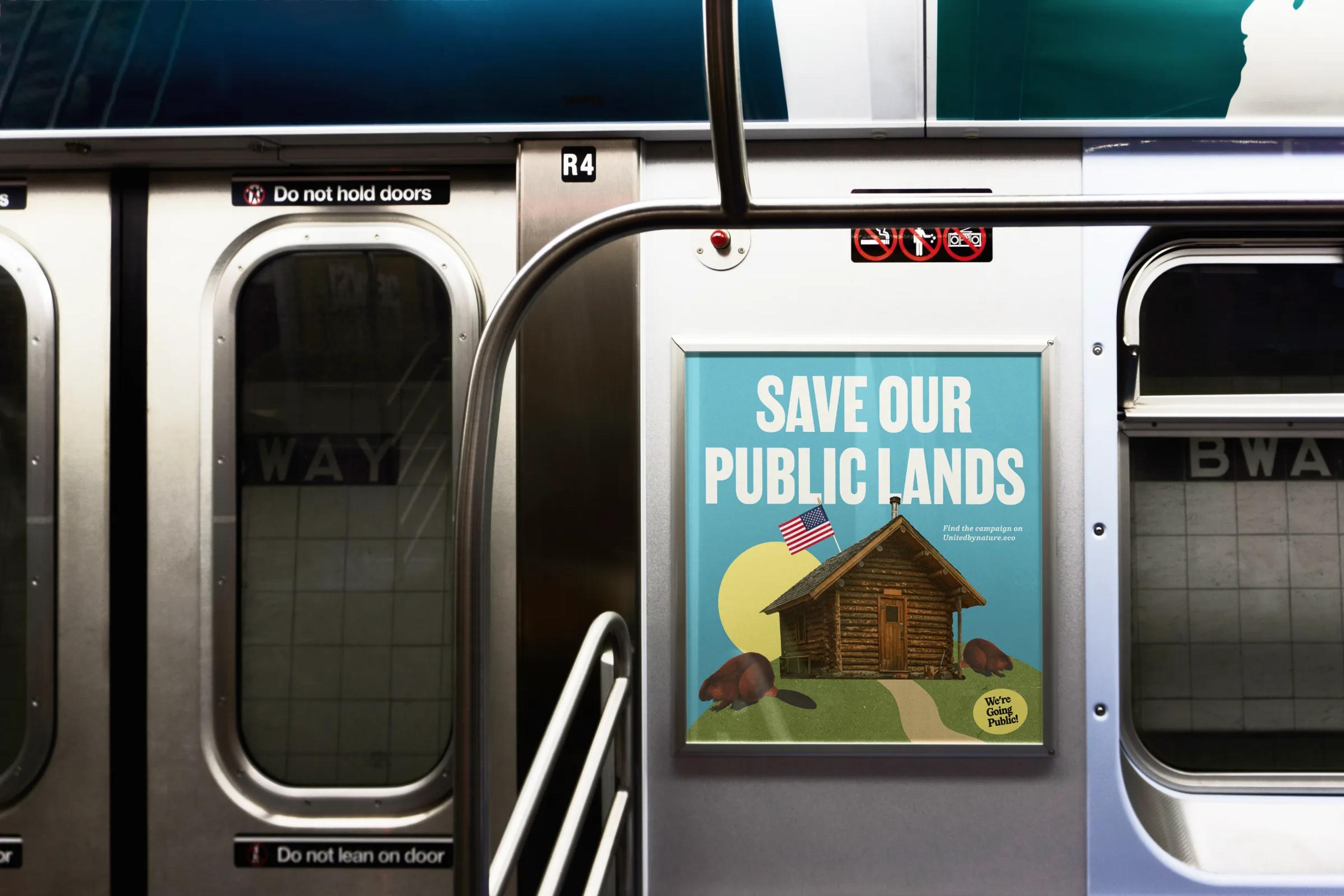
After pulling together old Wall Street Journal pages, 1980s outdoor ad campaigns, and vintage postcards, one idea became pretty obvious. Take all of it and layer it into one. That's called a collage, and that's exactly what we did.

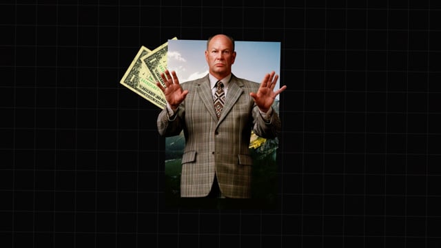
That's how we ended up mixing color and black-and-white photos of dollar bills, mountains, folders and clippers, foxes and bears, and traders in suits, all together. Then we threw some textured paper into the mix for even more grit and personality.

Video thumbnail

The Website

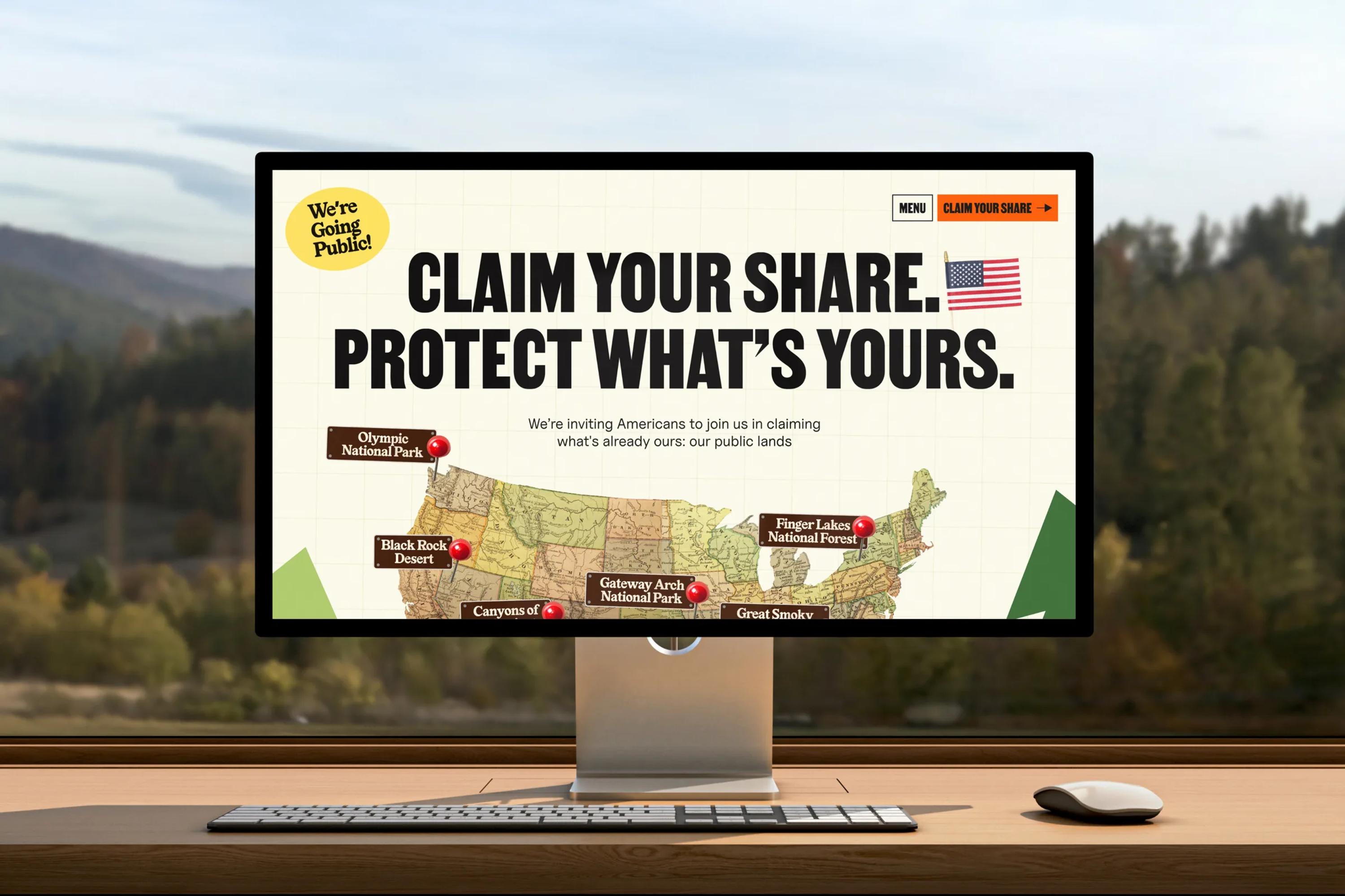
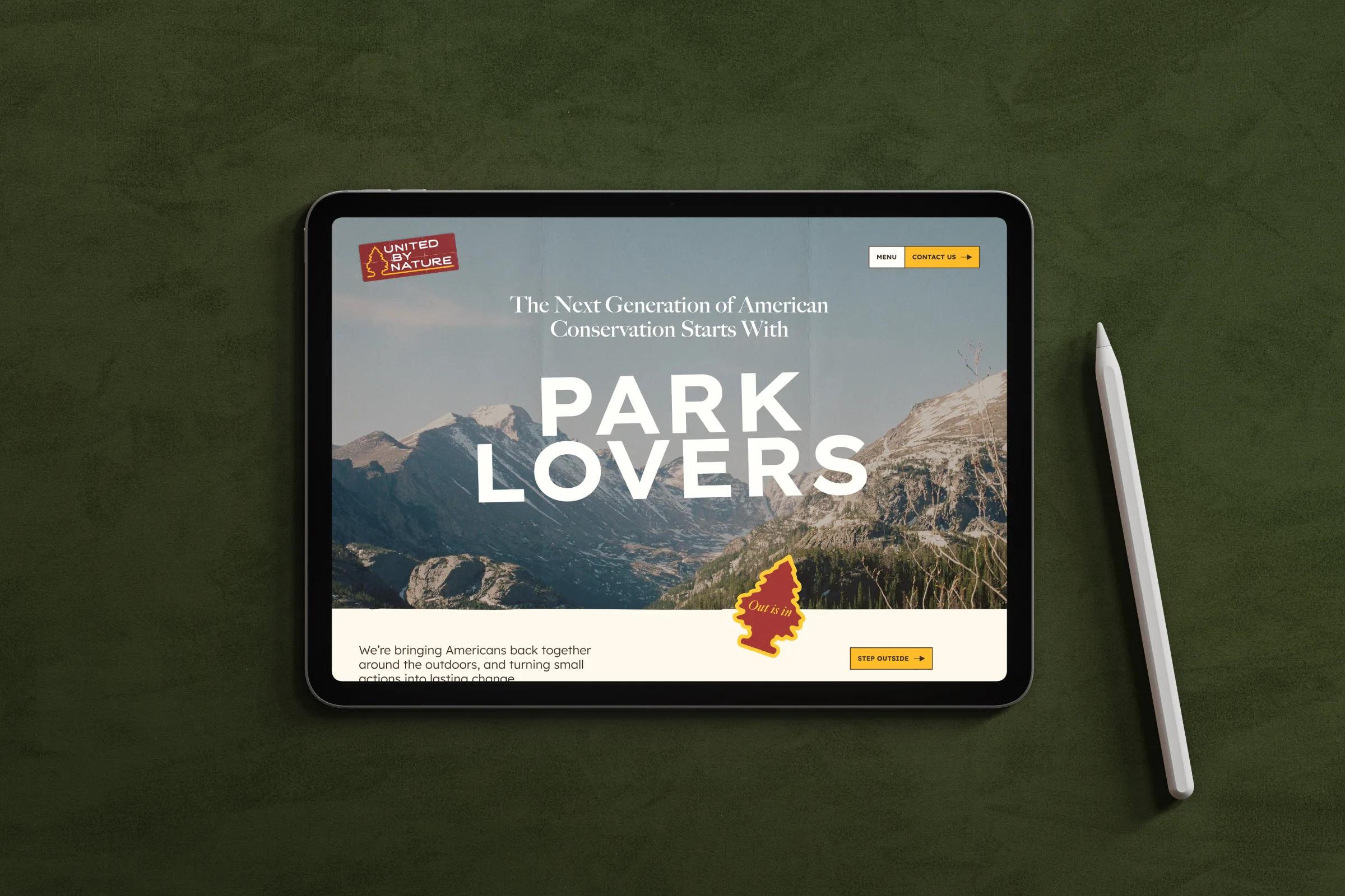
We then designed the website: a one-pager with a system to search for your favorite public land and buy your shares, plus a leaderboard that displays each land's rating in real time to make the competition more fun, just like a real stock exchange.


And because We're Going Public! is a playful brand, we added a bunch of micro-interactions to make the experience even better, like the little bear head that pops up when you click on the search bar.

Video thumbnail
Video thumbnail
Video thumbnail

Times Square

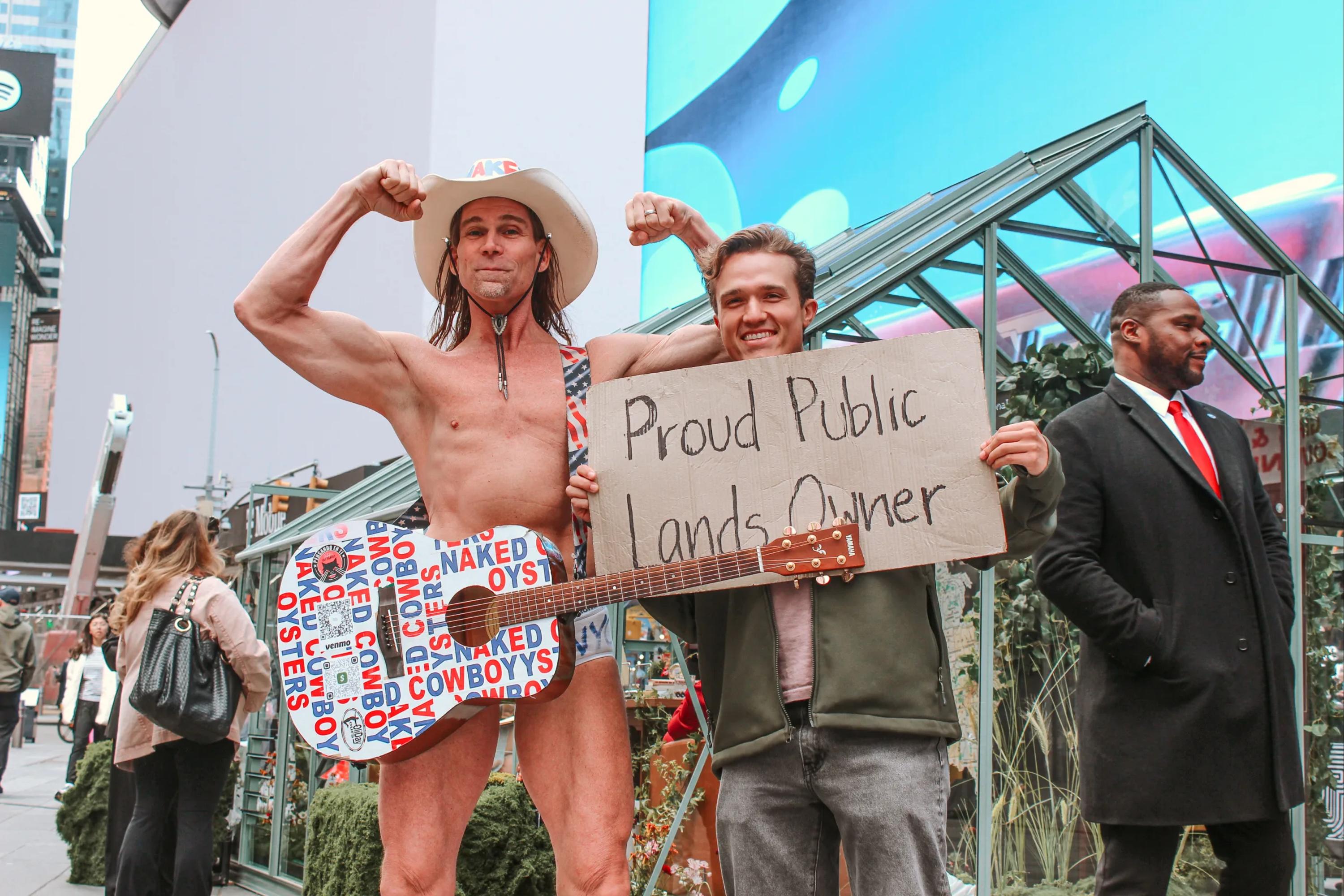
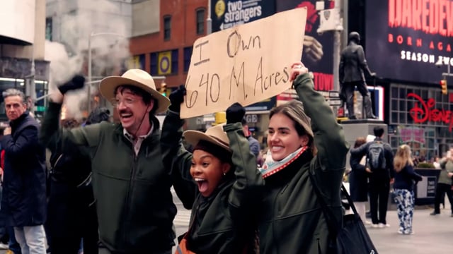
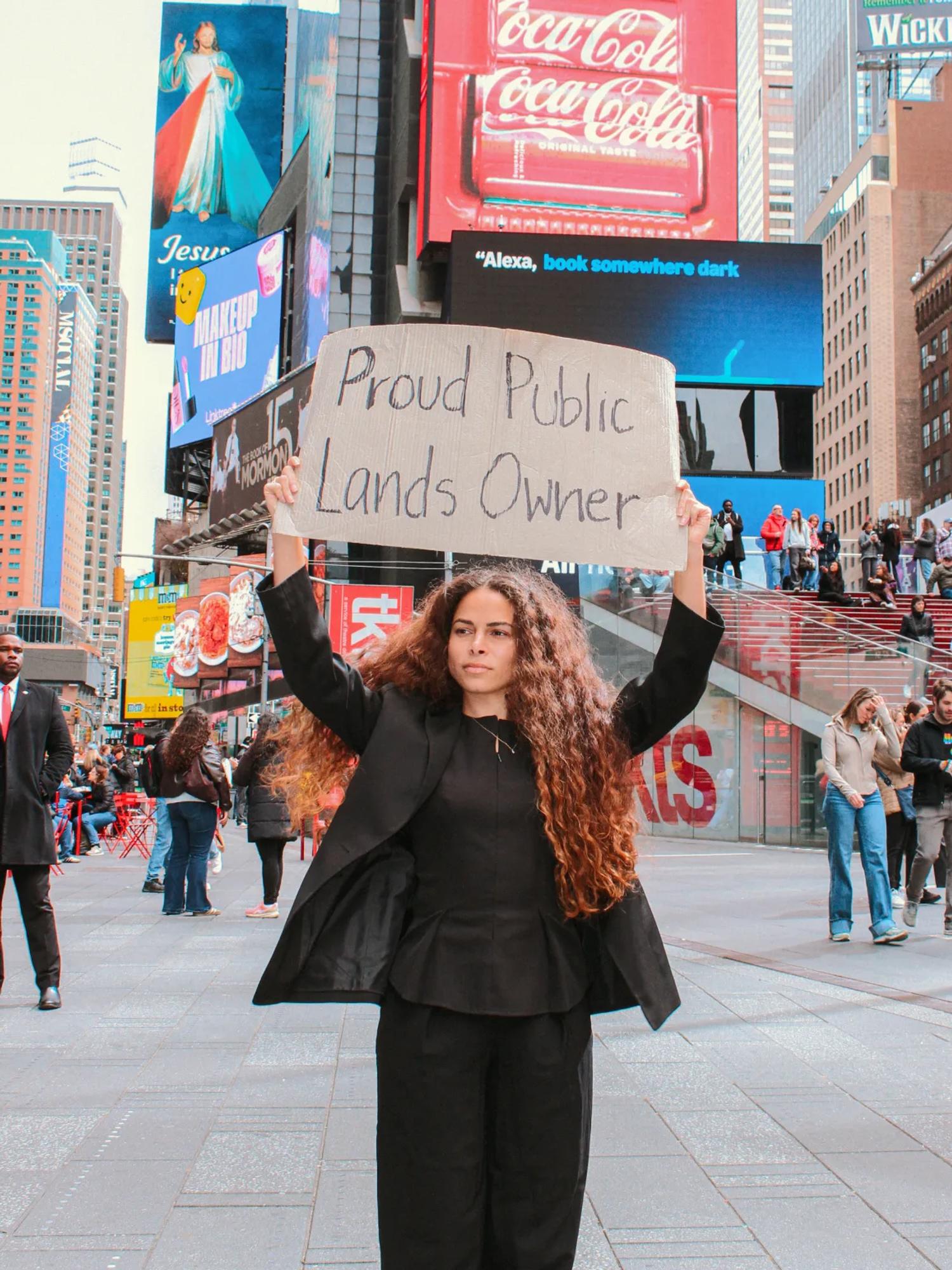
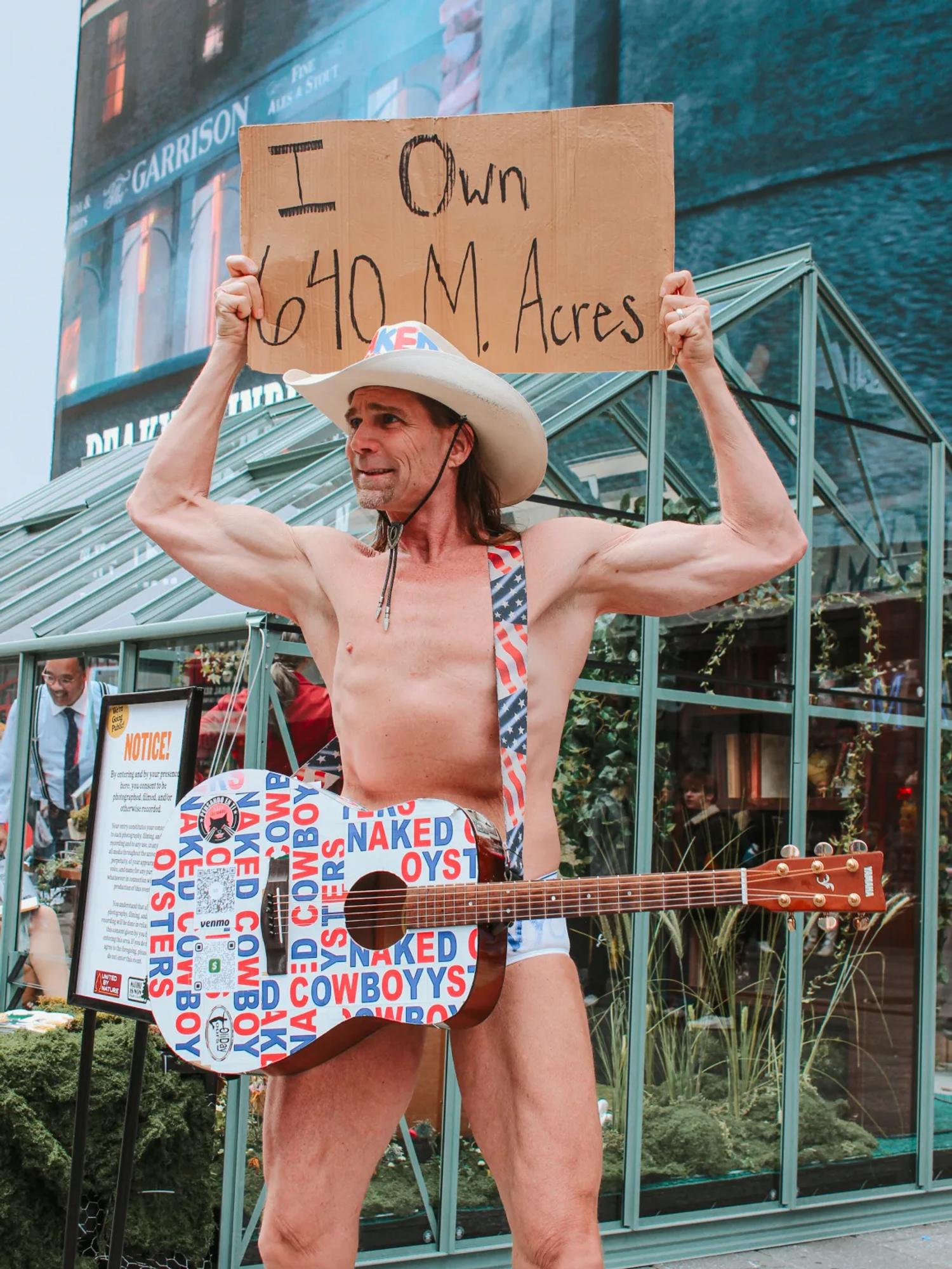
On March 27th, we launched the website live. That same day, United by Nature staged a big live event in Times Square with a bunch of members of the organization. The goal? A powerful visual moment to build buzz around the campaign. For the occasion, they brought in influencers like the Naked Cowboy and Uncle Pappy.


They also projected the campaign visuals across four huge screens in Times Square.


I can't express enough what it feels like to see your design on Times Square.
In a designer's career, there are different levels of achievement: from your first project for a friend, to spotting your first logo out in the wild in a restaurant back home, to your first Website of the Day on Awwwards or your first featured project on Behance. But making it to Times Square is something else.
Mama, we made it!

Video thumbnail

Closing

I think the one thing we all have in common as a team is our love for nature. Despite being massive geeks glued to our computers all day, we share a deep passion for the wild open spaces. So it was a real blessing to work on something we feel so connected to, alongside the incredible team at United by Nature.

And damn, how exciting is it to have clients willing to take your designs and throw them up on big screens in NYC? That's the kind of thing we wake up for in the morning.


We're really proud of what we made on this one. Hope you enjoyed the ride!

project type

  • Branding
  • Web Design
  • Development

team

Jonathan Crowe

CEO

Jonathan Crowe

Bio:
Latest article: